LMMS redesign concept #1911
Comments
|
Looks very good, you can add pics right here, maybe just not all for ui and zyn |
|
stunning! |
|
For your (awesome!) LMMS-UI-Concept I fear this requires a complete rewrite of LMMS's GUI. How do you handle the windows? (switching in fullscreen per button? dragging the corners for sizing?) Greetz Bara |
I can't speak on behalf of the author, but most DAWs use a collapse/show method and the designated panes are just reused depending on which widget is shown.
Done. :) Very interested to know the possibility of this. When you worked with the Zyn team, how involved with the code were you? Did you have to fork the repository? Did they merge the change into base? Last I checked, Zyn wasn't fully Qt compatible but your library seems to make heavy use of Qt and QML (right?) Tagging @RebeccaDeField @pgiblock |
👍
Thanks for clarification. Yeah, Mark shows up here occasionally. I'm sure his efforts could probably be extended for LMMS as well. As far as a singleton window, we likely have thousands of lines to clean-up to make this a possibility, but your mockup is delightful and we're likely to use it as a reference point when discussing major UI changes in the future, thank you! 👍 |
|
@fundamental what type of overhaul are we looking at here if we were to adopt this new UI? I assume we'd have to port over pretty much every single widget, but how extensible is this opengl/QML for other projects? I'll quote the readme for others interested...
|
I am glad to hear that, I hope this would be very helpful. I'm tired of floating windows :) |
That's what I'm talking about 👍 |
@budislav P.S., you can use the |
|
Let's say I have a dual screen setup. Now I can stretch my LMMS window to cover both screens and place the subwindows where I like. In which way would the proposed concept be an improvement in that case? |
Thanks, didn't know that :) |
Sorry, it has to be the first character in order to work properly. 👍
Yeah, I was wondering this as well.... If the other usability improvements happen that is certainly an obstacle I'd like to have. My recommendation (even in our current design) would be to have unlimited container windows. This could get ugly for singleton objects though (which we have some other open items on already). |
|
@softrabbit looks like we're not the only DAW with this dilemma... Ableton, FLStudio, etc. |
|
@softrabbit |
|
One solution will be to undock desired section and to move it on second monitor which have container than dock it automatically. Now there should be some kind of pattern for each section. Browser should be docked only to left or right, and instrument and effect rack should be always on bottom, because it have fixed height. |
|
Seriously, I'm gonna put out some cash for implementing this. |

|
On 03-31, Tres Finocchiaro wrote:
At the moment the goal is to just get this to work for zyn, but I'd The draw routines should be easily swapped out, as most of them are The mouse interactions should be pretty much identical for many of the The bindings of the widgets to the engine will need to change as once I So, there will be some mismatch, but nothing that would prevent another Given the current rate of development, there's likely a year to go |
|
About multi-display operation:
@fundamental you mean about a year to replace ZynAddSubFX UI? And then you could start working on LMMS? |

He was talking about the readiness of his GUI framework for Zyn which will make a good portion of the mockup possible. He never said he'd integrate it into LMMS, but rather was speaking broadly on behalf of its port-ability to non-Zyn uses (which I specifically asked about) :) I'm curious how the messaging described as -Tres |
|
Very nice. A complete UI overhaul probably won't be any time soon, but I do prefer single-window functionality and would be very pleased if this was implemented. Good work. |
|
On 03-31, Tres Finocchiaro wrote:
Well, QT pretty much anything is very much unsafe to use anywhere near Some sort of message passing is the norm for effectively creating a As per why I care about caching, it's mainly to avoid waiting for --Mark |
|
Is it possible to easily undecorate QWindows (i.e. remove each window's menu bar) and then have some layout engine that positions them in code? This would allow for an easy way to toggle between a tiled interface and the current windowing interface for multi-screen users. Should also reduce the amount of code affected. A quick search shows that Qt may support this pretty easily. |
Ever heard of bountysource.com? It's made for exactly that purpose 👍 |
Oh yeah, bountysource is awesome! Should we consider putting bounties on some issues with our donation money? That could lead to a faster development of some features. |
|
I'm supportive of that. It allows.non-devs like me to contribute more than On Sun, Apr 5, 2015, 1:45 PM Umcaruje notifications@github.com wrote:
|
|
Our donation money does well to break even with expenses. Please don't misdirect funds to our donation account, leave them for the bounties. Bounties are a much more sensible approach to these bugs (any developer can step in). We lack the organization to make promises with our own funds. We're not prepared to dispurse and organize a large amount of funds, nor are we prepared turn our volunteers into paid devs. Separate bounties can attract new help without putting unnecessary burden on a relatively inexpensive and simple to maintain team. :) So please pledge against bounties you believe in supporting, but don't think the current team can necessarily allocate more time. These bounties would put a price on a feature that anyone can fulfill (like new help). That idea sounds promising. :) |
|
oh, the evils of money....... :( :( |
|
Sorry for bumping this thread, but this UI looks really amazing! Absolutely can't wait for the release. :) |
|
Maybe i'm the only one, but i think that the green line of the slider should be vertical, because the slider is horizontal, like this
|

@michaelgregorius @Lathigos The CPU meter got pushed to the right side and I wasn't sure why. So I started cleaning up the toolbar code (#5125, #5148). Unfortunately I didn't have time to continue that recently. |
|
@winniehell Ah, I see! Still, thanks for the refactoring, it'll probably speed things up tremendously! 😃 @RoxasKH I've implemented your slider handle design! I've also made the sliders a little smaller and changed some of the widget spacing. How does this look? Perhaps the shading gradient of the slider handle should point upwards (as if light is coming from above), but this looks pretty good as well (as if it's a wedge-shaped knob or something). |

|
@Lathigos I think it looks dope, i could design the gradient from above, but i got no time atm |
|
@Lathigos My only suggestion is to make sure that you're using shades of gray color picked with the same hue as what is elsewhere in the program so we don't end up with any clashing colors. This is looking great 💯 and I think any other fine details can be finalized with the PR |
|
For Time Sig, might a formatting of "4/4" be a better fit than "04/04"? |
|
@mxmilkb I think we should keep it as "04/04", since it is possible to have time signatures with numbers higher than 9. If we would remove (not just hide) the leading zero, then having a number higher than 9 would cause all widgets next to it to move. @RebeccaDeField The gradient in the picture has roughly same hue as the area next to it according to a colour picker tool, but it has a lower value (brightness) to make it pop out a bit more. Unfortunately, the hue is actually not constant throughout LMMS (ranging from ~190 to ~210), so I am not sure which exact hue to pick. Once we get closer to @budislav's design, though, we'll be able to get properly matching colours everywhere. |
|
My thought was that the spacing for one number would be the same as for two numbers so as to keep the other widgets in a fixed position. As in to "just hide" the leading zero. |
|
@mxmilkb You will find that even the single UI theme has some hue variations as well as that does not necessarily = clashing. I recommend color picking the hues from a similar area as it is a good way to better foolproof designs where color theory is involved with other contributors. Budislav's design is also flat so the number of colors would be much more simplified than as it is now with more gradients. It is however the nature of an open-source project for more variations to come up than intended and a comb through in this regard wouldn't be a bad idea. Last time I talked to budislav about colors, we were heading towards something like this while prepping for an instruments rehual so that his design would coordinate with our current branding. The plugins project would also be a great effort towards the single window design. |
|
Just a sight from aside: do not hardcode colors and use lightness/hue manipulation on very few colors from the base palette like it's done in Godot, Renoise and Ableton Live to allow different color schemes. |
|
@mxmilkb Ah, I see! Yes, that could be possible - but I would rather work on key parts of the LMMS UI that need work the most before implementing that, because I think it looks alright as it is (unless everybody disagrees and demands this feature be implemented, of course 😄). @RebeccaDeField Can you take a look at the pull request #5261? I've included a full-window screenshot there in which the color palette is more visible. Does it look alright? @zezic Good point! Luckily everything from the background to the font color is customizable through a stylesheet 😃! In fact, that's also how I implemented the gradient, it's just an entry in the theme's .css file with a start and end color. The only thing not stylizable I think is the widget spacing, but perhaps I could add that in too sometime. By the way, I've added a pull request (#5261), so let's continue the discussion regarding the toolbar over there! |
|
I'm the only who'd like to see in the single-window lmms, both the color scheme of Budislav and Rebecca that were designed? So we could have a light and a dark theme, like atm there are the classic and the default theme. |
|
That looks like an interesting idea! I also like how the mockup was designed around the single window. I wonder how's progress on this? |
|
@MetalMaxMX it's a great mockup that is referenced for many of the more recent design tweaks and continues to be incorporated into the UI as people have time or ability to within the current codebase. I'm currently converting icons to .svgs which is hopefully one step towards better scalability, something this mockup keeps in mind :) |
|
Since I am preparing another branch in which I will attempt to remove MDI from LMMS, I have a few questions regarding the intended design. I can resize all the widgets to fit into the new single-window design properly, except for the VSTs and other external plugins which come with a predefined fixed frame size. I am unsure how to incorporate this unknown size constraint into the somewhat fixed layout proposed here. Any ideas? For what I can see now, I see the following options:
|
|
In my opinion VST should have their separate container/window, as we see a lot of variety in their interface sizes. From tiny to really big. This mean all internal LMMS components can be part of single-window interface, but those external are in separate window. |
|
Both Ableton Live and Bitwig open their VSTs as separate windows: |


Yeah, i was gonna say the same, also reaper and cakewalk have vsts in a separate window. |
|
Also what if unify VST instruments and effects lmms workflow. Basically, from my perspective, those are completly the same except being more wonky in instruments, as they had two separate windows. And I know, there is more stuff going on like arpeggiator, effects and so on in "instruments" Vestige. |
|
Another argument for separate windows is that many modern VSTs are resizable. |
|
That's an amazing work man I wonder when are we going to be able to work with with this beautiful lmms. |
Well, it is complicated. Because this is really nice looking UI, but more important in this kind of apps is UX, this mean "How user will interact and use lmms, and how hard it is to use", because nobody wants something pretty but harder than Dark Souls on nightmare-hard difficulty level to use. |
Well I'm pretty sure it's easier than the actual interface where you end up opening windows instead of making music. |
|
As stated above by devs in previous comments, we already agree that this mockup is the right direction to head in and already make efforts with the abilities, manpower, and steps possible with where LMMS is at now, as we can't work with a version of LMMS that doesn't exist yet. All design-related pull requests end up referencing this mockup and there's no argument over whether or not we should, just a matter of time and number of devs, and the degree to which the program needs to fundamentally upgrade to reach this point. No one is blocking any steps towards that, which seems to be a common misconception on the thread. I'm hugely in favor of this direction and hope that we find ourselves with a UI much like it at some point. There are a lot of steps to get there, one of which I am working on, despite it being one tiny step of so many needed. 👍 |
|
I'm locking this conversation, as it gets a lot of comments that are essentially just "+1", or debating issues that (1) have already been resolved or (2) aren't relevant or useful to discuss right now. If you'd like to say something about this issue, feel free to do so in the LMMS Discord server. Perhaps those of us with access to comment on locked threads can copy over any useful comments. |
|
Behance link updated (see original post) and title updated per request of @budislav (via email). @budislav has also requested that we close:
|
(Click to enlarge)
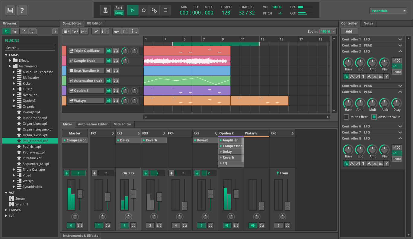
Hi all,
My previous work for Zynaddsubfx has same purpose to dock all windows in one (link is dead)
http://budislavtvp.deviantart.com/art/ZynAddSubFX-UI-Concept-2014-455890191It is in development phase > https://github.com/fundamental/zyn-ui-two
Link to full concept:
http://budislavtvp.deviantart.com/art/LMMS-UI-UX-Design-Concept-Single-Window-523696539https://www.behance.net/gallery/38503021/LMMS-UIUX-Design-Concept-Single-Window-Interfacehttps://www.behance.net/gallery/194917259/LMMS-Redesign-Concept
Full version (mirror):
full version
The text was updated successfully, but these errors were encountered: