Adds dimension controls to Group Block #16730
Conversation
 getdave
added
the
[Block] Group
getdave
added
[Package] Block editor
getdave
added
the
[Block] Group
getdave
added
[Package] Block editor
packages/block-editor/src/components/dimension-control/index.js
Outdated
Show resolved
Hide resolved
Addresses #16730 (comment)

Renames `type` to `property` to better indicate that it is a formal CSS property value and therefore should not be translated lest it break the underlying code.

Added title attribute to enable true text-based strings to be translatable.
|
Maybe |
|
@kjellr has pointed me at some nice UI for responsive controls. |
getdave
added
the
Needs Technical Feedback
getdave
requested review from
ajitbohra,
chrisvanpatten,
ellatrix,
gziolo,
jorgefilipecosta,
talldan and
youknowriad
as code owners
|
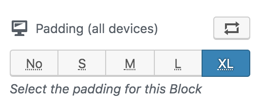
Nice, but I find the information with S, L, M, XL ect somewhat strange. Why not with pixels? The current variant is nice for beginners, but very inaccurate for advanced users... |
|
Based on #13363 (comment) Some design feedback:
|
@SchneiderSam Thanks for your opinion. I assume by "strange" you mean that it wasn't immediately clear to you why the arbitrary values had been selected over absolute units?
Imagine you are a Theme designer. You craft your CSS with spacing that is perfect for the design. You want to ensure that is consistent throughout your Theme, even if the page layout is being created by the end-user in the Block Editor. With the approach I've taken here, when a size is selected only classes are added to the Block in the DOM. This affords the Theme creator the opportunity to provide custom sizes in CSS that are suitable for their Theme. If they opt not to do this then sensible defaults are provided. With the pixels approach, we're locking users of the Block into absolute values and asking them to make a lot of decisions that they'd probably prefer not to have to make. It could also lead to an inconsistent visual experience.
I completely agree. This is why I've selected this approach for the first pass at adding this control. Average users (whoever they are!) will likely be grateful to receive a series of predefined options rather than having to make their own choices. I'm looking to cater to them first, which also serves to keep this PR simple and easily comprehensible, this increasing the changes it will be accepted and merged.
I take your point. As a power-user, you want precise control which this approach doesn't currently provide. Please consider however, that at this point we're introducing a new feature with a totally new UI. As a result, I'm keen to avoid overcomplicating this PR or increasing its scope. If this UI ships, in the future, I imagine we will want to enhance it with an "advanced" option which will afford power users the ability to
Ultimately, there's a lot of things we could look to do. However, for now, I'm hoping you will agree that keeping things simple and focus on the 90% of users will afford us the best opportunity of getting this PR merged. We can iterate from there. Once again, I want to say how much I really appreciate you taking the time to provide feedback. |
|
@drw158 Thanks for your feedback! All good stuff. I'll look at updating it tomorrow.
Note that there are tooltips for each option with the full text available. I think I agree that |
What about a No with a tooltip of None. |
@drw158 @paaljoachim I've updated to the below (
Is this better? |
|
Size Change: +996 B (0%) Total Size: 865 kB
ℹ️ View Unchanged
|
|
Sorry for the delay here. Been sidetracked onto the Nav Block for the past month and a bit.
@michelleweber Thanks for this. I've updated. I've added this as "Help" text below the input. Adding in the label itself didn't look good.
@mapk @michelleweber I've ended up removing the vertical stuff. Not sure how important it is because it could affect things differently depending on which Theme is active.
@mapk I'm glad you think this is ok. I think some experimental is required by the user when using this kind of setting. I've also added an animation to make it more perceivable (see gif in PR desc).
I don't know, but I think it's probably as clear as we're going to get right now. We've added explanatory text as well so hopefully folks with "get" it. We can always look at adding diagrams like you suggest in a follow-up PR.
@mapk I was testing using the Gutenbehr Starter Theme. I tested with Twenty Twenty and there is a CSS specificity issue. It looks like Twenty Twenty adds a
|


|
I wonder if we can simplify the spacing settings to reduce some of the copy. Maybe using "Inside" and "Outside" along with some visual explanation could help:
|

|
👋 Hey folks. Taking a look at this PR for the first time in a long time. A couple things:
That's all to say... themes can handle this, but it will require creating some relatively difficult patches. And I worry that it's just making an already-complicated approach to the Group block styles even more complicated for those themes. The best solution would be to figure out a way for core to handle all these wide/full/group/spacing stuff, but I think we're a long way off from that becoming a reality. |
|
@kjellr thanks for taking a look. I also noted some of your points during testing and didnt have a good solution Are we saying this isnt a goer? If so at least it has been explored and found wanting. In my head Themes need to evolve to handle this kind of manipulation from the editor. I wonder if allowinh Themes to register custom padding and margin values and making these available as CSS vars would help. Then based on which padd margin value is set in Editor the Theme could adjust its stylesheet using the CSS vars. |
I've been following along here as well, and pondering about whether to say anything in this direction or not. Sometimes it's useful to let things play out, since other innovations may blossom. I think this type of block-level CSS micro-management is at risk of running into mountain of mismatch issues on the frontend across the theme universe. Containers, such as Group block, can have a wild array of different uses, each needing their own systematic spacing setup, unlike a blockquote element, for an example. At minimum, these controls shouldn't be enabled by default - only themes declaring and having compatibility should enable them. |
|
I would say that it's bad practice for themes to center the content using auto margins, but it's not that easy to accomplish the same thing without either:
So we definitely can't just ask themes to stop using the auto margin method. But then again, is the horizontal-margins-not-being-applied even a problem? If there's nothing on the left or right, you don't really need to add margins there. The vertical margin will still be applied. Depending on how you look at it, this could even be considered a feature. While I would have been more than happy to see this feature implemented a year ago, the Global Styles discussion (among other recent developments) has partially changed my mind about adding this kind of feature. I think it might be best to avoid adding any more new kinds of style controls until we know for sure how Global Styles is going to work. Otherwise, we may end up creating another legacy option/control/style/etc. that will hinder future progress with backwards compatibility concerns. |
|
Thanks all for the feedback and input. Given that @mtias raised the original Issue, I'd really like to have his opinion on whether we continue to pursue this feature in this PR. Hopefully he can offer some direction based on his in-depth knowledge of where the Block Editor is heading.
Given how themes rely on auto margins, perhaps we could simply give up on margins for now and just pursue the padding element?
We could indeed make both dimension controls an opt-in feature thereby allowing Theme authors to choose to implement the necessary changes in their own time. For example, if you know your Themes relies on auto margins for centring then you might:
This would avoid the "mountain of mismatch issues" suggested above. That said, I am not wholly convinced that just because Theme authors have to make some changes we should limit the power exposed to users to control their website via the Editor. There's a delicate balance to be had, but I think with some careful planning we can mitigate any negative effects.
Thanks for raising this. Reading the comment, I was struggling to understand why Global Styles makes individual block controls redundant. Even if we have some kind of global styles that allows control over Block padding/margin then it's still likely users will want/need to control Block dimensions individually. If I've missed something please let me know, as I'm not super familiar with the progress of Global Styles at the moment. |
The only negative effect really is the hodge-podge result across pages / blocks, since there is no "Global Styles" yet to keep things in sync, and micro-managing consistency across blocks is too much work for probably everyone (if it's even technically possible to manually curate a 100% coverage, due to lack of proper visibility tools, etc). It's true, though, that sometimes adjusting a specific block like this achieves the user's goals much cheaper than finding/hiring someone to do a "proper" consistent job across the board. It's certainly the type of Power we'd like to provision, in general. My "controlled enable/disable" thinking above is more suited for the scenario where higher fidelity solution resources are available, and editors should use them, instead of hacking individual blocks that nobody will have time to find and unhack later (temporary things are forever, right?). |
|
Regarding Global Styles, @karmatosed may be able to fill in more details here. But in general, the benefit would be that there's a system set up to manage these sorts of settings and translate them into something that themes can hook into easily. As a simple example: If this spacing setting was recorded in a CSS variable via Global Styles, then themes could hook into that, and it would automatically adjust the spacing in real-time without requiring a bunch of extra classnames and complicated style rules. Looking further out, global styles (and full-site editing in general) also allows for the possibility that the basic stylesheet scaffolding of these blocks would be entirely handled by Gutenberg. In this case, the group block would work out of the box without the theme supplying front-end code. This is a little bit of a future wish on my part, but Global Styles and Full-site editing get us closer to that then we are today. If this were to happen, then we wouldn't have to worry about these sorts of theme issues at all moving forward. |
|
The lack of control over padding (in the group block in particular) is becoming a pretty severe limitation for building block patterns. We won't be able to solve all problems at once, but we should start by adding padding control to Group to allow these customizations. This is orthogonal to the global style system recognizing and setting defaults together with the theme which cascade through blocks. @ItsJonQ was exploring having canvas controls for it as well: https://codesandbox.io/s/happy-platform-0leig |
Agreed 💯
Let's do this. @shaunandrews presented a design. @karmatosed would this work for you? How shall I proceed visually here?
This looks great and would be vastly preferable. Are we agreed this would be something for a followup PR? |
@getdave Thanks for the feedback! That was a really quick test. It sounds like there may be something to it. In that case, I can work on refining the prototype to make sure the interactions and intent feel right |
|
👋 Hai there!! Apologies for the late reply! It's been a bit hectic. Updates! The The above PR is very close to landing. For context, it would be for the top / right / bottom / left based padding values. A demo of this can be found in my prototype here: (The padding units at the top) |
|
Ill put this back on my roadmap of issues to get done. |
|
I just linked to another PR for adding padding to the Cover Block. Seen just above. |
@ItsJonQ Sounds like we'll be able to merge that into this PR quite easily then? Core Navigation is taking all my time at the moment anyway, so I'll wait for you to finish up. |
|
@ItsJonQ I believe you've been iterating quite heavily on adding features to the Cover block. Are you able to briefly outline the steps that might need to be taken to add the dimension controls to the Group block as well? I'm happy to try and take a look at doing it, but it might save a tonne of time if you could roughly sketch out the roadmap as I'm slightly out of touch with latest UI control developments. |
@getdave Haiii!! I'll do my best to help 💪 ✅ SupportsWith the The values are (currently) rendered in the block as inline styles. 🕹 ControlsFor the above system to work, the controls are "bound" to the support attributes through the Here are the padding controls: These controls are abstracted away from a block's ✨ VisualizersThe tricky part is, the Cover also adds some UI to help "visualize" the padding changes via these transparent blue rectangles. The implementation of that currently looks like this: https://github.com/WordPress/gutenberg/blob/master/packages/block-library/src/cover/edit.js#L533 (I wish we didn't have to manually rig this part up. But that's how it currently has to be done) The spacing controls have to be enabled via the ( // experimental-theme.json
{
"global": {
"settings": {
"spacing": {
"customPadding": true
}
}
}
}🍇 Group blockIt looks like the Hopefully the above explanation helps clarify some of the mechanics of how this is coordinated 🙏 |
|
Now being handled in #25988 |
Closes #14747
Description
Adds dimension controls (currently limited to
padding) to the Group Block via experimentalDimensionControlcomponent within the@wordpress/componentspackage.Please note: this PR aims to implement the basic feature set for dimension controls. More complex UI will be added at a later date. For a more detailed explanation see this comment.
Todo
core/groupBlockresetUIAdd individual padding side control(probably out of scope)Enable responsive settings(descoped as superceeded by other work in other PRs)Screenshots
How has this been tested?
Manually for now.
To test please use these test annotations.
Code Editormode from the editor settings menu (dots in topmost right corner).Visual editor(again using editor settings menu top right).Types of changes
New feature (non-breaking change which adds functionality)
Checklist: