Try: Always collapse block alignments. #16557
Conversation
 jasmussen
requested review from
aduth,
ajitbohra,
chrisvanpatten,
ellatrix,
gziolo,
jorgefilipecosta,
talldan and
youknowriad
as code owners
jasmussen
requested review from
aduth,
ajitbohra,
chrisvanpatten,
ellatrix,
gziolo,
jorgefilipecosta,
talldan and
youknowriad
as code owners
|
I have been thinking about this as well. |
|
I'm all for this. It saves space, and also helps apply text labels to some often-confusing toolbar icons. These are the sorts of toolbar controls that you're likely to hit just once or twice for any given block, so I don't think hiding them behind an extra click is too much of a hassle. Especially given the other benefits explained above. Looks like some of the tests would need to be rewritten if we decide to land this one. |
packages/block-editor/src/components/block-alignment-toolbar/index.js
Outdated
Show resolved
Hide resolved
packages/block-editor/src/components/block-alignment-toolbar/index.js
Outdated
Show resolved
Hide resolved
 gziolo
added
General Interface
gziolo
added
General Interface
|
I'm all for this as well. With the introduction of more toolbar items, it's getting crowded. I'm just not sure what our dropdown pattern is for this stuff. Do we use an arrow icon to indicate it's a dropdown or not? I vote yes. Here's an example of the Table block which uses a variety.
|

|
My concern is would be hiding a useful thing away and as a result, causing it to either be thought to not exist, happen from this suggestion? If people agree that's not the case it's totally worth exploring. |
Yes, 100% agree. Everything that opens a dropdown should have a consistent indicator. I also think that this should be handled on the component side rather than through CSS as proposed in this PR. (internally it can use CSS approach, it doesn't matter, my point is that this should be the default which you can opt-out from) |
gziolo
force-pushed
the
try/always-collapsed-alignments
branch
from
8f12cf0 to
afc3756
Compare
|
Changes applied:
This resolves a few issues discussed:
Issues to resolveI think there are blocks like Columns which should have
|


| @@ -69,6 +69,7 @@ function HeadingEdit( { | |||
| <HeadingToolbar minLevel={ 1 } maxLevel={ 7 } selectedLevel={ level } onChange={ ( newLevel ) => setAttributes( { level: newLevel } ) } /> | |||
| <p>{ __( 'Text Alignment' ) }</p> | |||
| <AlignmentToolbar | |||
| isCollapsed={ false } | |||
There was a problem hiding this comment.
It's temporary for backward compatibility. It should be resolved with #16682.
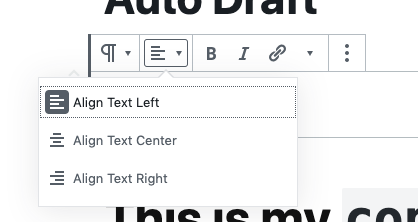
This PR makes the block alignments always be collapsed. This group would already collapse at mobile responsive breakpoints. In addition, this PR also adds a dropdown arrow.

This comes with a couple of benefit:

- It ensures that the block toolbar always fits even when the item is deeply nested inside columns.
- It affords a scalable method to show additional alignment options, such as those suggested in #16385.
- It scales to future ideas of allowing a theme to create CSS grid-based layouts, which could allow theme authors to create their own custom alignments such as "pull right" or others.
- It has labels, to be descriptive of such new alignments.

Noting that 3 is just an idea at this point, but the other items on the list can potentially benefit us today.
gziolo
force-pushed
the
try/always-collapsed-alignments
branch
from
afc3756 to
a93b328
Compare
packages/e2e-tests/specs/__snapshots__/font-size-picker.test.js.snap
Outdated
Show resolved
Hide resolved
packages/e2e-tests/specs/__snapshots__/block-hierarchy-navigation.test.js.snap
Outdated
Show resolved
Hide resolved
gziolo
force-pushed
the
try/always-collapsed-alignments
branch
from
a93b328 to
66a5518
Compare
|
@mapk and @karmatosed, I managed to update all e2e tests to work with the updated UI for all types of alignment controls which can be added to the block toolbar. I'd like to move forward with this PR as this gives are more space to work on further refinements for text blocks as described in #15096. |
|
I just tested these all out, @gziolo, and they look and work great! Let's get this merged.
|
There was a problem hiding this comment.
I consider it ready to go feature-wise. Given that I added most of the code changes, I would appreciate sanity check from another developer as well because I had to rework a few e2e tests to make Travis happy :)
I also opened #16764 so we could discuss how labels/titles should be capitalized.
There is also one possible follow-up task where we should add center alignment to those blocks which offer only full and wide alignments if we are concerned by the fact that no alignment selected is in fact center. However, I'm also fine with leaving it as is to avoid setting explicitly center when someone selects it.
This PR makes the block alignments always be collapsed. This group would already collapse at mobile responsive breakpoints. In addition, this PR also adds a dropdown arrow.
This comes with a couple of benefits:
Noting that 3 is just an idea at this point, but the other items on the list can potentially benefit us today.