Switches should always show On/Off label #2146
Comments
 jasmussen
added
[Focus] Accessibility (a11y)
jasmussen
added
[Focus] Accessibility (a11y)
No, I think it was mentioned here and there but no specific issue about it. See for example #906. As a first step, this should be as easy as removing all the To avoid misunderstandings, I'd suggest to always refer to this visible For completeness, I think I've already mentioned Material Design switch control, where they've deprecated the “on” and “off” text in favor of making the state |
|
We've been exploring these switches too in some of our upcoming redesigns, and having a clear label next to the control always seems to be the best option.
So I think your mockups look good! I'd be for the label on the left. Screenreaders don't register the label, they announce the state off of the switch itself, so then we're mainly left with the varying length concern - which makes left seem like the most practical choice? |
|
The on-switch icons are indeed icons that may require an initial understanding or occasionally be forgotten but IMO they have enough parallels in other places (appliance switches, other software) to be fairly universal. |
To recap: right now, the "knob" gets filled increasing its border width. That's because on #1562, thanks to the Simply Accessible people, we've learned High Contrast Mode on Windows removes any box-shadow or background, thus making the standard focus style not perceivable... This also means most of the current focus styles in WordPress based on box-shadow don't work, unless they also use a change in the border or outline 😱
Windows 10 does that, but... hm doesn't look so nice?
|

|
Would one of these work?
|

|
@jasmussen it needs to be done with a border or outline, but the border is already used for the black border, and the outline is a rectangle... |
Ah, I see. Could it be done with a box shadow? Perhaps a stacked box shadow the innermost being white? |
|
Box-shadows get completely removed in High Contrast Mode :( |
|
Aaargh, why do they make it so difficult :D |
|
What about something like what was discussed in the latest a11y bug scrub, see https://wordpress.slack.com/archives/C02RP4X03/p1504543766000048 |
|
Coming back from paternity leave, apologies for the belated reply:
I think that could work! (that is, providing a descriptive label below) I really like the idea of having the switch include the label in itself, though, as initially proposed. The primary concern here is still whether there's room for writing "On" and "Off" in a plethora of languages, right? Is there some way we could explore the worst case scenario for localizing those words and then consider whether it's feasible to make the switch bigger to encompass the necessary text? |
|
See also #3039 |
|
This ticket was mentioned in Slack in #core-editor by jeffpaul. View the logs. |
|
To visually represents a couple of the options proposed here, see the screenshots below:
The key point is there should always be a textual indication of the toggle state. |


|
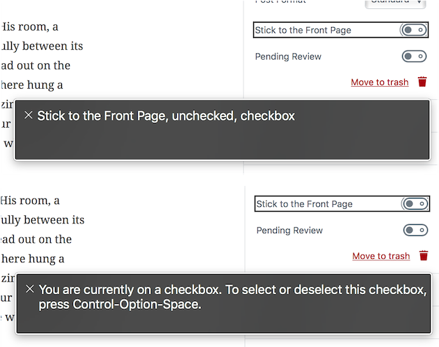
Sorry but there's no consensus on the "solution" implemented in #5500 for the many reasons explained in that PR (not going to repeat them here). The accessibility issue stands, so I'm going to reopen this issue. From an accessibility perspective, the important thing to understand is that the state of these switches needs to be reflected in some textual form too. I think everyone can agree that during the development of these switches the accessibility feedback hasn't blocked experimentation and has been available to try different options, trying to get a good balance between visuals and a11y. However, at this point, I don't see a great value added by these switches compared to native checkboxes. These controls are problematic, they can't be used easily by everyone and, I'm sorry to say it, they're not the best example of inclusive design. |
|
@afercia: To avoid miscommunication, could I get you clarify which accessibility issues you're referring to? After reading your comments on the PR, my understanding is that we need a visible, textual representation of the on/off state of the control. That text doesn't need to be literally "on" and "off", it simply needs to clearly state what the control is currently set to. Is that correct? If that's correct, I have a couple of questions:
If this is the case, I don't mind leaving this issue open while we added Were there any other accessibility issues that I missed while reading through? |
|
Oh, and there are four instances of |
|
@pento thanks for your questions. Yes, that's correct. There are different levels of accessibility, as in accessibility = universal access. Serious disabilities, cognitive impairments, different cultures, unexperienced users, and so on and on. Everyone has his own needs. In this specific case, a bit ironically, blind users will find these switch toggles perfectly accessible because, under the hood, they're native checkboxes and they will be announced as such by assistive technologies. E.g.: Simple, and perfectly clear. My concern is more about visuals. I'd say that's also an usability issue, not just an accessibility one. There are no "universal symbols" that can be understood by everyone. We can't rely on colors, we can't rely on symbols or icons alone. So yes, there's the need to use some textual representation as also recommended by the material design. Quoting: while they've deprecated the previous version with the text “on” and “off” they also state:
However, I'd recommend to not use the main label to represent the option state. That could be potentially very confusing, for example: Instead, keeping the label unchanged and using additional text would be a better option. At Yoast we use a similar switch toggle with an "On / Off" visual "hint", and we've gone a step further: we hide the hint to assistive technologies using
It depends on the solution: in both cases the text should be separated from the label so yes I'd use an adjacent
Yes, I like that behavior (also visually) and I'd recommend it. I didn't notice it was implemented for the gallery settings. For reference:
If all the switch toggles were standardized with some required help text, then I'd say the symbols |

|
Can anyone explain why these switches were designed instead of using checkboxes? Do they add something important for usability or design that a checkbox lacks? It seems the initial rationale for inclusion is missing from this conversation and makes everything else hard to evaluate. |
I was not present for the original design decision, however, I know that in design: switches toggle the state of a single setting on or off while checkboxes allow the selection of one or more items from a set. While it is also possible to use a single checkbox to turn an option on or off, switches may be preferred in this context due to design consistency and the fact they are already established in other areas (such as iOS, Android).
A switch turns the state of a single setting on or off and generally implies an immediate change. |
 designsimply
removed
the
Good First Issue
designsimply
removed
the
Good First Issue
|
I removed the |
I'd say this is not the case in an application like Gutenberg that aims to be usable by everyone, regardless of their different ability levels. That's the whole point of the discussion going on here and previously on #6578 (comment) etc. About "design consistency" I'd argue there are no switches in WordPress, so the ones introduced in Gutenberg actually introduce some inconsistency. As already pointed out multiple times, the state of the switches may not be clear to everyone:
There are a lot of potential issues with these switch toggles; the real question we should ask ourselves is if these switches actually add some value compared to native controls like checkboxes, which are universal as they're native. |
|
It's important to note the action of a checkbox isn't a boolean interaction alone. It can be for multiple choices and even to make a choice after. This means that in the case of a literal 'on/off' a switch is a better choice for interaction. It literally toggles something to one or other state. Imagine a light switch, a common interaction pattern. Performance wise there is no page reload or save changes, it just happens as naturally as that light switch. This issue has gone around a little and it's time to settle on making the most accessible switches we can and move into implementation. |
|
@karmatosed yeah however we should really distinguish the visual appearance of the switch from its functionality. Regardless it's a boolean choice or not, I'd just note that under the hood the switch is implemented using a checkbox 🙂it has the semantic of a checkbox and perceived by software (including assistive technologies) as a checkbox:
Any data, research, or user testing to support this statement?
This doesn't relate to the actual control used. As said, the switch actually uses a checkbox. The saving can be made asynchronous using any form field. I'd also recommend to consider that at the moment WordPress doesn't use switch toggles, so Gutenberg is going to introduce in core something that should be evaluated in the WordPress context. Worth reminding all the accessibility feedback is asking here is to just make clear the current state of the switch, using some meaningful text. |
I am not sure what you want data on as it's a literal on/off switch interaction here. It's widely accepted (which I know is a sweeping statement) that something with only 2 is binary in interaction. Do you have data, research or user testing that seems to counter this? Apologies but a little confused what you want me to provide. Whether it actually uses a UI element of a checkbox or not we are talking about the visual rendering - we need to be careful not to confuse the two. In the case where the UI literally indicates and on/off state then having switches makes a ton of sense. Let me add some articles for that to hopefully respond. http://uxmovement.com/buttons/when-to-use-a-switch-or-checkbox/ In this article a point raised that adds context to what we are using them for:
It simple comes down to:
Another good link is: https://uxplanet.org/checkbox-and-toggle-in-forms-f0de6086ac41 A valid point is that just because today WordPress doesn't use something shouldn't mean we don't explore new patterns.
Awesome lets move on then and get the state shown, there's some progress there we can move on with. |
|
@karmatosed my question was related to the part where you state that "it's better":
Without data or user testing, this is a personal opinion 🙂 Instead, what I've learned in years is that there's no such a thing that is "better" for everyone. Only native controls get close to be universally usable because they're native, expected, and supported by any software. |
|
There have been several discussion in different PRs and here is my conclusion.
I'll review is there some places we need the extra text or not. |
|
During yesterday's accessibility meeting on Slack it was agreed with @karmatosed to use labels to make the switches state clear. So there's now consensus to indicate the state the switch is in also with some text. What is left, is making a decision about which text should be used: the inline label itself or the descriptive text below the label? From an accessibility perspective I'd rather see the label text to not change. However, at this point of the discussion, any decision would be fine as long as there's a textual indication of the switch toggle. Material.io was mentioned a few times through all the discussions about switches. So I'd like to recap some of the recommendations material.io does: Switches are designed especially for mobile and tablet.
https://material.io/design/components/selection-controls.html#switches
I'm not opposed to use them on desktop too if designers think that's beneficial, however everyone should consider carefully they've been designed with touch interaction and mobile UIs in mind. The state should be made clear in the text
What material.io recommends is basically what you can see in the screenshot below, where the inline label changes to indicate the current state:
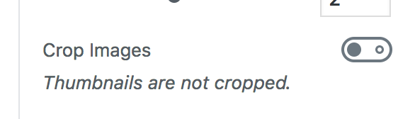
Instead, what we've tried so far in Gutenberg is to indicate the state in the description below the label. See in the screenshot below the Gallery "Crop" option that has been implemented this way since the beginning:
Either ways are fine (though the second one would be preferred for a11y). Once there's a final design feedback about the two options above, addressing this issue should be pretty straightforward. /Cc @karmatosed |


|
PR #6578 is good example that the copy text itself is more than hard sometimes. I personally don't know what it should be in that case. And if it was unclear, I'm OK leaving extra text out for case like that. It's too minor issue comparing to bigger issues. |
|
To be super clear I meant label beside the toggle if we have to such as saying 'on' / 'off' not having sentences below. I still standby I don't think that is a benefit here. I also still feel to be clear because that's important that having the same text all the time doesn't work. What Material do I think we could over having what we have currently suggested, which I don't think is the best route saying everything underneath as in #6578. I am going to early next week work on some ideas there. I want to dig into how Material do this as we totally can learn from them here. Thanks for looping back and I feel we are super close to a solution combining that balances design and usability here. |
|
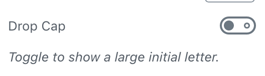
Let's try and focus on the issue at hand, the crux of which is: if there is a text label that indicates switch state, this is more clear for the user than if the label only describes the switch and the switch alone indicates state. Is that a correct assessment? If yes, then let's lazer focus on that. We already have one solution for particularly gnarly switches like the Drop Cap, when contextual help text can both help clarify the effect of the switch as well as the state. The recent suggestion to change the label itself correctly acknowledges the challenges with duplicate and overly verbose text, as well as the challenge that localization poses. In other words, if phrased right, it can presumably accomplish goals, as well as wrap. That's good. The question here is — how can we make sure a contextual label doesn't actually add complexity, as opposed to take it away? Given that the primary purpose of a label is to describe the control, does it confuse if it doubles as a state indicator? Usually UI that is changing is bad for spatial memory. That's not an issue with the help text given it's a separate element. At this point it is worth clarifying that "Line item off" is purely an example by Google, and not part of the guidelines. If you look at the top of the page, the switch is shown with example-text in context of radio and checkbox controls that show the same example-text:
It's clear from that context that Material guidelines treat the switch as a plain control exactly the same as a radio control or a checkbox control, and that the switch needs no more contextual information than a checkbox does. The pertinent part is this:
Be that as it may, those are Google guidelines, and if we truly believe we have a better idea than Google here, that's totally fine. To find out, I think we should mock up & brainstorm a few examples and look at them through the eyes of accessibility, usability, readibility, before we proceed. @michelleweber can you take a look as well? Suggested controls to look at could be:
Screenshots, for good measure:
Here are some quick ideas: Simply as an exercise of putting those labels together was hard, and I'm unconvinced that this adds clarity instead of confusion. But curious to see your thoughts and ideas here. |
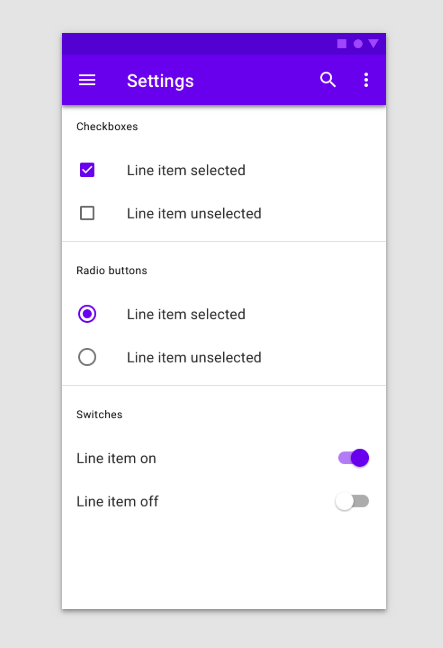


@jasmussen this is not correct. As mentioned several times, the material.io guidelines explicitly say the text label should indicate the switch state. You can read that under Switches > Usage:
Again, for completeness, in their first version the material.io switches had a "On/Off" text. That version was later deprecated in favor of state indicated in the inline label text. |
|
I quoted that very same guideline in my comment above, except I quoted both paragraphs:
We are interpreting semantics here, and it seems clear that you are interpreting it differently than I am. In my interpretation, "Allow Comments [X]" is a perfect example of an inline label that makes the state and the option the switch controls clear, without being contextual. It doesn't seem productive to continue to try and interpret Google guidelines if we both disagree, but agree that we can rise above them if we have a better solution. |
|
I'm sorry but what they say is
the better solution is to indicate the state to the switch in plain text, as requested so many times. Overall, I have my doubts about the introduction of the switches themselves in WordPress. I still don't see a clear added value compared to standard checkboxes. Let's try, at least, to make these switches understandable by everyone. |
designsimply
removed
the
General Interface
|
If we consider how mobile usage has overtaken desktop usage, and given that Gutenberg looks to the future, it's useful to note that the vernacular for user experience will be subsumed by the habits we learn on mobile. Over time, the approaches we held strongly to in the past will seem antiquated if we're not careful — and also desktop screens will be touch-sensitive like our smartphone screens within a few years (and on some desktop platforms it's becoming the norm). So when in doubt, I recommend that we keep learning from mobile patterns as they're the leading behavior of the future. |
|
Mobile patterns still have a long way to go when it comes to accessibility. They're designed for one specific device type, because the UI is embedded in a specific device. Instead, on the Web we should strictly follow a device-agnostic design. It is certainly true that once in a while new technologies will come to life and influence the way many user interfaces are designed. It is also possible, for example, that in the next 20 years mobile devices as we know them today will be dead because we'll all be using, say, holographic interfaces 🙂That's just one more reason why web interfaces should abstract from the device types and user abilities, to be truly universal and inclusive. |
|
This issue has become quite muddled and it's a bit hard to follow. I'm going to start with a summary of what seems to be the issue here, and address attempts to fix it. IssueThe argument is that switches alone are not an accessible UI because their state is not accurately reflected by their simple on/off button state graphical representation. The argument for this is based in switches not being universal UI. There has been a counterpoint that they are extremely common mobile UI and thus quite well-known. That point is somewhat debatable as even the countries with the highest smartphone penetration show 20% of users without smartphones. DiscoverabilityThat said, it's a switch, and a switch is a common UI paradigm in life. If presented with accessibility audits/studies/user testing that showed me a significant percent (let's say, over 10%) were not aware which switch state was which after a few minutes of usage, I'd be convinced that it was not a learnable UI. UIs throughout the web and mobile use switches with labels that do not have a third, semi-redundant state explanation. The drop cap explanation actually reduces usability by adding extra, changing text to a switch which already looks straightforward to any mobile user:
It was pointed out that sometimes these descriptions add even less context and are just repeats of the label. They can be difficult to write and create a crowded interface. I don't think these switches require an additional label on the basis that a switch is not an understood UI. If the issue is that non-sighted users are not aware of the state, that is a separate, discrete issue which I would appreciate filed and would certainly consider a part of the 5.0 merge milestone for accessibility. As it stands, I am actually for removing the state sub-labels for these switches because I think they are an impediment to more users than they help. They create a crowded UI with redundant information (because they are instant-effect their effects should be seen elsewhere, see: drop-cap):
On iOS switches are given the accessibility option to have the I/O markers when on or off. Ours already do that by default (iOS does not), and I think that is sufficient unless we hear user feedback in a higher volume that these switches are not usable. ConclusionOur switches have I/O markers thanks to #5500, which closes this issue (I agree with @jasmussen on this one). If there are issues with the usability of these switches for screen-readers, please file that as a separate issue that indeed needs addressing. For the on/off labelling of switches in Gutenberg, the decision is that our current I/O marker will suffice until we hear from users that it is unintuitive. |
|
For history: there's now a proposal from Google for a new HTML element for a 'switch' control, intended to be included in the Web Incubator Community Group (WICG) once it gets interest. The GitHub repository was created on April 24, 2019. This doesn't mean it will happen soon, but there are chances there will be a native HTML Aside: there are already 3 accessibility issues open in the related repository: Accessibility mappings Guidelines on proximity of labels for improved accessibility Guidelines and defaults for good contrast |
|
For reference: short Twitter thread with experts regarding textual indication of state: |
From Helen:
https://twitter.com/helenhousandi/status/892392998264344577
https://twitter.com/helenhousandi/status/892393559734853633
I could swear there was an existing ticket for this. The closest I could find was this one:
#470 (comment) — @afercia let me know if there's another.
We should always show an explicit On or Off label on or next to the switch. In our current mockups, this is the word "On" or "Off":
Perhaps in a PR there was concern about the switch moving places if the switch is right aligned and the text changes in length. We can just do this:
Helen has a great screenshot from iOS, where the labels are instead on the Switch, would that be an option?
Current size switches:
Slightly larger:
If the latter two can work, we'll probably want to find a different "unfocused" style than the current, which makes the switch knob into a ring. Perhaps a fatter focus rectangle outside the switch as a whole?
The text was updated successfully, but these errors were encountered: