-
Notifications
You must be signed in to change notification settings - Fork 4.1k
New issue
Have a question about this project? Sign up for a free GitHub account to open an issue and contact its maintainers and the community.
By clicking “Sign up for GitHub”, you agree to our terms of service and privacy statement. We’ll occasionally send you account related emails.
Already on GitHub? Sign in to your account
Redesign the Switch #5500
Redesign the Switch #5500
Conversation
|
I really like this! Thanks for iterating and working through @jasmussen - excited to see it get in. |
|
I'm sorry I understand the layout gets simpler but removing the visible text automatically makes this toggles not accessible. We've discussed this point a few times before in a few issues and I thought there was consensus... Switches should always show On/Off label In that issue some consensus was reached, see #2146 (comment) As I see it, there's a design problem. This problem can't bs solved at the expenses of reduced or absent accessibility. I'd strongly recommend to try a different solution. There are a number of options mentioned in other issues. One of them is to place the text below the toggle; a smaller (not too small) font-size could help. |
|
So, I do recall that discussion. However since then, translation issues have come to light, and in situations where a group that includes a label, a switch, and help text (see #5498), showing the On/Off label below the switch doesn't work. As such, when I noted that this ticket fixes #2146, it's because it includes the labels on the switch itself, specifically the universal On and Off symbols. This is the same as iOS does: http://osxdaily.com/2014/04/15/ios-settings-switch-on-off-labels/ — you might find that insufficient, but given that it's working for mobile users, I would argue that it's a vote that this unified switch design can be sufficient without an added label. |
Universal symbols don't exist. Different cultures, cognitive impairments, low vision... should I continue? 🙂 Saying it's the same as iOS does it's not an argument. That's a mobile UI (and it's not accessible). I do think this is totally insufficient from an accessibility perspective. I'd also argue that the root cause of the issue is just about aesthetics and the will to introduce some "pretty looking" controls. I don't see any particular advantage in introducing these toggles, they do more harm than good, while a native checkbox would do its job. All the previous conversations about these controls were already in the spirit of finding a trade-off between design and accessibility and, from the a11y side, we've already done a lot of compromises. Now, completely removing the text is a no-go as there's no textual indication of the toggle state. Aside: while they've deprecated the previous version with the text “on” and “off” they also state:
So they clearly warn there must be a textual inication of the state. And with good reasons. |
33688b3
to
35fdd72
Compare
|
Added logic so that components can supply a help label based on whether the switch is checked or not: Also tuned the hover state and rebased. @youknowriad do you have any suggestions as to the logic I wrote in 35fdd72? Can we reuse this for other form components? |
a13e9b9
to
a7dbaf9
Compare
|
As a single prop, I might imagine developers could be inclined to misuse it as some generic label describing the toggle, e.g. "Controls whether images are cropped", and assume wrongly that the state of the checkbox input alone would be a sufficient indicator. |
|
As discussed yesterday, I pushed 25a65a9, which make |
|
Thank you @gziolo. That looks good to me. |
|
@gziolo This is similar to what @youknowriad had shared as an earlier proposition. Do you not think the issues noted at #5500 (comment) are worrisome ? |
There are a few places where we pass down props which are created on the fly in the same component. I can refactor to use an object method instead. We never measured if this has a negative impact on the performance of the application. |
This changes the design of the switch to enhance the visuals, improve how it renders in Windows high contrast mode, and add a on/off indicator inspired by iOS.
90ca0f1
to
90bcc73
Compare
90bcc73
to
22b7e2a
Compare
|
Given the enhancements to high contrast mode, focus styles, and conditional help text, I think we should merge this into master and see how it feels. We can then revisit if there continue to be issues. What do you think, @karmatosed? |
I think shipping this is a good first step. We should always be open to iteration. |


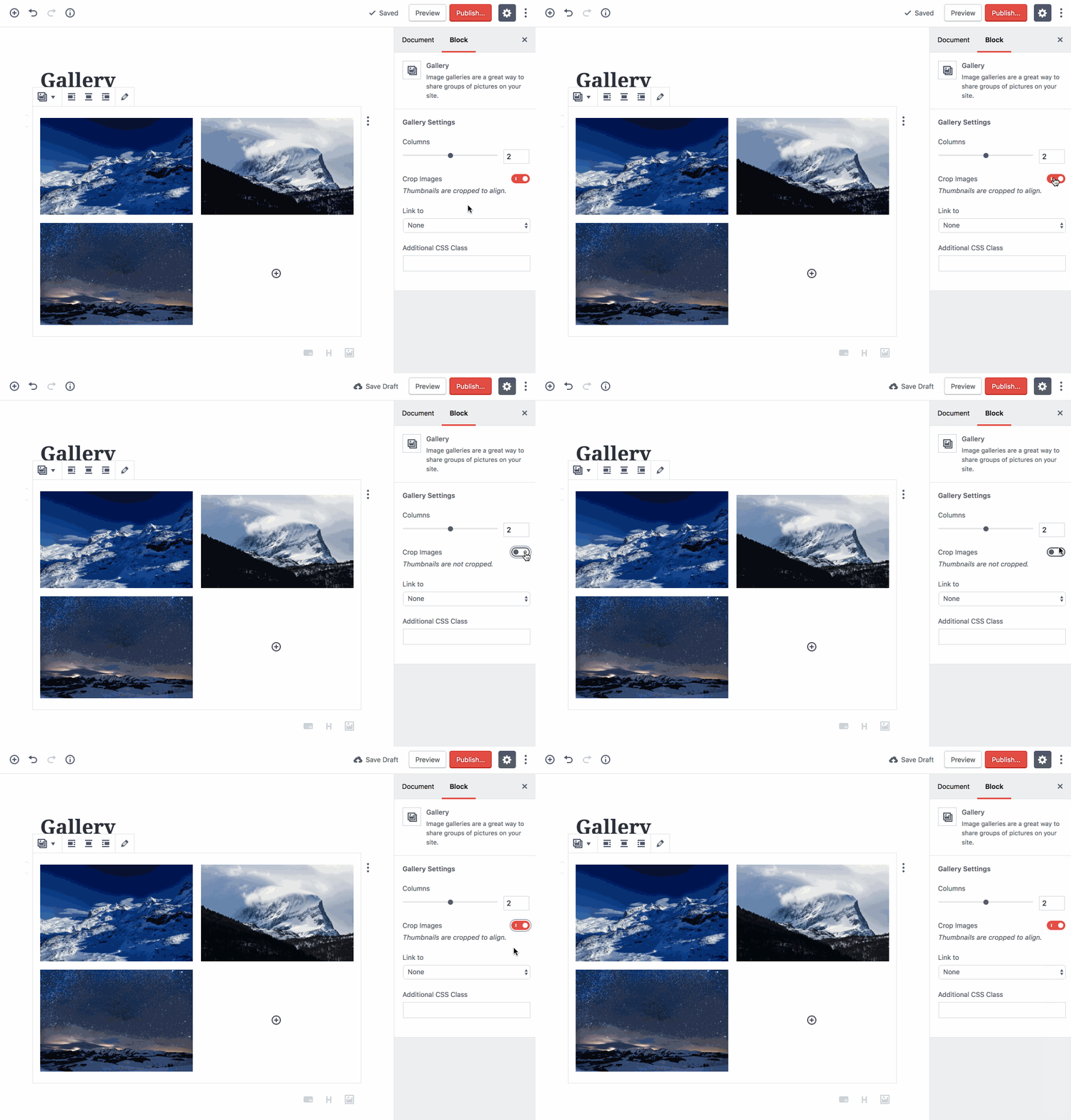
This PR aims to redesign the switch to be simpler, yet more descriptive in more cases, and to remove the burden of translation and what that does to layout. Fixes #2146. Possibly helps with #5498.
Here's what it looks like:
Here's what it looks like in Windows high contrast mode:
There are a number of benefits to removing the explicit text label on the right, in favor of the two 1/0 icons overlaid:
This has been tested on Chrome, Firefox, Safari, IE11 and Edge and high contrast mode.