-
Notifications
You must be signed in to change notification settings - Fork 1.1k
New issue
Have a question about this project? Sign up for a free GitHub account to open an issue and contact its maintainers and the community.
By clicking “Sign up for GitHub”, you agree to our terms of service and privacy statement. We’ll occasionally send you account related emails.
Already on GitHub? Sign in to your account
services: services page is hard to navigate #10010
Comments
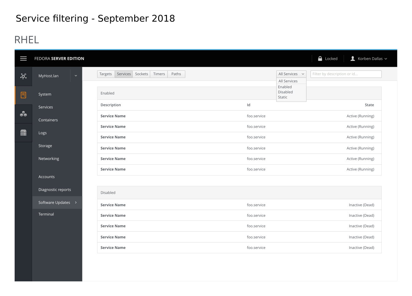
Services page is hard to navigate due to the amount of services.
Try to address this by adding filtering to the page.

For cockpit-project/cockpit#10010
|
We talked in a call about the dropdown being possibly misleading, looking like Amazon's section + search. (It's a pattern used all over the place, but it's front and center on Amazon.) In the scoped search pattern, you first select what area you want to search. I, and others on the call, thought it would dissuade others from selecting the dropdown, thinking that it is tied to filtering with a keyword. In the call, I proposed two possible solutions. Flipping the order and splitting the dropdown into a toggle button group. (I've included two tweaked mockups below.) FlippingToggle button group & reorderI played with the order of the widgets with the thought that people will most likely want to look for a specific service. (Why is the webserver down? → Search for "http", "apache", "www", "web", "webserver".) |
|
That all said, I wonder about the buttons... There are enabled/disabled sections already. Shouldn't we instead filter by active/inactive, and so on, so someone could easily spot a dead process? |
|
Out of the two above, I like the flipping one best. It's very confusing with the two button groups. |


As part of the usability test we ran on 21 sysamins one of the things we tested was services.
The majority of the participants had issues locating the httpd service that they were asked to look for.
Many asked for a way to filter the services on the page.
https://bugzilla.redhat.com/show_bug.cgi?id=1657752
The text was updated successfully, but these errors were encountered: