-
Notifications
You must be signed in to change notification settings - Fork 4.3k
New issue
Have a question about this project? Sign up for a free GitHub account to open an issue and contact its maintainers and the community.
By clicking “Sign up for GitHub”, you agree to our terms of service and privacy statement. We’ll occasionally send you account related emails.
Already on GitHub? Sign in to your account
Components: Adds AccessibleSVG component and use consistently for block icons #9565
Conversation
aa29c9c to
a5ebe0e
Compare
|
This is impressive. From my quick testing, it seems like all the block icons had the proper attributes as they need. Fine work! I can't really speak too much for the code — it looks good to me. But from everything else, 👍 👍 Thanks for working on this. |
There was a problem hiding this comment.
Choose a reason for hiding this comment
The reason will be displayed to describe this comment to others. Learn more.
I think some documentation around what happens here would be useful as right now this is elegant, but a bit Magic™.
Overall a cool solution though, and definitely one that prevents third-party developers from making mistakes.
I trust you to add some kind of documentation or something, so 👍 with docs. Feel free to ping for further review if needed 😄
| @@ -18,6 +18,8 @@ function renderIcon( icon ) { | |||
| } | |||
|
|
|||
| return icon(); | |||
| } else if ( icon && icon.type === 'svg' ) { | |||
There was a problem hiding this comment.
Choose a reason for hiding this comment
The reason will be displayed to describe this comment to others. Learn more.
That is, I suppose, a better solution that prevents developers who don't bother to use our components from causing an error. It's definitely less explicit though and I don't see any documentation around it: either that using AccessibleSVG directly is preferred or even that if the icon prop is an SVG that we'll add properties to it. We should probably at least document this, as it might be quite jarring to a block developer to see their icon markup change unexpectedly like this with no documentation.
There was a problem hiding this comment.
Choose a reason for hiding this comment
The reason will be displayed to describe this comment to others. Learn more.
I personally don't think it's important enough for people to know precisely that we're adding some props to their SVGs to make them accessible. I guess it doesn't harm to add a mention in the documention but if we do so, we should avoid using AccessibleSVG directly in the components because the behavior is documented in that case.
There was a problem hiding this comment.
Choose a reason for hiding this comment
The reason will be displayed to describe this comment to others. Learn more.
That's fair. I think I'd prefer the documentation because it teaches people about an accessibility issue and it means our code can be: 1. a bit leaner (no imports) 2. more idiomatic (regular SVGs)
So maybe just a note of "we add accessibility properties to SVGs" in the block property documentation with a link to the original issue for context or something.
| @@ -18,7 +18,7 @@ export const settings = { | |||
|
|
|||
| description: __( 'This block is deprecated. Please use the Paragraph block instead.' ), | |||
|
|
|||
| icon: <svg role="img" aria-hidden="true" focusable="false" xmlns="http://www.w3.org/2000/svg" viewBox="0 0 24 24"><path d="M7.1 6l-.5 3h4.5L9.4 19h3l1.8-10h4.5l.5-3H7.1z" /></svg>, | |||
| icon: <svg xmlns="http://www.w3.org/2000/svg" viewBox="0 0 24 24"><path d="M7.1 6l-.5 3h4.5L9.4 19h3l1.8-10h4.5l.5-3H7.1z" /></svg>, | |||
There was a problem hiding this comment.
Choose a reason for hiding this comment
The reason will be displayed to describe this comment to others. Learn more.
I get that we don't have to use our component directly, but I wonder why we wouldn't. This is less explicit and we're already changing all of the lines 🤷♂️
There was a problem hiding this comment.
Choose a reason for hiding this comment
The reason will be displayed to describe this comment to others. Learn more.
I don't mind, I was hesitant as well.
There was a problem hiding this comment.
Choose a reason for hiding this comment
The reason will be displayed to describe this comment to others. Learn more.
As mentioned though, feel free to leave them SVG if you add docs. I think that's probably the better approach, upon reflection.
37f1dad to
4d8ace6
Compare
|
@tofumatt I added a note to the docs, feel free to tweak it (I'm not great at documentation :P) |
There was a problem hiding this comment.
Choose a reason for hiding this comment
The reason will be displayed to describe this comment to others. Learn more.
Docs look good; I made a few tweaks (mainly changing a11y to accessibility).
![]()
❤️ |
|
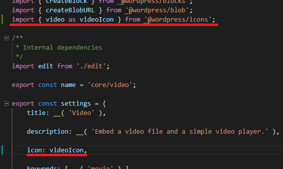
I think we should extract the SVG icons to another package, maybe Here's the PR where I extract the SVG icons to a new package |
|
CC: @gziolo because you mentioned https://github.com/airbnb/babel-plugin-inline-react-svg/blob/master/README.md |
|
@youknowriad coming a bit late to this, but I feel this should be just called |
|
That's kinda confusing if you quickly scan it 🤷♂️ ( |

closes #9372
AccessibleSVGcomponentTest that the svg icons contain the required A11y props.