Components: Show popovers fullscreen on mobile #3400
Conversation
 youknowriad
force-pushed
the
fix/fullscreen-mobile-popover
branch
from
youknowriad
force-pushed
the
fix/fullscreen-mobile-popover
branch
from
5ab5a3c to
e6c80bf
Compare
There was a problem hiding this comment.
Hi @youknowriad, nice work this generally works well 👍 I just noticed some improvements.
I think we need an option to close the popover's for example if we go to the inserter we cannot close it without inserting a block. Another problem is that in some resolutions the ones in the middle of small (600) and medium (782) e.g 678px width, the popover of the block (when you press (...) at the side) just display a big white rectangle and is impossible to use.
Codecov Report
@@            Coverage Diff             @@
##           master    #3400      +/-   ##
==========================================
+ Coverage   36.92%   36.92%   +<.01%
==========================================
  Files         267      267
  Lines        6662     6675      +13
  Branches     1203     1205       +2
==========================================
+ Hits         2460     2465       +5
- Misses       3550     3557       +7
- Partials      652      653       +1
Continue to review full report at Codecov.
|

| bottom: 100%; | ||
| } | ||
|
|
||
| .components-popover.is-center & { | ||
| .components-popover:not(.is-mobile).is-center & { |
There was a problem hiding this comment.
Instead of using a series of :not(.is-mobile) and given that is the component itself that sets the is-mobile depending on a width. I think using a CSS rule that uses our variable $break-medium may be an option to simplify this.
There was a problem hiding this comment.
is-mobile can be disabled even on mobile because this behavior is opt-out. Relying on the $break-medium would apply this consistently.
| @@ -35,6 +35,7 @@ const ARROW_OFFSET = 20; | |||
| * @type {String} | |||
| */ | |||
| const SLOT_NAME = 'Popover'; | |||
| const isMobile = () => window.innerWidth < 782; | |||
There was a problem hiding this comment.
There was a problem hiding this comment.
The problem is, the Popover is a generic component outside the editor module. I thought about factorizing this but we can't assume any context in the components module.
There was a problem hiding this comment.
Right, I would say given this it would be better to simplify the component and just receive a showFullScreen and than is up the callers to decide if is mobile and the enable this option (maybe using responsive redux) or they don't enable this option. The downside is we would need to activate this option manually in the cases we want.
There was a problem hiding this comment.
That's an option but I worry about having the component's user compute the isMobile on its own. I think this would create more duplication than it's supposed to avoid especially for third-party code or WP code no in the editor module.
I personally don't mind the small duplication here to make it generic enough.
There was a problem hiding this comment.
Yes, that is true it would require more effort from callers. In that case, another option would be instead of expandOnMobile we receive a prop showFullScreen that defaults to our isMobile function (If no value is passed). The advantage is that callers are able to use their own logic and their own breakpoint for mobile.
|
Thanks for working on this. I think it may be going slightly too far. I do appreciate what modality can do for us with regards to a teensy screen that might have most of it covered by browser chrome and soft keyboards. But I don't know that we can blanket decide that all popovers have to cover everything. Is it possible to make this an "opt-in" feature on the popover component? Also, we'll definitely need a dismiss button on every modal popover, so there's a way to exit it without the escape key.
|
Yes, I asked this question above in the description :)
I can try to add a close button on all "fullscreen" popovers. This could create some styling issues though because it will cover a small area at the top right of the popover. |
|
Updated this, it's opt-in and only applied on the Inserter for now. |
youknowriad
force-pushed
the
fix/fullscreen-mobile-popover
branch
from
cdc4569 to
ac0112f
Compare
|
Nice, the opt-in change is cool. Since this is very much a mobile property, I think we should output the X to close no matter the fact that it'll add styling issues. These are issues we should track and fix — and yes, the mobile inserter is on my todo list. But as it stands, you can't dismiss the modal on mobile without a X so it should be considered a requirement. Okay with styling issues, in other words. By the way, the Settings sidebar is also modal, and with a X button. I think it's modal through CSS only — should the sidebar be changed to use this method to go modal also? Given our sidebar idea in #3330, perhaps that would be nice? |
I think to achieve #3330's sidebar, we need a generic sidebar component, which we do not have yet, and we could replicate the popover's 2 fullscreen behavior in this component as well. |
components/popover/test/index.js
Outdated
| @@ -227,6 +227,8 @@ describe( 'Popover', () => { | |||
| style: {}, | |||
| }; | |||
|
|
|||
| instance.setState = () => {}; | |||
There was a problem hiding this comment.
If we assigned this as jest.fn() we could add some tests to confirm called with expected behaviors 😄
components/popover/index.js
Outdated
| return; | ||
| } | ||
| this.setState( { | ||
| isMobile: false, |
There was a problem hiding this comment.
This will always trigger a re-render, even if this.state.isMobile is already false.
components/popover/index.js
Outdated
| @@ -169,6 +185,9 @@ class Popover extends Component { | |||
| return; | |||
| } | |||
|
|
|||
| //popover.style.bottom = 'auto'; | |||
| @@ -258,6 +278,9 @@ class Popover extends Component { | |||
| className, | |||
| 'is-' + yAxis, | |||
| 'is-' + xAxis, | |||
| { | |||
| 'is-mobile': this.state.isMobile, | |||
There was a problem hiding this comment.
Does this need to be state? Can't we just call isMobile()?
There was a problem hiding this comment.
yes, because we need to rerender if it changes.
youknowriad
force-pushed
the
fix/fullscreen-mobile-popover
branch
from
2ea3a81 to
9b7cef0
Compare
|
Added a close button automatically on mobile. |
|
Nice work. I think this gets us within spitting range of something great. I feel like we should take the next step and just add a top bar and a label when fullscreen modal is invoked like this. See the sidebar:
Perhaps we could add something similar to the inserter — and indeed anything that invokes as a modal:
That's some quick and dirty inspector surgery. We could add a label on the left, like "Add" or "Add block". Let me know if you'd like me to help out here, I can commit to this branch. |


|
@jasmussen Nice design, Feel free to commit if you have bandwidth. Otherwise, I can update it later. |
|
PR updated with the header |
|
Nice work! Sorry I didn't get to it. There's a double border in the header compared to the settings box:
|

 youknowriad
force-pushed
the
fix/fullscreen-mobile-popover
branch
4 times, most recently
from
youknowriad
force-pushed
the
fix/fullscreen-mobile-popover
branch
4 times, most recently
from
400d11e to
ded6edd
Compare
|
This should be ready to go |
|
Hi @youknowriad, I did some tests and it looks like, there is a regression. In my environment the last two blocks on the inserter. Get out of the pop-over area. |
|
@jorgefilipecosta Good catch, looks like a regression introduced by the TabPanel refactoring (when rebasing) |
|
@jorgefilipecosta Hopefully, it should be fixed with the last commit |
 youknowriad
force-pushed
the
fix/fullscreen-mobile-popover
branch
from
youknowriad
force-pushed
the
fix/fullscreen-mobile-popover
branch
from
f510287 to
6ebaa82
Compare
refs #2691
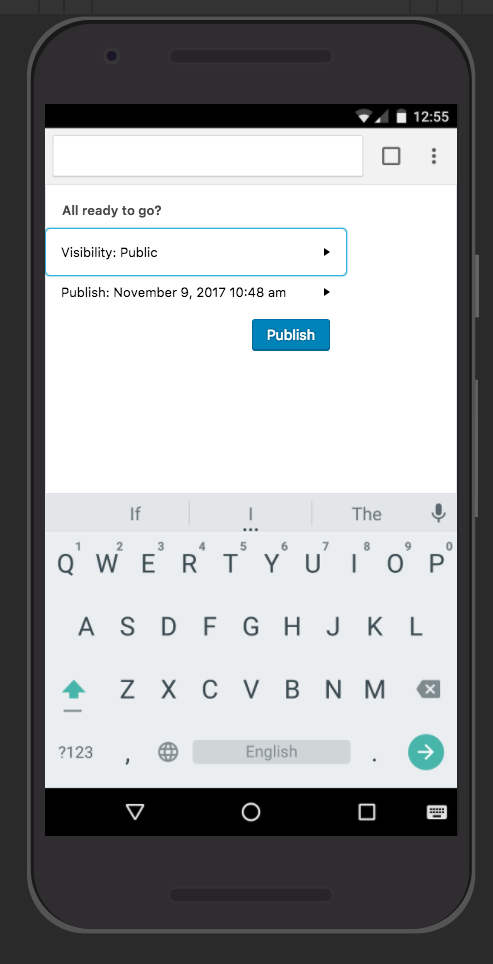
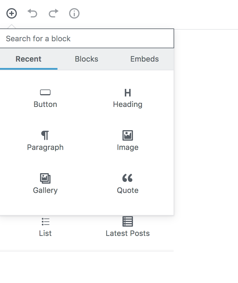
This PR updates the Popover Component to show all popovers fullscreen on mobile.
This makes the inserter more usable on mobile. This also adds an
expandOnMobileprop to enable this behavior for specific popovers. It's only applied to the inserter right now.Testing instructions