Edit Site: Expose "global style" tools #19255
Comments
 mtias
added
Customization
mtias
added
Customization
|
Potentially relevant, the "Site Block" (#16998) — if it can become intuitive to select the Site block itself, it makes sense to contextually open the global styles sidebar when that happens. Or possibly vice versa — highlight the site block when the global styles sidebar is open. |
|
In |
|
I have done some exploring around this. Thanks to @jasmussen and @ItsJonQ for the chats, files and researching on this as I dove into what could be here. Firstly, whatever we do here is a start, so it's important to get something out as a v1 then we can iterate. With that in mind, I focused on the foundations and whilst have some ideas for 'more' those sketches are going to come a little later as this builds up. Foundation functionalityThe starting functionality seemed to be agreed on to be:
Now, of course, we are going to build up from this, but starting from here is great. This exploration focuses on the sidebar and global style tools, not how you get to this screen or the actual full site editing itself. As noted, this is a plugin in the header. The flow of this could be using the site block:
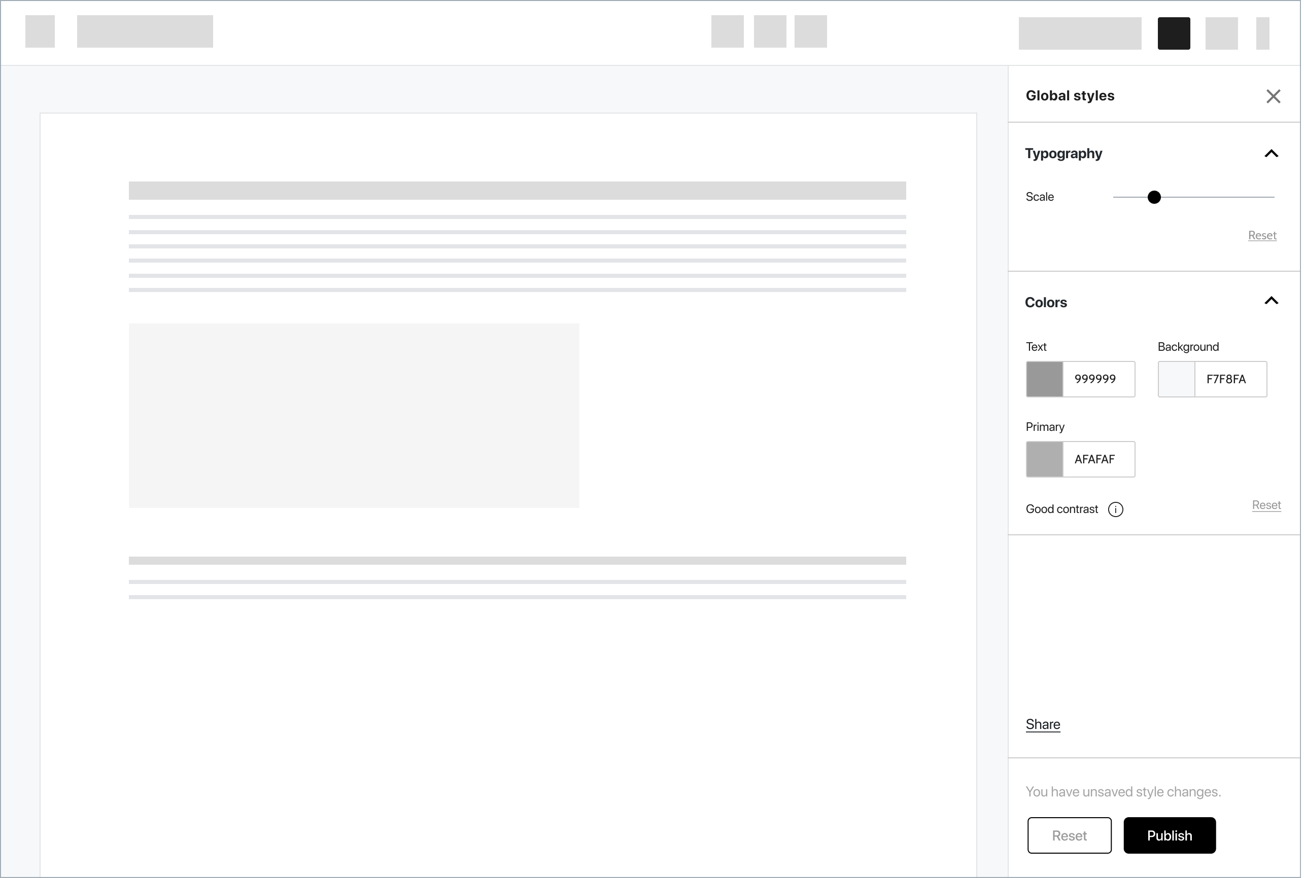
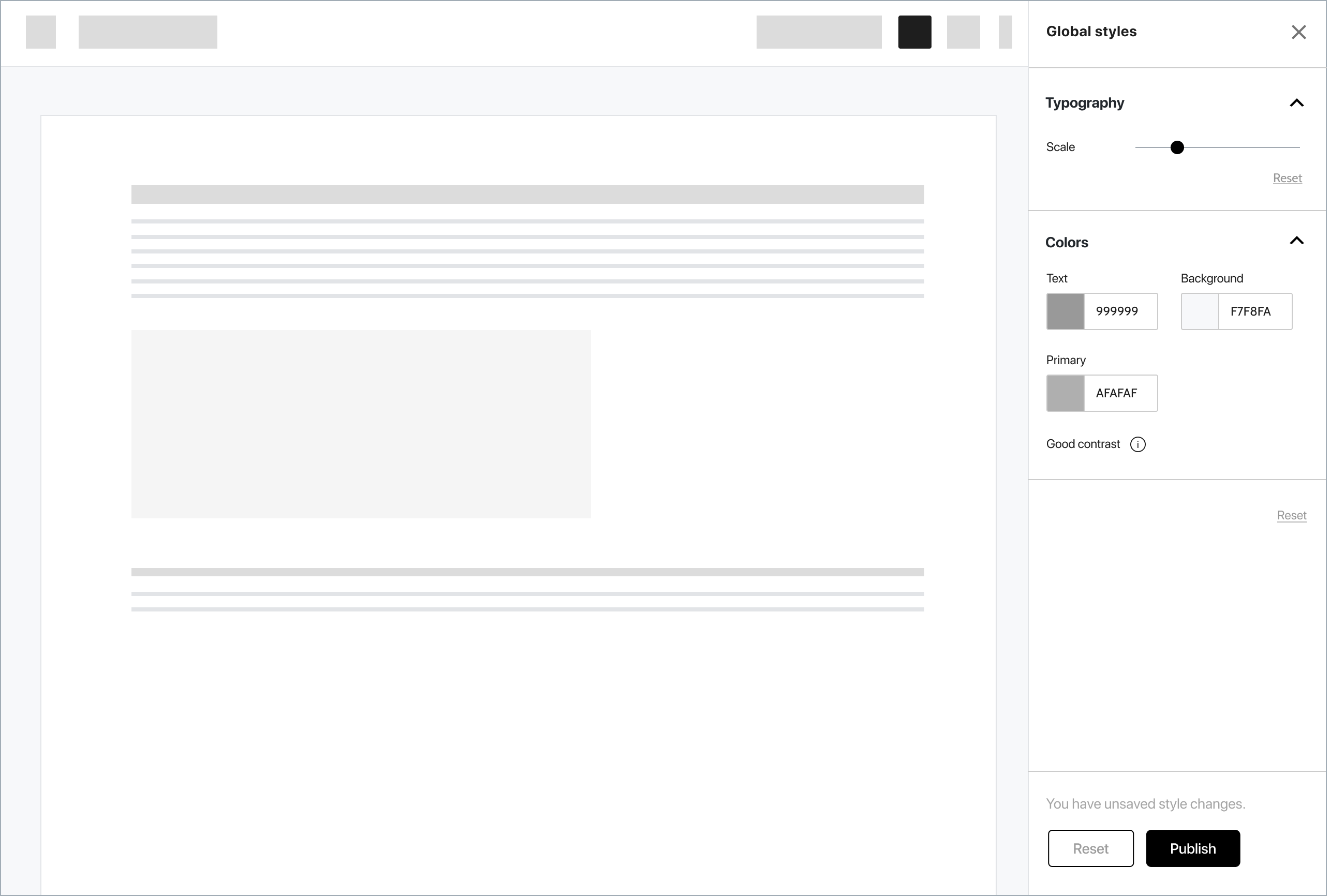
Any style applied is global (hence the name), this means you are changing throughout so whilst you only see what you are on content wise, being able to click through makes sense, therefore having this as able to be turned on anywhere in site edit is useful. Before I dive in, I wanted to clarify the foundational nature of this does mean this is just a start, more to come once we're in a direction here. IterationsI went into a fast mock-up phase where I began exploring what this could look like. For these examples, please note the styling has been removed to focus on the elements. Props to @mtias, @pablohoneyhoney, @jasmussen (and others), who worked on the interface iterations work as I brought in some ideas as I grew these mocks. Traditional sidebarThis design is pretty much aligned with what we have today. It's also the simplest implementation from a mental model view as expected. Note though here I have added a few features such as information about 'good contrast' and there is an idea for 'share' to package up whatever styling is made and export. A key behaviour here is the ability to reset per action and globally. This gives flexibility. However, we might want to on this page have the redo/undo showing and remove resets. A good point to discuss.
The second screen in this traditional sidebar mock shows what could be focusing in on different elements. I drew heavy inspiration from Illustrator here of moving in, zooming into the element and taking focus away from everything else on-page. The styles then come into the sidebar, potentially with a breadcrumb at the top to get back out, although clicking in/out will also give that behaviour.
This is just a suggestion but a way we could expand beyond in later versions and drill down into elements. A 'browse' all might also be great but that feels even more of a power user application. Note, I added import here also as an option, what if people could import in styles or those they share? As I worked on this, I am not set where share/import goes as much as noting that on this screen. These are areas I would like to explore as we grow this. The last 2 in traditional sidebar show it higher and wider, both options to explore beyond what we have today.
PopWhilst the sidebar does lend itself as a pattern we use today, the pop layer also could be an option. I did a little exploration into that just to see. If this was 'fixed on' we would need to add closing. There are some possible benefits to this:
However, the benefits also option to some negatives regarding what space we have, rapidly it could be just like a sidebar.
While I am very open to exploring this for the higher fidelity mocks I did stay with sidebar just because it's what we have today. I would love feedback if we just want to dive into a new pattern right now. UI of todayThere are explorations of next UI coming in, however, I did want to mock what we had today as then we can at least start shipping this feature. V1 : literalThis version is literally using the elements we have today. There are 2 versions of different colour pickers. These versions though for me showed 2 issues:
I began thinking about how this could be eased a little, which lead me to the next versions. V2: new colour pickerI think this is an opportunity to iterate the colour picker and taking inspiration from the exploration work of advancing the interface as noted earlier, I came to the following (note this was in my sketch mocks as really works well).
I thought I could, however, distil even further... V3: new colour picker and less resetThis removes the repeated word 'reset' and uses the undo/redo. As you are in a mode here, this could work. I also brought in alignment here to show what that could look like, noting if we do include justified text we should have a note of why this isn't always a great option as a warning, like colour contrast.
A bonus even more distilled screen would be to remove accordions, whilst they are useful for multiple contents and what we have today, this screen could be freed from them.
FeedbackWell, that was a lot! Thanks for staying with me on this comment as I know this is a lot to upload here but hopefully gives a start into how we can dive into this. I would like to get general feedback on:
From there, I will either iterate or come up with a final set of mocks and we can get this started to be created. After that, I plan to begin to explore beyond the foundational functionality, this is a feature needed now though so it's great to get something out we can then use, gather feedback on and iterate. |


 karmatosed
added
Needs Design Feedback
karmatosed
added
Needs Design Feedback
|
Loving the look of these - and looking forward to Global Styles coming to fruition.
I think this version looks so much cleaner - I imagine it relies on each section not having too many controls though? |
|
@karmatosed Amazing job on these designs 😍 ! It's very much inline with the global styles explorations I've been doing here: And more recently here: In terms of feedback...
@jordesign , I think that's a great observation. Since we're starting off simply (as I think we should), we need to have a design that can accommodate more controls. Especially if we want to support functionality like globally modifying styles for blocks (e.g. Button). @karmatosed I feel like you've acknowledged that challenge when you mentioned:
Off the top of my head, I don't know of a design solution yet. But I'm very glad we're mindful of the potential need for this feature :) The "Pop" version is actually very interesting. I almost want it to be draggable/moveable, similar to the experience you'd get from the Adobe products like Photoshop/Illustrator. The tricky part is that it introduces a new UX paradigm for controls. Not a bad thing, just something to be aware of. On that note... I wonder if perhaps the global style/site editor experience may need to look different? Not strikingly different, but different enough so the user is immediately aware they're now editing global/site things rather than post/page content. The best example I can think of is Google Slides. There are some strong visual cues that you're jumping from slide content editing: To master slide content editing:
Hope this helps!!! Again, amazing job 🤗 . I really love and appreciate you diving into this with such enthusiasm! |

|
With full-site editing, I imagine most themes will want to migrate from the customizer to these global styles. |
|
Had an idea for showing theme suggestions for fonts and colors, while still allowing customization. I also tried adding a way to quickly switch between pages. Also, since this would be a section in the wp-admin sidebar (replacing the customizer) the Gutenberg top bar could do away with any need for an icon to toggle the sidebar — it would always display.
--
|


|
Thanks for all the great feedback on this. @jordesign whilst yes the accordions removed seems minimal, I think it could scale if we use spacing and contextual, where you go into each component. I also think we need to limit how many options by default there are. That's a conversation though to find the balance on. @ItsJonQ I am nodding as yes the 'where' for this panel really needs some wider exploration. That's high on my list of next steps (more to come on those). @aristath I do think it's important to consider what we bring in or don't from customization options. For example, some might be a block as we enter full site editing, over a global style. I also think we should consider where can we have defaults that bring in options over exposing from the start macro details. Typography scale for example would be something that would work for most over having macro typography control. It's one aspect to explore as this is worked on. That all said, whatever is create does need to be tested for scale as there will be extensibility. @shaunandrews thanks for these explorations. I know the idea is to first have this in site edit (over outside), but where that entry point is I think is up for debate. There are 3 paths also:
Moving in and out of these is going to be something to curate as it flows. My current thinking as noted is to 'detach' and have a very similar experience to illustrator but I want to explore that a bit more. In seeing the screens, I would love to explore how to distill down text for example on typography. I think this is a great space I want to iterate with, how little is needed here to guide? Of course this could be something that comes out in usability testing. Onto next steps! The path I want to suggest is for v1: DevelopmentStarts and continues to iterate along with design, together, focusing on #19611. Design
|
|
I've got some updates as been working through this. I have found 2 possible directions to go and from here once agreed direction on menu I'll create a prototype of all screens and test that flow. A few points about these mocks I am sharing:
I am aware right now I have not looked at how this adapts on smaller screens, that's coming and not being left out. My goal is to after this work on 'what if it's not a sidebar' as this uses our existing patterns but perhaps we do more. AccordionsThe first is pretty much as we have today, using accordions in a sidebar.
SlideI wanted to explore what alternatives there were to accordions and began to think about sliding in. For example, this works great on settings panels and on smaller screens. There is a strong cognitive focus from going into the experience. What could that look like? Here's a rough gif.
Individual screens could look like this:
If this was extended it could look like this:
Going even further, what about font pairings?
FeedbackI am looking to know which direction to take the panel in, do you prefer accordions or sliding. From there I will work on a prototype after exploring if we even have a sidebar. It's worth noting the idea is to get a minimum version (without font pairings or picking fonts) made and then iterate. During the development phase of this, I'm going to be working on some ideas of taking it further, but let's keep our eyes on what we can distil to as a version one. Similarly, I am going to explore even if the 'sidebar' is the spot for this interface, we are close to the limits of our current patterns so perhaps we can go beyond. |


I think the accordions are a much strong interaction pattern here. Jumping in and out with a set of sliding, nested menus creates a barrier for quickly making changes. With accordions you can have easy access to all the available options (or the ones you want) at once. Sure you might have to scroll a little more, but that's less of a burden than jumping between nested menus. |
|
Reminds me a lot of the customizer... Initial iterations were using accordions and then we switched to a sliding UI - very similar to what is pictured above. |
|
To gain more context on these two UI, it might be helpful to explore how things would look with more options (that would come in future iterations) or looking at the interaction between the Global Styles UI and the canvas. If you're in "global styles mode" and you click on a Heading block, does the sidebar adjust to let you edit styles for all headings on the page, or across the site? Looking toward the future interactions would help us decide on a solid design direction now. (My instinct is telling me that the accordion pattern is going to be more "adaptable" and introduce less way-finding issue than a nested, sliding list.) |
 gziolo
added
the
Global Styles
gziolo
added
the
Global Styles
This is indeed very important. |
|
Accordions
Slides
In general we use accordions in the settings today. Making it easy to open and jump between multiple accordions with various settings. One might want to test out various combinations of settings. Having multiple accordions open at the same time makes changing settings quicker then slides. |
|
I've been looking at the block library lately (#19836 and #17335 (comment)), and as part of that I tried created three block patterns. Full gallery & markup here, key designs below:
It's a great exercise as it surfaces frustrating bugs. And — the reason I'm sharing here — it potentially surfaces what a Global Style system should be able to accomplish. The above mockups share a few traits:
Outside of bugs, a few things make these hard to accomplish:
Starting with the design was a helpful way to surface: what should my dream global style system be able to accomplish? In a way, each of the properties listed above could be CSS variables that a) were defined by the theme, and b) could be overridden by the user site-wide, or c) could be overridden by the user on a per-block basis. To extract just one example, the border radius of the button:
As a microcosm of the system, each property would be a CSS variable so, making it so we avoid the current CSS-override arms race: theme sets sans-serif, child theme overrides it to serif. In fact it could even use existing color swatches and existing tool, it would just make them global. Instead of the Paragraph having 40 lines of code baked in to provide a text color, this panel would come from Global Styles: boom — every block and even the site now has colors. Now expand the feature-set to font, font weight, font size, letter spacing, line height, font style, etc. etc etc. In short, we could relieve the theme of writing a ton of CSS that is overridden with even more CSS, and instead leverage these variables into something. The themer can direct the basline, the user can adjust each site-wide, and the tools can be surfaced on a block-level too. What do you think? |


|
Thanks for this comment and exploration @jasmussen. I am nodding as this aligns a lot with my own current thinking about global styles. This is really helpful to start thinking about usefulness because it's core to what we do. I have begun in many respects to see this as styling and it's 'where' it makes it global or 'block'. A visual I have in my mind is basically this:
If you note this is simple a 'button/icon' you click and then the tools appear. Not a mode, just useful tools. Global styles fail if things are too limited to create with them. They also fail I feel if you end up having to go into CSS for really basic things. This is a good point to review have we gone too shallow with our options and what can we missing from our style toolkit? If we move this out to mental models, I began to think a bit about how you paint the outside of a house outside, go to the floor to do floor and into the room to paint walls. There's a lot to be said of the tools coming to the experience.
Now what this means for the interface is likely the flow is similar in sense of when in site edit you 'access' the tools but that's what they are not a mode. It has begun to make me think of this less about something you go into which I think the sidebar does also get you feeling is the case. In this mindset, it doesn't matter where they are these are style tools. For example, could this replace what we use for styling in blocks now? It's the location not the toolkit. The experience flow of global stylesI wanted to share what is currently in my mind for both global 'all' and 'by block' styles. The framing of this is in needs someone wants to do. The someone isn't a developer, they simply want to style their site.
The above flow feels I think unexpected and agreed on based on comments and feedback. I'm parking the visual for now as we have our baseline of a sidebar with accordions. Not seeing all styles problemOne problem we have which I have chatted with @ItsJonQ about is 'where is the start' regarding global styles. For example, if you 'access tools' and they show primary color but the page that site edit is on doesn't show that, how do you know you are changing this? A simple low-fi approach here could be a 'show styles' option similar to the demo page that you load. This is one aspect to discuss collectively though. This page has some benefits for art direction and themes might like this. However, there is a danger here of it becoming a mode and that is something to avoid I think for usefulness. Beyond a sidebarI also have begun to explore what if this isn't a sidebar. Here are some very early sketches, more to come! I am sharing super early but that's always a good thing.
Note: blocks in the above images have a section if blocks register specific global styles. This is a pure idea and might not be something going forward. This is very early just to frame. I also have been exploring what if it's not a drop-down but a modal you place. Little early to show those but incoming soon. For now, I just share as ideas, feedback is welcome once they are more baked than the soft cookie dough they are right now. All of these take it back to using existing editor patterns, it's part of the editor, not a mode. What next?We have some things I want to explore:
|


|
I'm generally liking all of this but want to call out the idea of picking between sets of predefined styles as something I'm super enthusiastic about. When designing or implementing a theme I create a global baseline set of styles, and then higher-level exception templates to override it on individual chunks of page (a section with big text, a section with a dark background, etc). Targeting individual elements is a last resort. However, in many site builder plugins, the default starting point for customizing something is the individual element, not something global/global-ish. It can quickly spiral into stuff like needing to manually edit each individual heading on the site to adjust the font/spacing, instead of adjusting a default that cascades down. Gutenberg somewhat avoids this problem with block styles, but still allows users to make a huge mess with stuff like the custom font size/color settings and per-block text alignment. It would be fantastic if the most obvious entry point for this level of customizability was a set of "theme swatches" that apply at a higher level than an individual block. |
|
I am going to post a new issue exploring beyond the sidebar, as for now this issue is moving into the prototype and good to focus on that exploration here. This issue is getting quite large so let's focus. For now, let's look at finalising the flow and what is in the sidebar. Before I dive in, I am going to note that the next steps is to take this into the prototype work that is happening in #20062 These visuals can and should be refined once everyone agrees and iterated based on feedback, but it's important to share now. The flowHere is a break down of the flow in a list, then I am going to go through each step.
Entering stylesAfter looking at the work going on with site edit, I have brought in the tools drop down from that as an entry point. Now, this work might change but styles can fit in theory from anywhere, it just needs an agreed (for now) starting point. This could just as easily be an icon like plugin, but for these mocks, it's using what site edit are proposing for things like templates. This image shows how you would activate styling by selecting and then the tool would show as an icon once done. A point worth noting is once selected I would suggest the '+' icon goes. I have done that in the next mocks. Similarly, I am not sure about the options always being available for this experience, so removed those for later mocks.
Default stylesNow here comes where some decisions need to be made. For example, on activation, you'd not have anything selected. If the entry point is from any content (any point in the editor), then likely not all things that can be globally styled would show on that page. It would be perhaps a little weird an experience to see things listed you can style that aren't visible. Let's look at what by default is a good base for the styles. So far we have these:
Note the *, those require a specific type of block, for example, text for typography and something showing primary color for that. So, what would show by default? This is my suggestion:
Here is a point that needs discussion. At this point we could do a few things:
If there is a technical way of doing number 2 there I would say that is a preference, failing that just showing defaults could be ok.
All of this though does have one drawback, there has to be a knowledge you can click to interact and see other styles. This is worth testing as this gets prototyped. Similarly, testing could be good to see if the hunch that showing every styling option is an issue. Selecting a blockLet's move into how you could select a block and then see the styling options for that. A point to raise is that this may or may not have the toolbar on a block at this point. My personal feeling is to not do that and clear the interface as much as possible. Again, this is where what happens for full site editing should be reflected in global styles.
Another possible option is to not have sections and just show everything that is available. I'd love feedback as to which feels good here. I have changed 'font base size' to be 'font size' here as that works better once in the block. Going liveThis is a stage I am not convinced we need but going to share at this point, however with the work on the 'dot' to show changes, I'm just going to add. At this point the visuals are really just an idea so very raw. If we add a confirmation step, this could be a 'check what you've done' before go live. You could see what you've done and then simply go live.
But wait! What about mobile?As you will have noticed all the mocks so far as of desktop. That's a great assumption we don't want to make. This is where the pattern of a sidebar isn't a great one for styling (more on that in next comment). As was explored a little white ago this bottom interaction section can be incredibly problematic, but perhaps there are options at the bottom that can even slide across. There is a lot of presumed technology working at this point.
Other options include dropping from top and the side. As you can see with these block layouts, both have issues for actually interacting with content.
For version one I would suggest we do take the same approach as we have for block toolbars. This just seems to work better for me and whilst there is a smaller area, it just makes more sense than the sidebar clumsiness. This did lead me to thinking about what if we got rid of the sidebar completely - more on that in new issue!
Next stepsI realise this is quite a bit and I am about to post an alternative to the sidebar also. However, I would love to get feedback on this right now around a few areas:
General feedback is also welcome, but it's great to start focusing on this so we can get into prototype. |


|
As an example of what for each block could look like in styling. I have a quick mock of what paragraph could be like this. Notice here a few changes between global styling and just a single block:
Alignment, in this case, would also include justification as raised earlier in this issue. What you see in 'styles' is what when you have global styles active is available on selecting the paragraph block.
Another variation could be to have a split between block specific and global cc @mtias. However, this is later on, might not use this interface and it's good to focus on what specifically is global right now.
|


|
Great mockups. They are helpful in scouting out potential avenues to explore; without mockups it's much harder to discuss which way to go. It seems like the sidebar is just a vessel to hold style controls, and that wherever the button to invoke it sits ( It's worth noting that in the case of all the global styles I can think of, you never actually have to have the cursor in text, which means on mobile the soft-keyboard should never show. In that vein, it could be a dialog that took up the bottom half of the screen. Regardless of which vessel the settings will live in, it seems like we're reaching a point of fidelity where it would be nice to explore some practical examples. In the vein of those explored earlier on, which adjust "exotic" aspects such as font weight, line-height and even drop-cap style, what would the sidebar/dialog/sheet look like? |
|
I only have 1 big issue with the mockups above... The font-size should allow string values, not just an integer pixel value. Using an integer forces everyone to use pixels, which is not something we should be forcing. |
Yes, that is way I am seeing this. A container that reflects the active content. As I am exploring this more the next iteration I feel has the most value is toolbars, adapting to whatever selected.
I agree, the lowest level to me would be 'the block'. Or at least that is way I am considering this. You can click the page for those type of settings or select 'block' to style that, going no deeper.
Absolutely agree and that's my next step. Thanks for all the great feedback @jasmussen |
|
I created some variations the idea of the sidebar changing based on where you click in global styles. As a summary we have a few states of global styles:
Each block also has its own individual style that is isolated and not global. Entering global stylesHere you click on global styles, the default panel shows of all styles that you can add to any block. As you select a specific block their global style tools are available. Here is where this needs testing as it's changing content based on what you click, this combines select and styling tools. We could show all but this perhaps allows more refined control. As a visual indicator that all of that type will get adjusted they all highlight in some way.
The paragraph block has different styling tools so those swap out in the sidebar for the default global styles. This allows more finite control of block specific styling. Having a block select before going into global stylesThis might not be a common pattern but worth showing how this then would know that was selected and for global. At this point the styling tools are only those for the block globally, it will affect all blocks of that instance. Again, this highlights all blocks on that page which are the same type.
This last path feels complicated but if global styles are tools we have to think of all entry points and possible selection of blocks. A default could be to just 'reset' on click, but it's worth showing. Exploring complex blocks@jasmussen I took a look at what a complex block could be and using the patterns above it would just adapt to what contents are global in there. For example:
Here is perhaps what happens as you drill down, again selecting the block within pattern.
Other exploringOther options that could come into this include using 'block / global' switch in the sidebar to be distinct about what each is.
FeedbackThis is all now moving beyond our v1 of showing just global and moving into what could happen on specific blocks if local. It's further ahead but worth exploring a little. There also needs to be consideration of what happens as we get into more complex blocks. |


|
Looking good! Two initial notes:
|
|
Nice work. Just to be sure, that pink color you highlight the group block with, is that a background color set by the user or something else? |
That is a background color set by user. It could of course also come from a preset pattern color. |
Maybe, however, I think having an option for things like justified text is something asked for. If that does get added we need an accessibility warning of course.
I don't mind this idea, but I also wonder if this is where a recommendation section could come in. I am actually thinking about this for things like color palettes. Let me mock that idea up as it might tie in here. I think if we can offer great presets, that's going to be magic for people. |
Tammie makes an excellent point here, that I'd like to expand on a little bit. I worked on a global styles project that we've tested on WordPress.com, and as part of one of the mockup efforts I did there, I explored a way to bring a better form of justified text to bear. The accessibility issues of justified text are well documented, and in my personal opinion, no-one should ever use it. However we've learned from feedback that there are a few cases, like specific newspaper websites that have a manual of style, or a school teacher that demands the homework that's being published on a school WPMU install be justified. Why not just add justified text to the text alignment menu, you might ask? Well for one, so as to not double back on the past WordPress decision to remove it from there. But overwhelmingly more importantly, because justified text is almost never something you set on a per-block basis. it's rarely something you even set on a per-post or per-page basis. It's often something you set on a per-theme basis and then forget about. So given the role of themes and global styles as it's currently being imagined, justified text seems like an appropriate property to be able to change on a per-site basis. And as Tammie notes, this affords us a space to show an accessibility warning when you choose that, just like we show a contrast warning for text. |
It should also be something that's easy to reverse without having to update hundreds of blocks. |
|
As this has grown into quite an issue, splitting out into actionable smaller ones that PRs can come from. #20367 is a start on this. |
edit-siteprovides a great context to explore ideas from #9534 (comment) without disrupting the main editor by registering a plugin in the header. The plugin would register a sidebar similar to this:But it needs more design explorations.
cc @ItsJonQ
The text was updated successfully, but these errors were encountered: