


SVAR React Comments is a flexible React component for adding comment sections to your applications.
It supports plain text or markdown comments, multiple display styles (like chat or forum threads), and full CRUD operations: users can add, edit, delete, and view comments.
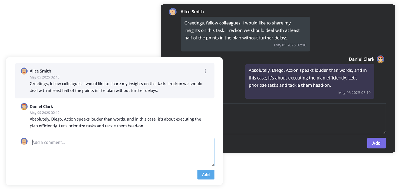
- Bubbles or flow layouts;
- Event handling to track changes and synchronize with external systems;
- Specifying the currently active user to highlight their comments or give special permissions (such as editing or deleting);
- Readonly or editable modes;
- Localization and date format customization;
- Light and dark themes;
- React 18 and 19 compatible.
To use the widget, simply import the package and include the component in to .jsx file:
	import { Comments } from "@svar-ui/react-comments";
  import "@svar-ui/react-comments/all.css";

    function MyComponent(){
        const data = [
			{ id: 1, user: 1, content:'Greetings, fellow colleagues', date: new Date() },
    		{ id: 2, user: 2, content: 'Hi, Diego!', date: new Date() },
		];
		const users = [
			{ id: 1, name: 'Diego Clark'}
			{ id: 2, name: 'Alice Smith'},
		];

        return (<Comments value={data} users={users}/>);
    }