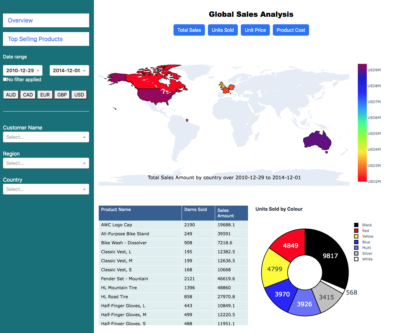
My first dashboard where I use python to recreate the dashboard in a Power BI assignment
Initially I tried Power BI, but being a Mac user this was not straightforward: Running Windows 10 on a virtual machine, Power BI was painfully slow on my 2009 iMac and there is (as yet) not a version compatible with my 2020 Mac Book Air (Apple M Series Chip). I therefore opted for Python Dash to build the first report required by the course -- The Complete Power BI Practical Course on Udemy.
I was impressed by how much of this could be done in python. Also, by using python:
• All of the pre-processing (cleaning, manipulation and cross-matching between tables) could be done in pandas.
• Operations (such as currency conversion and date filtering) could be performed without long and complex syntax.
• The analysis is much more robust by avoiding the usual pitfalls when using spreadsheets.
In this task there are 60,000 transactions for 18,000 customers in Australia, North America and Europe (France, Germany and, ahem, the UK). The dashboard shows the sales, which can be filtered by date range and currency. In addition to the required Total Sales, I went a little further and added filters for Units Sold, Unit Price and Product Cost, as well as ensuring that the date and currency filters applied to all components on both pages. Additionally, on the second page (Top Selling Products), I also added a smoothing function to the plot showing the total number of items sold.
One challenge was the pop-up modal, although the final result was clearer than the original (click on a country on the world map). Although perhaps not the prettiest design, my goal was to emulate the dashboard in the assignment.
