-
Notifications
You must be signed in to change notification settings - Fork 1
Lightbox mode
Ramil Valitov edited this page Mar 16, 2017
·
2 revisions
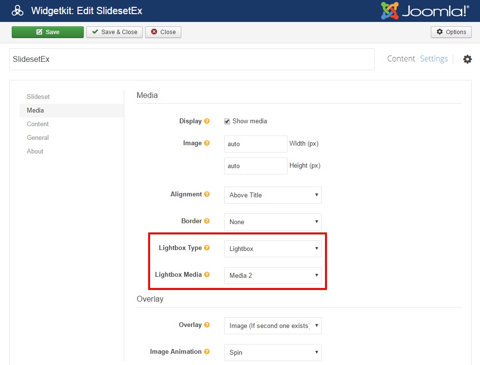
The Lightbox mode allows to display the items with lightbox effect. You may choose how the widget will respond to user clicks: standard behavior or lightbox mode. This feature is configured using the following options:

- Lightbox Type - enables/disables the lightbox.
- Lightbox Media - defines what media will be used as a source for the lightbox. Three options are possible:
- Media - is the standard image, i.e. lightbox will open the same image in the lightbox.
- Media 2 - lightbox will use secondary image (which is defined as media2 field in the content interface), if available. If secondary image is not available for the item, then primary image will be used.
- Media 3 - the logic is the same as in case of Media 2. The difference is that this field is called media3.
It's possible to define 3 different images per item (using all the 3 fields - Media, Media 2 and Media 3):
- primary image which is initially displayed when widget is rendered on a web page;
- image which is displayed on mouse hover;
- image which is displayed in the lightbox.
In general case all these 3 images can be different and unique.
If you don't see the Media fields in the interface, you can add them yourself, read more.
- All the images in the lightbox are grouped, so that the user can browse to the next or the previous image by clicking the left and right arrows in the lightbox mode (without the need to quit the lightbox mode).
- The title of the image is used as a title in the lightbox.
- Lightbox has a higher priority than link. For example, if you have a link and a lightbox configured for some item, then a click on this item will open a lightbox, not a link.