-
Notifications
You must be signed in to change notification settings - Fork 2
Quick start guide
Ramil Valitov edited this page Oct 26, 2016
·
2 revisions
Follow the instructions here.
The widget has built-in tooltips for all options, so, that it is quite easy to use it.
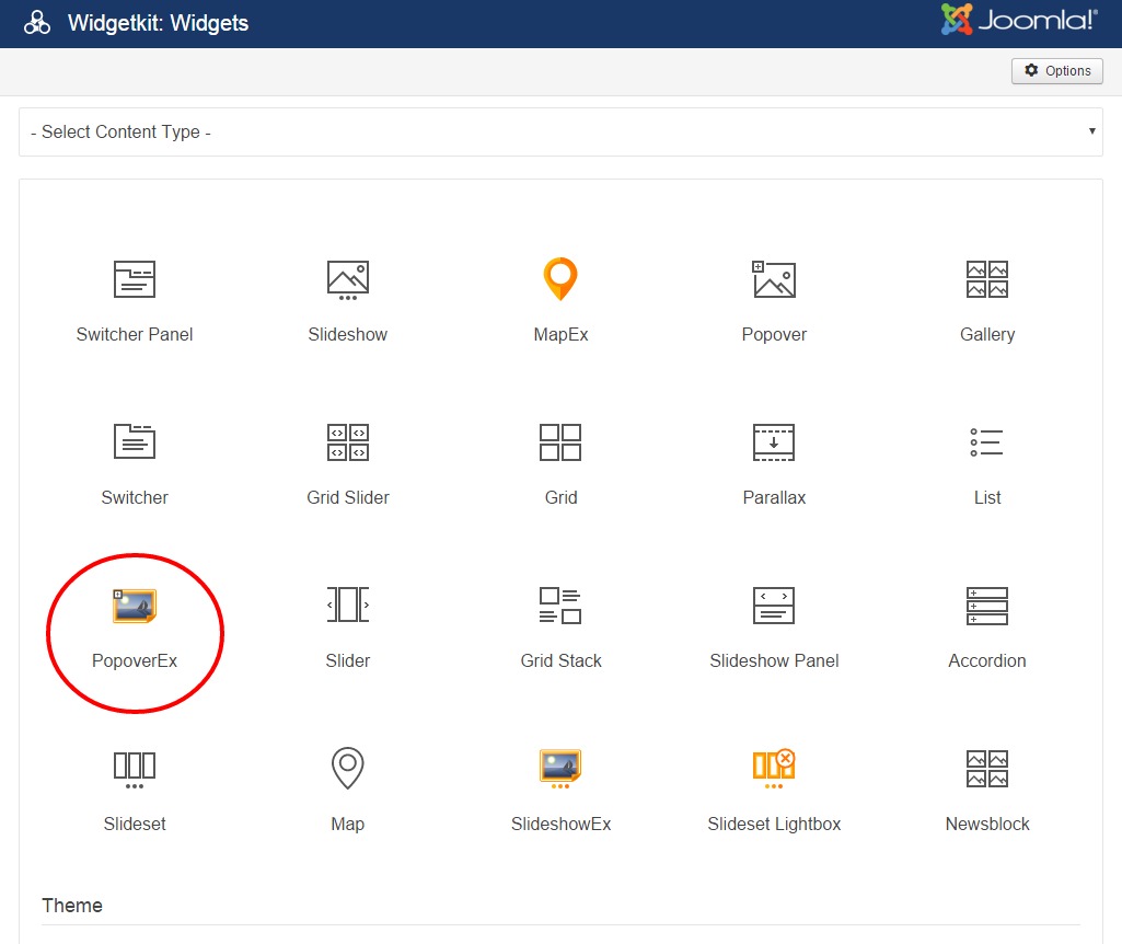
First of all you must create a widget by selecting it in the list:

You should select Custom as a Content Source.
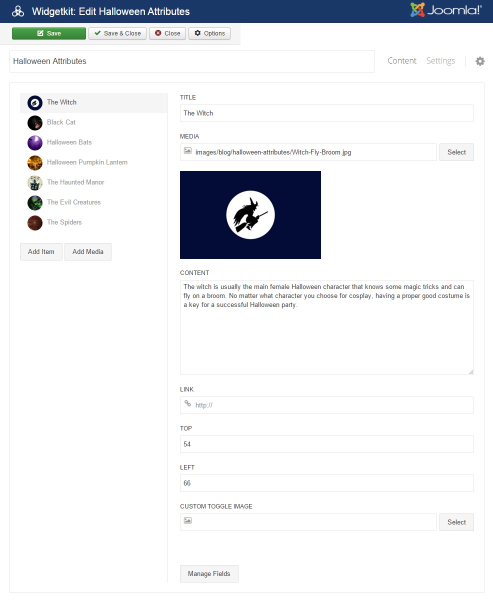
Then you should add one or more (content) items:

For each item you need to specify:
- Position (TOP, LEFT) that defines the location of the toggle icon related to this icon. The values can be specified in percents (e.g. 10%) or in pixels (e.g. 10px). If you don't specify the dimensions then percents are used, i.e. value of 10% and 10 are the same.
- Content by specifying Content, Media or Title fields (one or all of them).
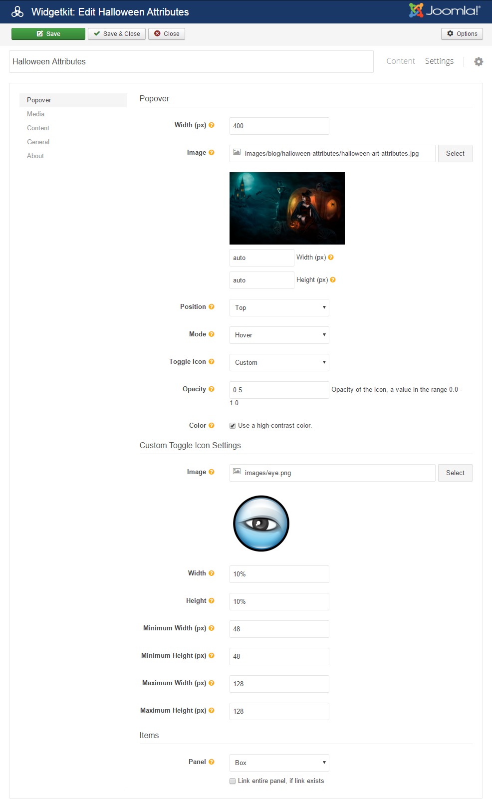
Other fields are optional. Then you should add the main image that will be used as a background (it's the halloween image in the example below):

Other settings are optional.
Finally you can add the widget to your web pages using the standard approach by adding the code:
[widgetkit id="XX"]The XX is the ID of the widget you have created.
Advanced usage examples and details are explained in the Wiki section.