Span markers in diagnostics can be confusing if text above wraps #42112
Comments
|
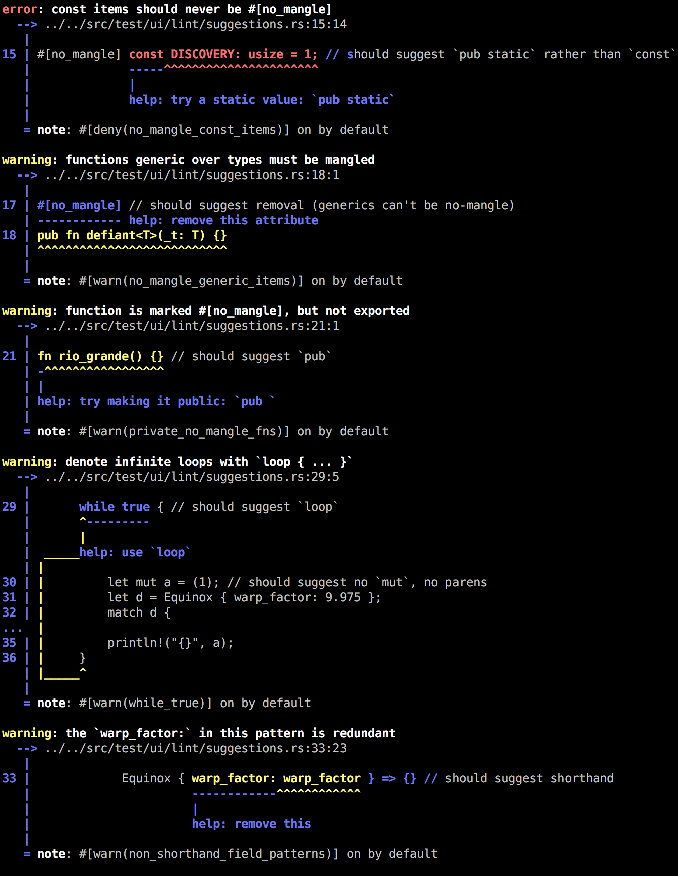
@nikomatsakis, @GuillaumeGomez, @arielb1, @jonathandturner should we go back to highlighting the part of the code being underlined? If so, should it be highlighted with the same color as the underline, or just use bolding? I can post mentoring instructions if we wish to implement that change. |
|
Well, I like how it is right now. :-/ |
|
@GuillaumeGomez what do you think of the following output?
With the code from above:
It only highlights the primary span when it isn't multiline. Looking at that output it wouldn't fix the original issue unless I added the highlighting for secondary spans too. |


|
I have to admit that it looks pretty nice. So for me it's ok. |
|
Other alternatives:
Examples for 2:
|

|
I also wonder -- we've talked from time to time about using a pager (like git does) when running rustc from the command line. If we did so, we could also avoid wrapping at 80 terminals. |
|
I don't like this idea. :-/ |
I don't know if we need to go that far. There're ways of getting the size of the terminal and truncate the output accordingly, within reason (removing indentation, using shorter labels, moving labels to always be below the underline, cutting off code to the right of the span that wouldn't fit, etc.), but don't know if we want to start introducing that kind of behavior in the compiler (and if we do it should have extensive tests). For the original case presented here, the options presented above could look like this (these would not take care of spans that would fall outside of the printed "window"): |
|
@estebank hmm I don't know. I've long wanted some kind of "wrapping" for long labels, but that output you showed doesn't look all that clear to me, and it seems like a shame to invest a lot of effort into it. That said, some kind of minimal effort where we just truncate a long line (perhaps even to a hardcoded width of 80) if the highlight doesn't include that part might be ok. That said, I'm curious why people are so negative on the idea of a pager. To me, it's always been a great feature of git that it doesn't spew tons of output out by default. Moreover, the early errors in the compiler are the most useful -- so if you run the compiler on the command line, then you either have to pipe through |
Highlight code on diagnostics when underlined

Highlight the label's span with the respective color:

<img width="692" alt="" src="https://user-images.githubusercontent.com/1606434/32411026-a1842482-c18d-11e7-9933-6510eefbad19.png">

Fix #42112.
Code:
This is how the error is displayed on a 80 column terminal
It's even worse in the real-life scenario that inspired this:
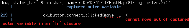
The second span marker just lazily points to the top of the closure.
Possible improvements:
Perhaps the irrelevant part could be omitted:
An additional advantage of this method is that there is less spam overall. The less irrelevant information there is, the more comprehensible the diagnostic becomes. It can also be applied in both directions. For example, if the relevant arg is in the middle, it could be displayed like
fn just_do_it(..., relevant_arg, ...).If the overflowing part should be kept for some reason, maybe it could be modified to make
the span marker fit in somehow.
my_arg_1could be highlighted directly. This would require the use of color or making the font bold.The text was updated successfully, but these errors were encountered: