1. Dashboard
The Dashboard page provides insights on any work items at Backlog level (PBI, User Story, Bug, etc.). It excludes any levels higher such as Epic or Feature. Task work item type is not included in the dataset.

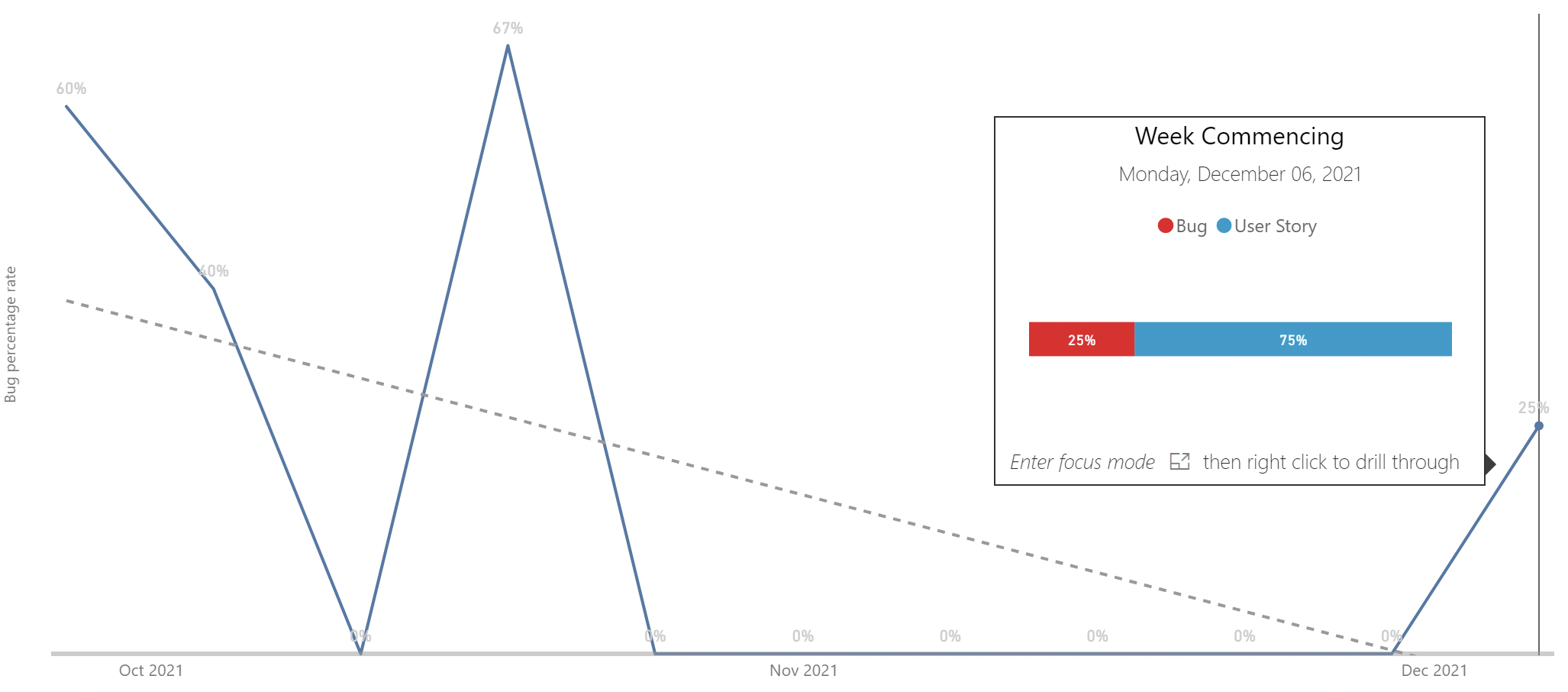
What is this chart?
Quality is measured as the percentage of completed work that is marked as bug work item type. The number of bugs completed each week is divided by the total count of completed items that same week.
What is the intended behaviour?
Help teams continuously triage and complete bug work items at a consistent rate. Try and drive to keep the percentage level (and low!) without deferring bugs.
How is it gamed?
Bugs are entered as PBIs/User Stories (seen by growing throughput, but lowering customer satisfaction and complaints)
When overdriven, what can it lead to?
Responsiveness metric may increase. The number of open issues may grow (and thus the age for these items will increase) if PBI/User Story work is done in preference.
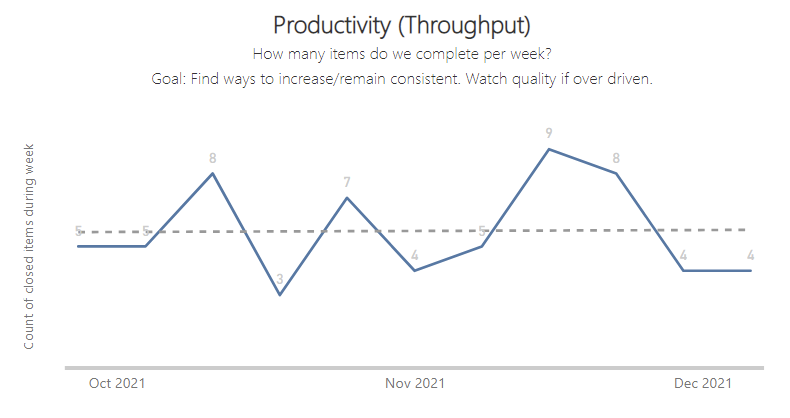

What is this chart?
Productivity is measured as the number of completed Issues per week, commonly referred to as Throughput. The chart counts how many items were finished each calendar week, helping see the trend over time.
What is the intended behaviour?
Help teams find what level of throughput per week is consistently achievable and to find ways to increase this over time by improving their processes.
How is it gamed?
Throughput can be increased by breaking down items into smaller pieces (may not be a bad thing – so long as they are vertically slicing!). Teams could also prematurely sign-off work only to have more issues reported later (seen by increase in age chart).
When overdriven, what can it lead to?
More bars and longer bars in the Age chart as more Issues are reported. Predictability may move down into more orange bars (starting more than finishing).
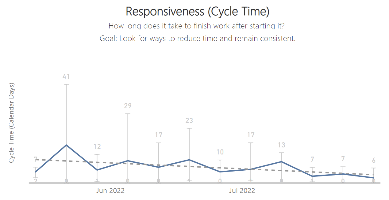

What is this chart?
Responsiveness is measured as the average lead time for all items completed in the same week. Lead time is calculated from when an issue is first Opened till when it is Closed.
What is the intended behaviour?
Help teams understand the lead time for completing items, and to look for ways to reduce the time (and variability) by eliminating unnecessary steps and waste.
How is it gamed?
Only fast simple work is started (seen by initial increasing productivity only to regress later). Premature sign off of items as finished (seen by more bars in the age chart)
When overdriven, what can it lead to?
Quality metric goes up as more defects are reported due to premature completion. Predictability chart has higher peaks as more work completes but then work starts on more bugs that are opened.


What is this chart?
Predictability is measured as net flow per week. The dashboard counts how many items were finished and subtracts how many items were started for the same calendar week creating a positive bar (blue) if more is finished than started, or a negative bar (orange) if more items were started than finished.
What is the intended behaviour?
Stop starting, start finishing. Help teams focus on finishing something in-progress (or helping someone on the team finish something) before starting something new. Aim for getting close to zero consistently (meaning we finish as many things as we start).
How is it gamed?
Teams can prematurely sign-off work only to have bugs reported later (seen by increase in quality chart). Teams can slow down starting new work (seen by a decrease in productivity chart).
When overdriven, what can it lead to?
Quality metric goes up as more defects are reported due to premature completion.