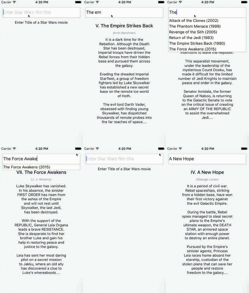
A pure JS autocomplete component for React Native. Use this component in your own projects or use it as inspiration to build your own autocomplete.
Tested with RN >= 0.26.2. If you want to use RN < 0.26 try to install react-native-autocomplete-input <= 0.0.5.
$ npm install --save react-native-autocomplete-inputor install HEAD from github.com:
$ npm install --save l-urence/react-native-autocomplete-input// ...
render() {
const { query } = this.state;
const data = this._filterData(query)
return (<Autocomplete
data={data}
defaultValue={query}
onChangeText={text => this.setState({ query: text })}
renderItem={data => (
<TouchableOpacity onPress={() => this.setState({ query: data })}>
<Text>{data}</Text>
</TouchableOpacity>
)}
/>);
}
// ...A complete example for Android and iOS can be found here.
Android does not support overflows (#20), for that reason it is necessary to wrap the autocomplete into a absolute positioned view on Android. This will allow the suggestion list to overlap other views inside your component.
//...

render() {
  return(
    <View>
      <View style={styles.autocompleteContainer}>
        <Autocomplete {/* your props */} />
      </View>
      <View>
        <Text>Some content</Text>
      <View />
    <View>
  );
}

//...

const styles = StyleSheet.create({
  autocompleteContainer: {
    flex: 1,
    left: 0,
    position: 'absolute',
    right: 0,
    top: 0,
    zIndex: 1
  }
});| Prop | Type | Description |
|---|---|---|
| containerStyle | style | These styles will be applied to the container which surrounds the autocomplete component. |
| hideResults | bool | Set to true to hide the suggestion list. |
| data | array | An array with suggestion items to be rendered in renderItem(item). Any array with length > 0 will open the suggestion list and any array with length < 1 will hide the list. |
| inputContainerStyle | style | These styles will be applied to the container which surrounds the textInput component. |
| listContainerStyle | style | These styles will be applied to the container which surrounds the result list. |
| listStyle | style | These style will be applied to the result list. |
| onShowResult | function | onShowResult will be called when the autocomplete suggestions appear or disappear. |
| renderItem | function | renderItem will be called to render the data objects which will be displayed in the result view below the text input. |
| renderSeparator | function | renderSeparator will be called to render the list separators which will be displayed between the list elements in the result view below the text input. |
| renderTextInput | function | render custom TextInput. All props passed to this function. |
| renderScrollComponent | function | A function that returns the scrollable component in which the list rows are rendered. Defaults to returning a ScrollView with the given props. |
- By default the autocomplete will not behave as expected inside a
<ScrollView />. Set the scroll view's propkeyboardShouldPersistTaps={true}to fix this (#5). - If you want to test with Jest add
jest.mock('react-native-autocomplete-input', () => 'Autocomplete');to your test.
Feel free to open issues or do a PR!
