-
Notifications
You must be signed in to change notification settings - Fork 30.1k
New issue
Have a question about this project? Sign up for a free GitHub account to open an issue and contact its maintainers and the community.
By clicking “Sign up for GitHub”, you agree to our terms of service and privacy statement. We’ll occasionally send you account related emails.
Already on GitHub? Sign in to your account
Error hover semantic information should be rendered separate of error message #62370
Comments
|
Another problem: changing Now I get: Good things I miss from previous one:
|
While that is true, isn't the real question what value the |
|
@jrieken From an extension author point of view, he doesn't care about passing in semantically correct info. He only knows the messages displayed on hover and problems are |
That sounds a little artificial but if that is the case, then I would probably search for that specific error code using the filter box on the upper right. (actually I wouldn't use the UI at all but I'd use the command line) |
|
Inline widget renders the source and code similar to Problems view. Example 1: Example 2: @jrieken @joaomoreno @misolori Feedback is welcome. |
|
I think having source and code on separate lines gives them way more attention than they should have. And to my eyes it also looks ugly. What again is wrong about the inline rendering and why is it only wrong in the hover? |
|
Since it is a suggestion from @joaomoreno I would request him to reply for above comment. |
|
Pushed changes in inline view - made source and code less prominent just like in problems view. |
|
|
|
Since some of us does not like how the current metadata is shown in the hover I am proposing following options. Each option shows hover for single line and multi line errors.
@Microsoft/vscode Please give the option you like |
|
I vote for Option 3. Imho a user is not interested in the source and of course not the code. If we decide to go with option 2 I suggest to right align it so it is less noticable and less space between it and the actual error. |
Yeah, if we have
This would look great to me. Option 3 would mean "I should not follow the semantics of the Diagnostic interface", because I need the I also hope |
|
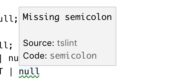
I think first we have to decide whether the metadata should be shown at all, or whether it should be configurable to be hidden, etc. Then, if it's shown, how it should be displayed. I think it should be shown because if I have multiple extensions contributing diagnostics, I want to know where a message is coming from. The error code is also useful, e.g. if you want to know which rule in a tslint.json is associated with an error message. I prefer option 1. |
|
Another thought is a hybrid of option 1 & 3 where we have some way for a user to expand the additional information but it's hidden by default (similar to the suggest widget info box). |
|
@roblourens @octref Source and code information are hidden only in hover. If you want you can find them in Problems view. Is not that enough and helpful? |
That's what I currently resort to:
I need to open panel, find the matching message (hard if I have many errors) and read the error rule id. It's not my workflow. Plus, this makes it much harder for people to write inline pragmas such as |
|
This is what I meant:
|
|
I would prefer either show or not show them but not configurable (through setting or action) as it is not worth. I personally think above approach is the best out of all where metadata is not prominent and rendered nicely. Sure. Let's discuss in the next UX meeting. |
I feel so ignored. 😄 |
|
Another suggestion from @egamma is to inline the source and code with the message without labels |
|
Closing this with above inline approach |
|
There's no consistency.
Inline View:
I also don't like the code/source appended to the last line's message. If not on a new line, I hope they can be right-aligned. |
|
@octref I do not like to make it right aligned because it looks ugly as I showed it already. Regarding consistency, I think its not a big issue. (like status bar and problems view are inconsistent). If you strongly feel so, I would change the line and column rendering similar to in status bar. |
|
There have been too many iterations done on this and thanks to all for the suggestions. Since it is highly individual opinionated, I would collect more feedback on the current approach before changing and going in circles. |
|
Yes, the comment 6 days ago #62370 (comment) got most upvotes and everyone seems to like it. That looked great: but suddenly you changed it to the current form. I don't know what's the reason we can't have one extra line for the source/code. It's easy for user to locate and read, and it's always aligned. Vertical space is not limited for diagnostics hovers, are they? And the new design generates inconsistencies. User now will be confused for "what's inside a parenthesis" and "what's inside a bracket". This goes against our effort to "make errors/hovers consistent". /cc @joaomoreno @misolori for input. |
|
In the UX call yesterday we discussed both of those options and even though we all liked both versions, we all agreed that we liked the cleaner look of last one (the one that's now on insiders). |
|
@octref To be fair, the option to not show any additional information is actually the one with the most likes and it is what Visual Studio does too.
Note that the hovers in vscode are clickable. If said information is not shown, what about clicking the hover and having it shift focus to the full diagnostic in the problems view? Personally, I think it would make sense as most people eventually get an idea of where a diagnostic is coming from an no longer need that data. |
|
Fixes for his have caused regression for https://github.com/rust-lang/rls-vscode. We used backtick-enclosed strings for types and since everything is escaped now to render a custom hover window, the error messages are illegible now, for example: current output note: expected type previous output note: expected type See rust-lang/vscode-rust#479 for more details. |
|
Suffering the same issue as @Xanewok in nwolverson/vscode-ide-purescript#115 - diagnostics are rendering fine in problems and tooltip but replaced by displayed HTML entities in the hover |


From @octref in #62159
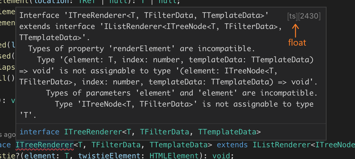
If we have access to semantic information we should render it much better. The message should come first. Then the source on a separate line, with a
Source:label preceding it and in non-monospace font (since source should be a user-readable string likeCSS Lint). Then, the code with the same style, but with monospace, since code is often a library/OS error code. Something like:cc @sandy081 @ramya-rao-a @misolori
The text was updated successfully, but these errors were encountered: