The Material Theme builder is built to assist in exploring the possibilities of dynamic color, harmonizing brand colors, and providing a type scale. All with implementation in mind to bridge designer and developer workflows. With built-in code export, Material Theme Builder makes it easy migrate to the M3 color system and take advantage of dynamic color.
Material Design’s Dynamic color brings user personalization to apps by generating accessible light and dark color schemes from a user’s device wallpaper. Build a custom Material Theme, allowing you to migrate to Material Design 3’s new color system, and export it to code.
Material Theme Builder: https://m3.material.io/theme-builder/
Material Theme Builder for Figma: https://goo.gle/material-theme-builder-figma
⚠ The latest update introduces Surfaces based on tone values, these are no longer read-only overlays. Surfaces 1–5 will remain in the builder for current users, but we recommend migrating to new surface tokens as soon as possible. Fixed accents add a new set of colors that will remain consistent across light and dark themes.
- Repair: If using a previously generated color scheme, Repair your theme or Create a new theme to get the new color tokens.
- JSON import, this will update the theme values with the same name, allowing to move themes across files and between web and figma.
- Color style properties will now export. Meaning exact color values can be set in style properties and then exported in theme files.
Previous release:
- New UI for custom colors for easier to read labels and descriptive subtitles.
- Extended color with harmonization is now on both the Web version and Figma plugin! Your extended colors will carry between Dynamic and Custom scheme. (Harmonization is only to visualize with dynamic color).
- Speaking of extended colors, you can now rename and delete from within the plugin.
- The new HCT color picker allows to update colors using Hue, Chroma, and Tone. Plus the color picker allows to copy/paste hex code values.
- The Figma plugin includes setup settings and a settings modal to toggle certain features off if not needed and even try out Beta features!

- Run by searching for Material Theme Builder within Figma plugin search or Try it Out from the Community page (will create a new file).
- With the plugin open click Create Theme to generate a theme (material-theme) and Material Design tokens as Figma styles.
- Using design kit components? Turn on State Layers within settings, this will generate needed state layers when customizing the theme.
- Select and Swap to update the theme used in the components.
- Assign MD tokens (Figma styles) to custom elements and components, then swap to the currently selected theme.

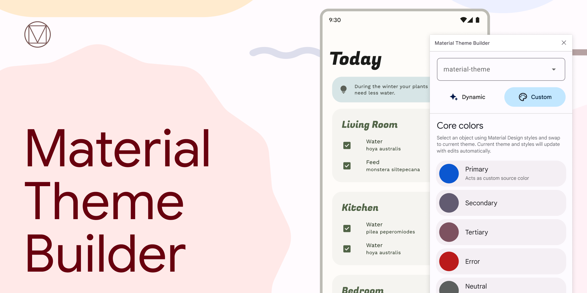
The foundation of a color scheme is the set of key colors that individually relate to separate tonal palettes. Specific tones from each tonal palette are assigned to color roles across a UI. Start by opening Material Theme Builder. You can build a scheme through a few methods…
Under Source Image, drop in an image or choose one from the file browser. Set the source of the image, Wallpaper or Content, to toggle which algorithm is used. Now select Update, the color scheme will be updated. This gives a preview of dynamic color from a user’s wallpaper or local color extraction. Don’t want to choose an image or color? Randomize the source color with Shuffle.

Instead of generating from a source image, build a more customized scheme… Start updating the key colors, with Primary first. Primary can be your main brand color, or primary accent color that is most utilized. Key colors are created from the input color’s hue by adjusting the chroma and tone. The primary key color will be used for the source color, much like the source color in the dynamic setting and will override all other key colors, so set this one first. This means, there is no need to add additional colors. Secondary roles are used for less prominent components in the UI, while expanding the opportunity for color expression. Tertiary roles are used for contrasting accents that can be used to balance primary and secondary colors or bring heightened attention to an element. Neutral roles are used for surfaces and backgrounds, as well as high emphasis text and icons. Select Update. Your brand colors will now be included in the core color scheme adjusted to match the M3 color space, accessible, and able to export and implement within code as a theme.

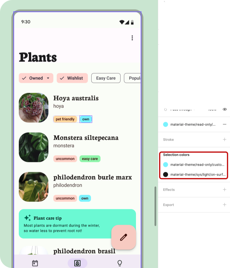
- To extend out past user-generated dynamic colors or the baseline schemes. Click Add a color. A color input will appear and update the color schematic.
- Click on the color well to prompt a color picker to update the color.
- To rename a custom color, with the modal closed. Find the source group and update the Custom style name. The color name will be updated next time the plugin is open.
- Delete by deleting the custom color source (in Figma styles).
You can change the current theme, add a new theme, and reset the current theme within the Theme menu (dropdown at top).

Selecting a different theme changes the current theme to edit. Swap with will update whatever is selected to the current theme in the dropdown.
Presets are available in the menu to reset the current theme back to the Material baseline theme.
Ready to implement your theme? Click Export and select your desired code format. Learn about themes and migrating to M3 or try out implementation with Adding dynamic color to your app codelab.

The foundation of a color scheme is the set of key colors that individually relate to separate tonal palettes. Specific tones from each tonal palette are assigned to color roles across a UI. Start by opening Material Theme Builder. You can build a scheme through a few methods…
Under Source Image, there are a few wallpapers provided to demonstrate wallpaper generated themes. The last option allows to Add your wallpaper from an uploaded image or link. Don’t want to choose an image or color? Randomize the source color with Shuffle.
Instead of generating from a source image, build a more customized scheme… Start updating the key colors, with Primary first. Primary can be your main brand color, or primary accent color that is most utilized. Key colors are created from the input color’s hue by adjusting the chroma and tone. The primary key color will be used for the source color, much like the source color in the dynamic setting and will override all other key colors, so set this one first. This means, there is no need to add additional colors. Secondary roles are used for less prominent components in the UI, while expanding the opportunity for color expression. Tertiary roles are used for contrasting accents that can be used to balance primary and secondary colors or bring heightened attention to an element. Neutral roles are used for surfaces and backgrounds, as well as high emphasis text and icons. Select Update. Your brand colors will now be included in the core color scheme adjusted to match the M3 color space, accessible, and able to export and implement within code as a theme. Color Match will use the color inputs in place of Container roles to provide color fidelity with your brand colors or to provide a more vibrant output.

- To extend out past user-generated dynamic colors or the baseline schemes. Click Add a color. A color input will appear and update the color schematic.
- Click on the color well to prompt a color picker to update the color.
- To update a custom color, open the overflow menu and select Rename.
- Delete by selected Delete.
- Extended colors can be harmonized (color shifted to) with the dynamic colors.

Click through to Pick your Fonts to add custom type to your theme.

Ready to implement your theme? Open the drawer or click through to Export. Learn about themes and migrating to M3 or try out implementation with Adding dynamic color to your app codelab.