DatePickerView

PickerView inside。
Project level build.gradle
allprojects {
    repositories {
        maven { url 'https://jitpack.io' }
    }
}
App level build.gradle
dependencies {
    implementation 'com.github.limxing:DatePickerView:1.1.0'
}
<top.leefeng.datepicker.DatePickerView
    android:id="@+id/datePickerView"
    android:layout_width="match_parent"
    android:layout_height="300dp"
   />
app:dpvBackgroundColor="#ffffff" 选中(中间条目)的背景色,默认透明
app:dpvDateEnd="2021-05-05" 截止日期,默认今天
app:dpvDatePaddingEnd="75dp" 右边距,默认0
app:dpvDatePaddingStart="75dp" 左边距,默认0
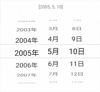
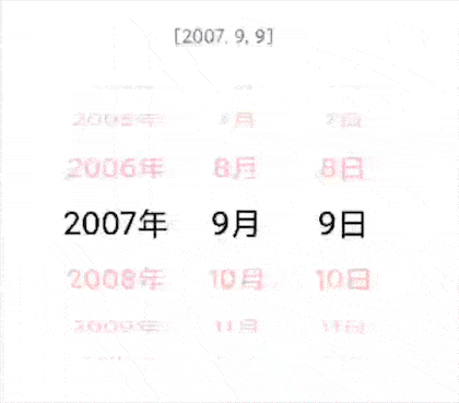
app:dpvDatePosition="2021-02-03" 定位日期,默认截止日期
app:dpvDateSize="7" 当前课件范围内显示日期的个数,默认5
app:dpvDateStart="1995-01-02" 开始日期,默认 1970-01-01
app:dpvDateTextColor="@color/black" 设置选中日期文本颜色,默认Color.BLACK
app:dpvDateTextSideColor="@color/black" 设置未选中日期两侧文本颜色,默认与dpvDateTextColor一致
app:dpvDateTextSize="24dp" 日期文字大小,默认 20dp
app:dpvLineColor="#33000000" 选中(中间条目)上下边界线颜色,默认透明
app:dpvLineWidth="1dp" 选中(中间条目)上下边界线宽度,默认1dp
app:dpvUnitMarginStart="10dp" 如果年月日单位固定不滚动,设置单位与数字之间的距离,默认0
app:dpvUnitScroll="true" 是否设置单位(年月日)与数字一起滚动,默认false
app:dpvUnitTextColor="@color/black" 设置单位(年月日)及选中的日期文本颜色,默认与dpvDateTextColor一致
app:dpvUnitTextSize="20dp" 设置单位(年月日)文本大小,默认 18dp
app:dpvDateEnableAlpha="true" 是否透明度向两侧渐变,默认true
app:dpvPaddingTop="20dp" 设置顶部padding值 默认0
kotlin
//获取选中的日期 yyyy-MM-dd
datePickerView.dateString
//获取选中的日期,时间戳
datePickerView.dateLong

//监听回调闭包
datePickerView.listener = {
     //[year,month,day]
}

//起止日期及当前定位日期
datePickerView.setDate("1990-01-01","2021-01-09","1999-09-09")

//需要进一步加工
datePickerView.drawListener = object : PickerView.DrawListener {
    /**
     * width recyclerView 宽
     * height recyclerView 高
     * cellHeight 选中View 高
     */
    override fun drawBelow(canvas: Canvas?, width: Int, height: Int, cellHeight: Int) {
        //按需要画背景
    }

    override fun drawOver(canvas: Canvas?, width: Int, height: Int, cellHeight: Int) {
        //按需要画前景。(有同学可能需要上下覆盖渐变效果,可在此实现,避免在此创建对象)
    }

}
SimplePickerView
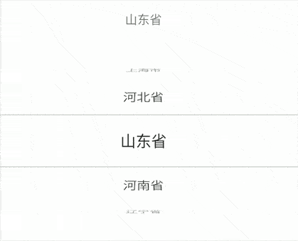
 val list = listOf("北京市","天津市","上海市","河北省","山东省","河南省","辽宁省","江苏省","安徽省")
simplePicker.setData(list,3){
    //position
}
//进一步加工
simplePickerView.drawListener  //... 同上
java
//什么?都2021年了你还在使用JAVA。Kotlin与JAVA 兼容,请自行Google。首先我们分析一下:
草稿:

- 角度:滚轮效果上来看就是一个半圆,从正面看,选中的条目x轴方向角度是0,其上方的条目x轴角度的方向应该是0 至 90°,其下方的角度应该是0 至 -90°
- 大小:选中的条目大小与设置的一致,从中间至上下逐渐变小
- 位置:当Item进行角度和大小的变换后,越远离选中条目的条目之间的距离越大,因此,我们要对item设置y轴的位移,
分析:查看RecyclerView的源码,所有的Item的位置是由LinearLayoutManager管理的,
但是界面的绘制还是在Recyclerview中,我们是否能够在绘制Item前对itemView进行配置呢?
当然可以,我们重写RecyclerView的dispatchDraw方法,这样绘制子View的工作就由我们来处理,
源码可见,绘制子View使用drawChild方法。因此我们继承RecyclerView命名PickerView并且重写dispatchDraw方法。
 override fun dispatchDraw(canvas: Canvas?) {
    children.forEach {
        //1、计算 0-1-0 变化因子
        val cellCenter = (it.top + it.bottom) / 2f
        var f = cellCenter / (measuredHeight / 2f)
        val revert = f > 1
        if (revert) f = 2 - f
        //2、计算缩放,此处以最小 0.7,并设置给view
        val scale = 0.7f + f * 0.3f
        if (scale.isNaN()) return
        it.scaleX = scale
        it.scaleY = scale
        //3、计算透明度,此处以最小 0.3,并设置给View
        it.alpha = 0.3f + f * 0.7f
        //4、计算旋转角度
        val degree = 90 - f * 90
        it.rotationX = if (revert) -degree else degree
        //5、计算位移距离
        if (degree < 90) {
            val s = degree.toInt() / 90f
            it.translationY = (if (revert) -(s.pow(3.0f)) else (s).pow(3.0f)) * it.height

        } else {
            it.translationY = if (revert) it.height / 1f else -it.height / 1f
        }
        //6、绘制此view,文本在分割线变化可参考源代码
        drawChild(canvas, it, drawingTime)
    }
}DatePickerView继承自ViewGroup,是一个常规的自定义View,有兴趣可以参考 源码 。
本项目还提供了一个通用选择器:SimplePickerView,使用如上所述。 当然你还可以使用PickerView进行其他选择器的开发,例如时间选择器、省市联动选择器。
最后,如遇到bug请及时issue。希望能够对你有帮助。
感谢 caiyoufei bug贡献
DatePickerView and PickerView is available under the MIT license.