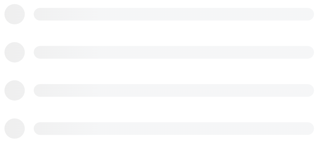
Ported from React-Content-Loader
SVG-Powered component to easily create placeholder loadings (like Facebook's cards loading).
- ⚙️ Customizable: Feel free to change the colors, speed, sizes, and even RTL;
- 👌 Plug and play: with many presets to use, see the examples;
- ✏️ DIY: use the create-content-loader to create your own custom loaders easily;
- ⚛️ Really lightweight: no runtime! 0 dependencies;
pnpm i qwik-content-loadernpm i qwik-content-loader --saveyarn add qwik-content-loaderCDN from JSDELIVR
There are two ways to use it:
1. Presets, see the examples:
import { ContentLoader, ContentLoaderFacebook } from 'qwik-content-loader'

const MyLoader = () => <ContentLoader> <!-- Your custom shapes! --> </ContentLoader>
const MyFacebookLoader = () => <ContentLoaderFacebook />
2. Custom mode, see the online tool
const MyLoader = () => (
  <ContentLoader viewBox="0 0 380 70">
    {/* Only SVG shapes */}
    <rect x="0" y="0" rx="5" ry="5" width="70" height="70" />
    <rect x="80" y="17" rx="4" ry="4" width="300" height="13" />
    <rect x="80" y="40" rx="3" ry="3" width="250" height="10" />
  </ContentLoader>
)
(React version Demo:) Still not clear? Take a look at this working example at codesandbox.io Or try the components editable demo hands-on and install it from bit.dev
Prop name and type |
Description |
|---|---|
animate?: boolean Defaults to true |
Opt-out of animations with false |
title?: string Defaults to Loading... |
It's used to describe what element it is. Use '' (empty string) to remove. |
baseUrl?: stringDefaults to an empty string |
Required if you're using <base url="/" /> document <head/>. This prop is common used as: <ContentLoader baseUrl={window.location.pathname} /> which will fill the SVG attribute with the relative path. Related #93. |
speed?: number Defaults to 1.2 |
Animation speed in seconds. |
interval?: number Defaults to 0.25 |
Interval of time between runs of the animation, as a fraction of the animation speed. |
viewBox?: string Defaults to undefined |
Use viewBox props to set a custom viewBox value, for more information about how to use it, read the article How to Scale SVG. |
gradientRatio?: number Defaults to 1.2 |
Width of the animated gradient as a fraction of the view box width. |
gradientDirection?: string Defaults to left-right |
Direction in which the gradient is animated. Useful to implement top-down animations |
rtl?: boolean Defaults to false |
Content right-to-left. |
backgroundColor?: string Defaults to #f5f6f7 |
Used as background of animation. |
foregroundColor?: string Defaults to #eee |
Used as the foreground of animation. |
backgroundOpacity?: number Defaults to 1 |
Background opacity (0 = transparent, 1 = opaque) used to solve an issue in Safari |
foregroundOpacity?: number Defaults to 1 |
Animation opacity (0 = transparent, 1 = opaque) used to solve an issue in Safari |
style?: CSSProperties Defaults to {} |
|
uniqueKey?: string Defaults to random unique id |
Use the same value of prop key, that will solve inconsistency on the SSR, see more here. |
beforeMask?: JSX.Element Defaults to null |
Define custom shapes before content, see more here. |
animateBegin?: string Defaults to undefined |
Delay before the animation begins, identical to the SVG animate element begin attribute |
See all options live
import { ContentLoaderFacebook } from 'qwik-content-loader'

const MyFacebookLoader = () => <ContentLoaderFacebook />import { ContentLoaderInstagram } from 'qwik-content-loader'
const MyInstagramLoader = () => <ContentLoaderInstagram />import { ContentLoaderCode } from 'qwik-content-loader'
const MyCodeLoader = () => <ContentLoaderCode />import { ContentLoaderList } from 'qwik-content-loader'
const MyListLoader = () => <ContentLoaderList />import { ContentLoaderBulletList } from 'qwik-content-loader'
const MyBulletListLoader = () => <ContentLoaderBulletList />For the custom mode, use the online tool.
const MyLoader = () => (
  <ContentLoader
    height={140}
    speed={1}
    backgroundColor={'#333'}
    foregroundColor={'#999'}
    viewBox="0 0 380 70"
  >
    {/* Only SVG shapes */}
    <rect x="0" y="0" rx="5" ry="5" width="70" height="70" />
    <rect x="80" y="17" rx="4" ry="4" width="300" height="13" />
    <rect x="80" y="40" rx="3" ry="3" width="250" height="10" />
  </ContentLoader>
)In order to avoid unexpected behavior, the package doesn't have opinioned settings. So if it needs to be responsive, have in mind that the output of the package is a regular SVG, so it just needs the same attributes to become a regular SVG responsive, which means:
import { Code } from 'react-content-loader'

const MyCodeLoader = () => (
  <Code
    width={100}
    height={100}
    viewBox="0 0 100 100"
    style={{ width: '100%' }}
  />
)When using rgba as a backgroundColor or foregroundColor value, Safari does not respect the alpha channel, meaning that the color will be opaque. To prevent this, instead of using a rgba value for backgroundColor/foregroundColor, use the rgb equivalent and move the alpha channel value to the backgroundOpacity/foregroundOpacity props.
{/* Opaque color in Safari and iOS */}
<ContentLoader
  backgroundColor="rgba(0,0,0,0.06)"
  foregroundColor="rgba(0,0,0,0.12)">


{/_ Semi-transparent color in Safari and iOS _/}
<ContentLoader
    backgroundColor="rgb(0,0,0)"
    foregroundColor="rgb(0,0,0)"
    backgroundOpacity={0.06}
    foregroundOpacity={0.12}>
Using the base tag on a page that contains SVG elements fails to render and it looks like a black box. Just remove the base-href tag from the <head /> and the issue has been solved.
Old browsers don't support animation in SVG (compatibility list), and if your project must support IE, for examples, here's a couple of ways to make sure that browser supports SVG Animate:
window.SVGAnimateElementdocument.implementation.hasFeature("http://www.w3.org/TR/SVG11/feature#SVG-Animation", "1.1")- Or even use https://modernizr.com/
- React: react-content-loader
- React Native: rn-placeholder, react-native-svg-animated-linear-gradient;
- Preact;
- Vue.js: vue-content-loading, vue-content-loader;
- Angular: ngx-content-loading, ngx-content-loader.
Fork the repo and then clone it
$ git clone git@github.com:YourUsername/qwik-content-loader.git && cd qwik-content-loader
$ pnpm i: Install the dependencies;
$ pnpm run build: Build to production;
$ pnpm run dev: Run the Qwik Dev Server to see your changes;
Commit messages should follow the commit message convention so, changelogs could be generated automatically by that. Commit messages are validated automatically upon commit. If you aren't familiar with the commit message convention, you can use yarn commit (or pnpm run commit) instead of git commit, which provides an interactive CLI for generating proper commit messages.


