A ring view which show current progress with animation.
This view used to show a ring, which sweep a angle. You can use this view to show progress, percent, or something else.
- background ring's width and color can be changed by property.
- percent ring's width, color can be set.
- percent ring's color can be changed gradually by set startColor and endColor property.
- percent ring's startAngle and sweep angle can be set.
- you can set whether use animation or not when show percent ring, if use animation, you can set animation duration, default duration is 2000ms.
- startAngle: at which angle percent ring start to be drawn. default is 90.
- sweepAngle: sweep angle, the whole circle is 360.
- bgRingColor: color of the background ring.
- bgRingWidth: width of the background ring.
- startColor: start color of percent ring.
- endColor: end color of percent ring.
- percentRingWidth: width of percent ring.
- duration: is show animation, this is duration time, unit is ms. default is 2000.
- showAnim: whether show animation when display percentRing, default is true.
<declare-styleable name="RingPercentView">
    <attr name="startAngle" format="float" />
    <attr name="sweepAngle" format="float" />
    <attr name="bgRingColor" format="color" />
    <attr name="bgRingWidth" format="dimension" />
    <attr name="startColor" format="color" />
    <attr name="endColor" format="color" />
    <attr name="percentRingWidth" format="dimension" />
    <attr name="duration" format="integer"/>
    <attr name="showAnim" format="boolean"/>
</declare-styleable><com.hc.progressringview.RingPercentView
android:layout_width="match_parent"
android:layout_height="200dp"
app:bgRingWidth="8dp"
app:percentRingWidth="16dp"
app:startColor="#ff0000"
app:endColor="#0000ff"
app:sweepAngle="222"
app:duration="1500"/>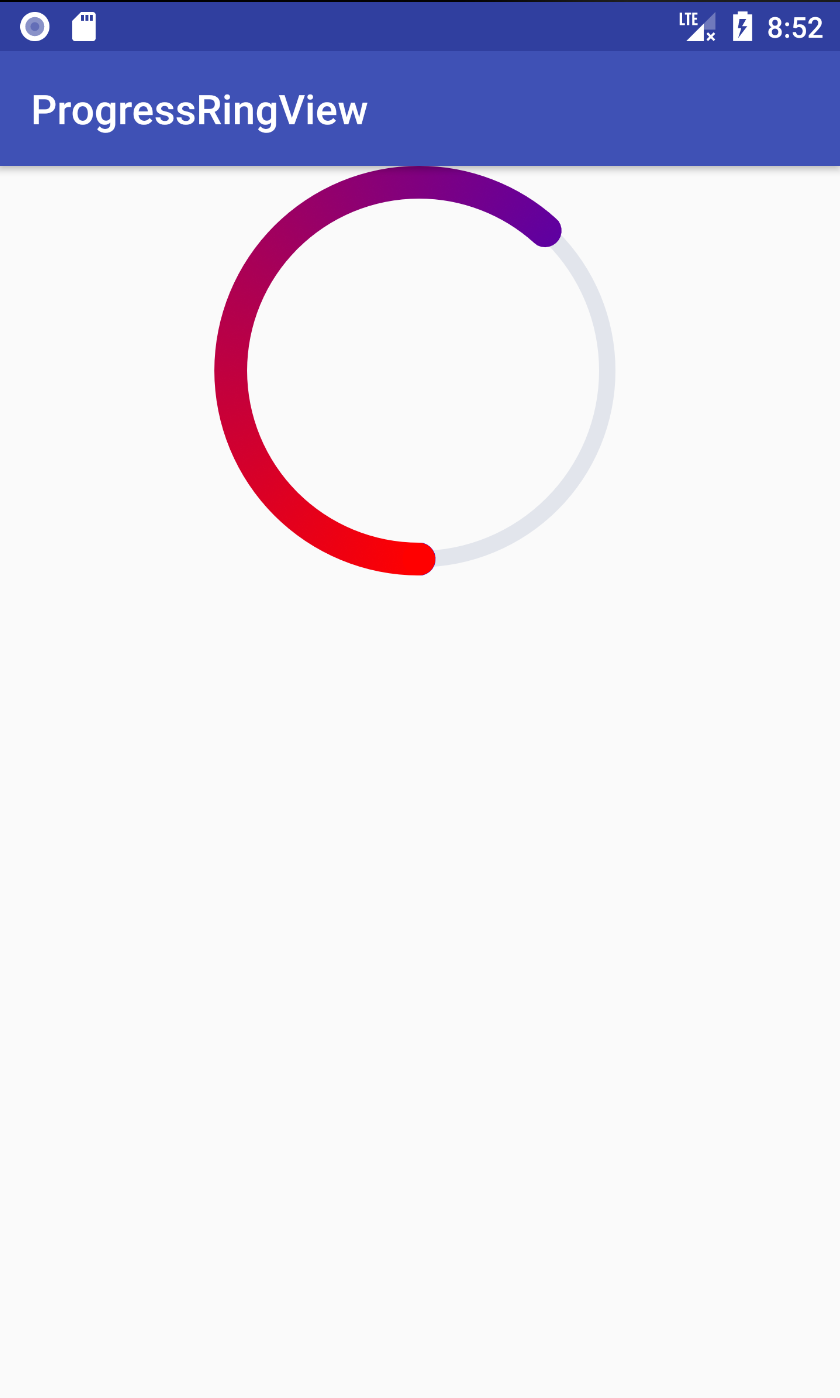
夫君子之行,静以修身,俭以养德。非淡泊无以明志,非宁静无以致远。夫学须静也,才须学也。非学无以广才,非志无以成学。淫慢则不能励精,险躁则不能治性。年与时驰,意与岁去,遂成枯落,多不接世,悲守穷庐,将复何及!