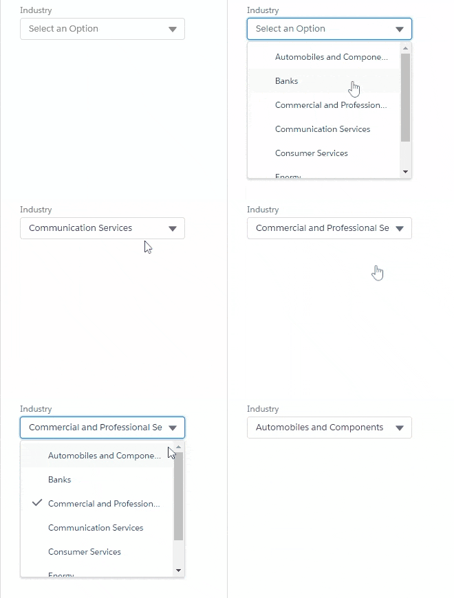
Picklist is a Salesforce lightning aura component which let's you create single-select and multi-select picklist from a single component.
Single select picklist:

Multi select picklist:


Single Select cmp code:
<c:Picklist options="{!v.options}" label="{!v.label}" variant="label-stacked" onChange="{!c.handleOnChange}" />Multi Select cmp code:
<c:Picklist options="{!v.options}" label="{!v.label}" variant="label-stacked" multiple="true" allOption="true" onChange="{!c.handleOnChange}" />Controller code to handle the change event:
handleOnChange: function (component, event, helper) {
   console.log(event.getParam('selectedValues'));
}Attributes
| NAME | TYPE | REQUIRED | DEFAULT | DESCRIPTION |
|---|---|---|---|---|
| label | String | ✔️ | Text label for the picklist. | |
| placeholder | String | Select an Option | Text that is displayed before an option is selected, to prompt the user to select an option. | |
| options | Object[] | ✔️ | A list of options that are available for selection. Each option has the following attributes: label and value. | |
| selectedValues | String[] | This stores the list of all the selected option's value. | ||
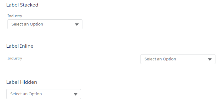
| variant | String | The variant changes the appearance of an input field. Accepted variants include label-inline, label-hidden, and label-stacked. This value defaults to label-stacked, which displays the label above the field. Use label-hidden to hide the label but make it available to assistive technology. Use label-inline to horizontally align the label and input field. | ||
| multiple | Boolean | false | This will handle the multi-select functionality. If true, multi-select will be enabled. | |
| allOption | Boolean | true | If true, 'All' option will be provided in multi-select picklist. | |
| onChange | action | The action triggered when the value is changed. The event will have an 'selectedValues' param which contains all the selected option's value. In case of single-select only one value will be there in the array. |
To contribute follow these steps:
- Fork this repository.
- Create a branch with your username:
git checkout -b <branch_name>. - Make your changes and commit them:
git commit -m '<commit_message>' - Push the changes to your forked branch:
git push origin <branch_name> - Create the pull request.
Alternatively see the GitHub documentation on creating a pull request.
This project is MIT licensed, as found in LICENSE.md file.

