-
-
Notifications
You must be signed in to change notification settings - Fork 5.6k
New issue
Have a question about this project? Sign up for a free GitHub account to open an issue and contact its maintainers and the community.
By clicking “Sign up for GitHub”, you agree to our terms of service and privacy statement. We’ll occasionally send you account related emails.
Already on GitHub? Sign in to your account
Revamp repo header #27760
Revamp repo header #27760
Conversation
|
I still prefer the |
|
Well if others think the same I can bring it back, but then we'd need a way for it to no longer look horrible on mobile if the repo name is even a bit longer :) |
I'm not a fan of this. The Username is used for all technical purposes (repo url, git clone etc.), s we should show the username instead of the displayname. |
|
horizontal scroller. There is some view port math here, calculate the length of overall row view port and then calculate the length of every item, if sum of all view row item > view port then hide the last one and push in the And I agree with @JakobDev point we should use the username. Not displayed name. For IMO desktop view looks good in gitea, we need to focus on mobile view and Accessibility more. |
|
What do you think? |
|
😃 Much better, just the Overall looks good. |
Yes we should do this but I think the implementation will be complex as it can not be done in CSS and it needs JS with an ResizeObserver to dynamically populate the dropdown. I would defer this to another PR. |
|
I agree that we should do it at some point, but to be honest, my JS skills are not good enough to create something that would be maintainable 😆 |
|
Hi! Relatively a lot of software projects have adopted huge margins, but I don't think thats a good change. Screens are larger to fit more information nicely, not to have larger empty spaces, and at the same time, not everyone has large screens. |
|
I also am a fan of small margins as long as you can still visually separate elements without thinking about it. For me, the sheer amount of different elements in that header justifies the big margins, but I can try to play with it a bit and maybe I'll find a better combination |
|
I really dislike that background in repo name |
|
@lafriks I thought it would be a good highlight on hover, but I can remove it if others think the same |
|
Personally it makes it harder to read because of less contrast and the UI too crowded :) |
|
Some more reviews would be nice :) Are there any things left that should be changed? |
|
ping for reviewers. |
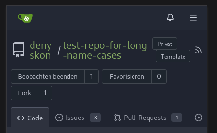
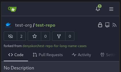
Redesign repo header with following new aspects: - responsive & better-looking repo title - hide repo button text instead of icons in mobile view - use same tab style as on explore and org page <details> <summary>Before:</summary>     </details> <details> <summary>After:</summary>    
Follow #28712 1. Missing Locale word `mirror_sync` 2. Maybe forgot checking the conflict from #27760 Before:  After: 
…tea#28841) Follow go-gitea#28712 1. Missing Locale word `mirror_sync` 2. Maybe forgot checking the conflict from go-gitea#27760 Before:  After: 
Redesign repo header with following new aspects: - responsive & better-looking repo title - hide repo button text instead of icons in mobile view - use same tab style as on explore and org page <details> <summary>Before:</summary>     </details> <details> <summary>After:</summary>    
…tea#28841) Follow go-gitea#28712 1. Missing Locale word `mirror_sync` 2. Maybe forgot checking the conflict from go-gitea#27760 Before:  After: 


Redesign repo header with following new aspects:
Before:
After: