Perfect Angular theme support in two lines of code.
Support system preferences and any other themes. Integrated theme switcher.
- ✅ Perfect theme/dark mode support in two lines of code
- ✅ Support for additional customized themes
- ✅ System setting with prefers-color-scheme
- ✅ Supports Bootstrap color modes via custom data attribute
- ✅ Themed browser UI with color-scheme
- ✅ Integrated theme switcher (considers custom themes as well)
- ✅ Sync theme across tabs and windows
- ✅ Force pages to specific themes
- ✅ Class or data attribute selector
- ✅ Toggle element visibility based on a selected theme
Check out the Live Example to try it for yourself.
$ npm install ngx-themes-plusYou have to add the module to the root module definition. The simplest AppModule looks like this:
@NgModule({
  declarations: [
    AppComponent
  ],
  imports: [
    BrowserModule,
    ThemesModule.forRoot()
  ],
  bootstrap: [AppComponent]
})
export class AppModule { }
Adding theme support takes 2 lines of code:
<tp-theme-provider>
  <router-outlet></router-outlet>
</tp-theme-provider>
That's it, your Angular app fully supports themes, including System preference with prefers-color-scheme. The theme is also immediately synced between tabs. By default, ngx-themes-plus modifies the data-theme attribute on the html element, which you can easily use to style your app:
:root {
  /* Your default theme */
  --background: #FFF;
  --foreground: #000;
}

[data-theme='dark'] {
  --background: #000;
  --foreground: #FFF;
}As of version 5.3.0, Bootstrap supports different color modes. By default, a light and a dark mode are integrated. You can use all features of ngx-themes-plus by setting a custom attribute via the theme options. The next code snippet shows an example how to configure the plugin for use with Boostrap color modes.
const themeOptions = new ThemeOptions();
themeOptions.attribute = 'data-bs-theme';

@NgModule({
  declarations: [
    AppComponent
  ],
  imports: [
    BrowserModule,
    ThemesModule.forRoot(themeOptions)
  ],
  bootstrap: [AppComponent]
})
export class AppModule { }ngx-themes-plus supports switching themes using the integrated theme-switcher component. You can use it as easily as the parent component with an additional line of code.

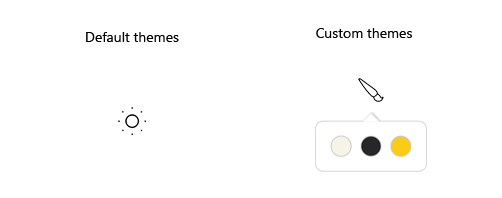
When using the two default themes light and dark the theme-switcher uses some default icons. The following snippet shows the simplest implementation when using the default themes:
<tp-theme-provider>
  <tp-theme-switcher></tp-theme-switcher>
</tp-theme-provider>
When your application requires additional colors you can extend the themes via the options during bootstrapping.
const options = new ThemeOptions();
options.themes = [...options.themes, 'yellow'];

@NgModule({
  declarations: [
    AppComponent
  ],
  imports: [
    BrowserModule,
    ThemesModule.forRoot(options)
  ],
  bootstrap: [AppComponent]
})
export class AppModule { }
For the theme to be displayed correctly, the styles need to be extended.
Take care about adding the color definition --theme for each theme since that color is used by the theme-switcher to render its selection.
:root {
  /* Your default theme */
  --background: #FFF;
  --foreground: #000;
}

[data-theme="light"] {
  --theme: #f6f4e6;
}

[data-theme="dark"] {
  --theme: #27272A;

  --background: #27272A;
  --foreground: #f6f4e6;
}

[data-theme="yellow"] {
  --theme: #FACC15;

  --background: #E4E4E7;
  --foreground: #18181B;
}A forced theme is the right option if you like to present a page using a specific theme only. Switching themes does not have an effect.
To force a theme on your Angular pages, simply inject the ThemeProviderComponent via the constructor and set the theme you like. Integrated theme-switcher is disabled in this case.
@Component({
  selector: 'app-page-forced'
})
export class ForcedPageComponent implements OnDestroy {
  constructor(private readonly themeProvider: ThemeProviderComponent) {
    this.themeProvider.forcedTheme = 'dark';
  }

  public ngOnDestroy(): void {
    this.themeProvider.forcedTheme = '';
  }
}
A second possibility is to set the value of the property forcedTheme via template binding.
<tp-theme-provider [forcedTheme]="forcedTheme">
  <!-- Content -->
</tp-theme-provider>
/*
* The way how you enforce a specific theme depends upon
* the possibilities of your application.
* The `AppConfigService` is just a kind of placeholder
* for any application specific logic.
*/
@Injectable({ providedIn: 'root' })
export class AppConfigService {
private _forcedTheme$ = new BehaviorSubject<string | undefined>(undefined);
public forcedTheme$ = this._forcedTheme$.asObservable();
public forceTheme(theme?: string): void {
this._forcedTheme$.next(theme);
}
}
@Component({
selector: 'app-root',
templateUrl: './app.component.html',
styleUrls: ['./app.component.scss']
})
export class AppComponent {
public forcedTheme: string | undefined;
constructor(private readonly appConfigService: AppConfigService) {
// Set the forced theme using any application specific logic.
this.appConfigService.forcedTheme$.subscribe({
next: (theme) => this.forcedTheme = theme
});
}
}
@Component({
selector: 'app-page-forced'
})
export class ForcedPageComponent implements OnDestroy {
constructor(private readonly appConfigService: AppConfigService) {
this.appConfigService.forceTheme('dark');
}
public ngOnDestroy(): void {
this.appConfigService.forceTheme();
}
}It may be possible to show or hide elements depending on the selected theme, e.g. a specific logo. The library exposes the directives tpThemesOnly and tpThemesExcept that can show/hide elements of your application based on the selected theme.
The directive accepts several attributes:
| Attribute | Value | Description |
|---|---|---|
tpThemesOnly |
[String | String[]] |
Single or multiple themes for which the associated element should be shown |
tpThemesExcept |
[String | String[]] |
Single or multiple themes for which the associated element should not be shown |
The logo within the showcase is changed using both directives shown in the following snippet:
<div class="logo">
  <img *tpThemesOnly="'dark'" src="path-to-the-image" />
  <img *tpThemesExcept="'dark'" src="path-to-the-image" />
</div>If theme support does not work as expected, check that your application configuration is valid according to this documentation. If that doesn't help, please feel free to open an issue.
03/04/2023
- Initial release.

