Docs: Re-designed landing page for Relay #2696
Comments
|
So roughly, the idea is to compare Relay's declarative data deps approach vs imperative passing of the data through props. The first section explains how in you normally make a big request, then pass subsets of it through the tree:
Basically, something like this but recursive:
Thanks @zephraph Then the relay version talks to how you have each with their own shapes. I explored having these shapes be subsets of the full request ( e.g. one might be a half of the full hexagon, another a concave shape) and I really couldn't make that look good. Instead, I opted for smaller objects that could all be created from the original hexagon by deleting points. This looks nicer, and hints at the idea that each bit of data is smaller in theory but it's not too strong of a correlation.
In my head this kinda does that video-game-y "you've collected all the things" bring them all to the front and spin them to make sure you notice thing. I think it could do one full rotation to represent a full load and then fly back into the original places fully filled.
Both of these are a bit more word-y than I'd like. Would love ideas on optimizing word-count here, or even better metaphors. Though I think the animations can just take some time to give folks time to read. I think the animation should run through once, but maybe only start once you actively scrolled as it's not the first thing you would look at (especially considering how orange the headline is) It'll probably need a reset mechanism too, maybe that's just a refresh-style button once it's done |


|
I started poking at this a bit with the existing Docusaurus implementation, mainly just updating copy and a couple little styles: https://github.com/facebook/relay/compare/master...eliperkins:new-site-poc?expand=1 I'm happy to keep plugging away at this, if folks are keen on this direction. It could be nice to add more to the site in smaller steps, to improve what we've got already and add more as folks are able to/as we review and discuss things. I'd certainly need a hand on animation bits, as that's not really my forte.
|

|
@orta This is great already 👏 👏 👏 This will greatly help towards understanding relay a lot faster for new adopters Would you consider demystifying a few more complex stuff like transformations applied to the query Few internals are explained by @wincent here Would be nice to cover possibility of persisted queries , new |
|
I had a thought about enabling Visual learning from the following perspectives? Design Time perspectiveWireframe -> UI Design -> Component Hierarchy -> graphql fragment per component At Build/Compile time perspectiveperhaps an animated pipeline? Runtime perspectiveFetch -> Relay store -> Datamasking -> Distribution to components -> Garbage Collection on unmount Mutation -> Optimistic Mutation -> Impact on multiple components subscribed to shared state -> Commit/Rollback -> Impact on multiple components subscribed to shared state Subscription perhaps will be a repetition of query but could be a looped animation that can be paused or stepped thru perhaps? |
|
Hey sorry, I missed the first message! So, I think things like transformers, runtime and the build process are not really the right items to put on the homepage - they're things you need to know once you're using Relay but not things that will help you decide whether to use Relay. Valuable, yep, but inside the docs themselves. The "Design Time perspective" is something that I had been wondering about for the "how does relay work" section in the design. My goal there was to provide a very high level understanding of terms that you'd start seeing the moment you jump into the docs ( e.g. FragmentContainer, RefetchContainer, PaginationContainer, QueryRenderer ) I'm still not sure if that section pays for itself yet though? |
|
From my perspective, I am looking for a simple view and an exploded view that highlights the opinions that support the pit of success claim that will help make a strong case for relay. |
|
I've come round to thinking that the success of any future Relay front page hinges on how well it explains how data is passed to components with Relay (and with other libraries). I've mentioned to @orta that I think the hexagonal tree diagrams (which are already a massive step in the right direction) could benefit with being associated with a diagram with something a little more visceral — here's a rough mockup of what I mean by that:
This way I feel like you get a better idea of how the tree of data corresponds to a tree of components. I'd be interested to hear if anyone else thinks this helps/distracts. |

|
In the last two weeks I've not managed to think of a way to structure something like ^ in a way that doesn't require interacting to understand it, or that the extra illustration are worth losing the space where the text is. I'm not sure it's better than the current scroll animation where the text flows in and diagram animates to highlight what the text is saying. I'm open to other ways of interpreting it, or having it in a separate space but it might be worth just saying this is pretty good to go overall and then I can take a final stab at the reading flow and mobile designs |
|
Understandably you want to get on @orta — I don't want to bog down this effort. But I still think the abstractness of this diagram might not communicate what Relay is doing in tandem with React clearly, especially to new users. But perfect's the enemy of the good etc etc. 🙂 |
|
Saw this tweet. I have basic knowledge of Thanks. |
|
Woo - awesome - I'd recommend getting started by getting a copy of the site running running locally and making a few changes to get it feeling good 👍 |
|
Hey @orta I want to help also, how is it doing so far? |
|
Looks like I didn't leave a copy of the design anywhere (thanks for the ping @luansantosti) - here's a Figma doc with all my design work in - https://www.figma.com/file/NnzQcpGu8ulcLahR9tr70x/relay-website?node-id=0%3A37 |
Summary: New relay home page ui See #2696 Final result: http://luansantosti.github.io/ This is the first step to improve the relay home page. Ps: Need to check the docs links if it's ok, there's one missing an url. The code example Orta will add the hightlights sintax to improve it. cc orta 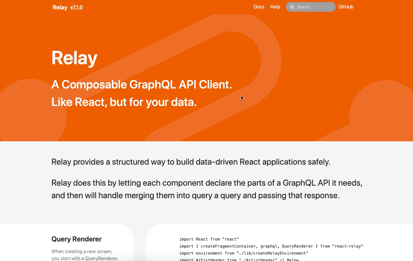 Pull Request resolved: #2953 Reviewed By: josephsavona Differential Revision: D19025678 Pulled By: jstejada fbshipit-source-id: 7493097b666aeda09e92bfd4a94eb9f1a06c3de2
Summary: New relay home page ui See #2696 Final result: http://luansantosti.github.io/ This is the first step to improve the relay home page. Ps: Need to check the docs links if it's ok, there's one missing an url. The code example Orta will add the hightlights sintax to improve it. cc orta  Pull Request resolved: #2953 Reviewed By: josephsavona Differential Revision: D19025678 Pulled By: jstejada fbshipit-source-id: 7493097b666aeda09e92bfd4a94eb9f1a06c3de2
|
This issue has been automatically marked as stale because it has not had recent activity. It will be closed if no further activity occurs. Thank you for your contributions. |
|
can we close this? |
|
This issue has been automatically marked as stale because it has not had recent activity. It will be closed if no further activity occurs. Thank you for your contributions. |
👋 - continuing my design work on the Artsy Omakase stack: prettier/prettier#3669 jestjs/jest#7265
Like with the re-designs above, this issue is a call-to-action for someone to help out in building the design - I'm happy to come in once there's some WIP and help out but I'd rather live in design world first.
This keeps the same logo, and color scheme - I like the simplicity of the Relay logo (and how it fits with what Really does) and the color scheme doesn't offend me. That said I don't use the orange that much In here outside of the large header, so, eh, whatever it's mostly a highlight color in my mind.
What were my goals?
I explicitly aimed for much more toned down design in favor of the more colorful other designs, Relay feels like serious work,
Link to explore
on Figma
Desktop
Mobile
Coming later
Notes
The text was updated successfully, but these errors were encountered: