Download KML file for Google Earth Here
On August 3, 2015 the Clean Power Plan was finalized by the U.S. Environmental Protection Agency. This was accompanied by both celebration and controversy. The coal industry in particular is quite concerned over the impacts that this may have on their industry.
The US states differ considerably in terms of how much coal they mine and how much they use for electricity generation. This visualization allows you to explore the web of dependencies between both the mining and consumption of coal.
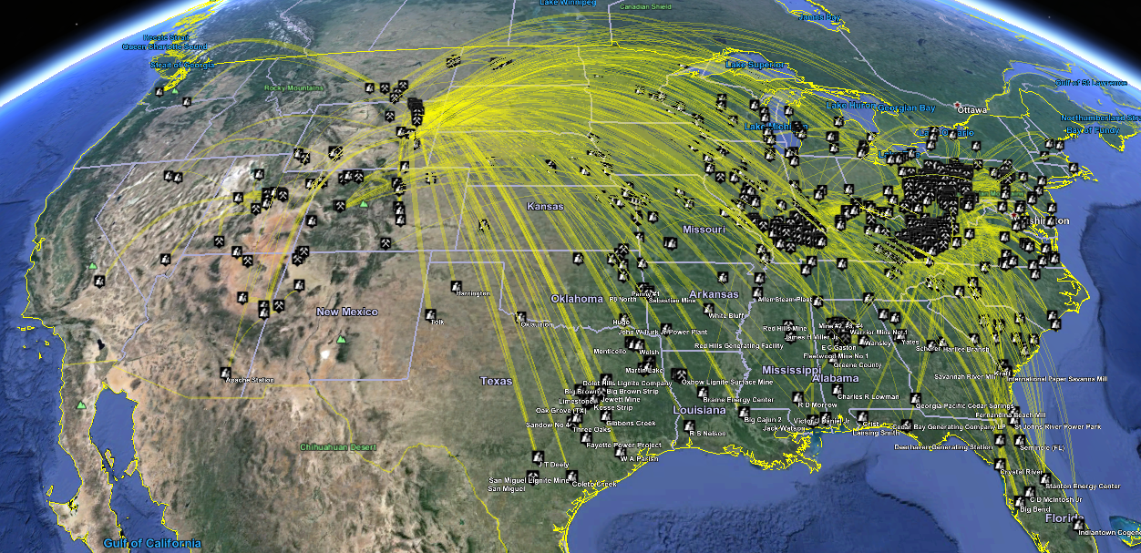 Exports from Wyoming dominate the landscape, with a much lesser amount coming from Appalachia.
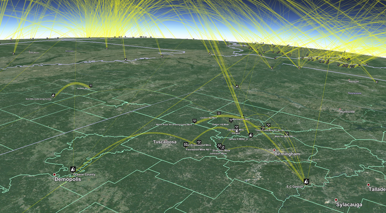
Coal-fired power plants in Alabama source much of their coal from local mines. On the horizon, Wyoming can be seen with its coal exports to the rest of the nation.
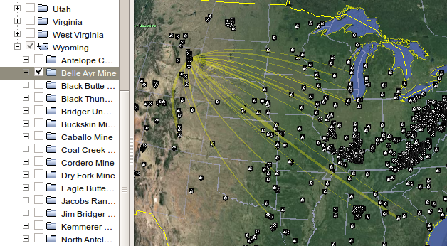
By selecting folders in the sidebar you can see the destinations for all the coal mined within a state or all the origins for all the coal consumed by power plants within a state. You can make further subselections on individual mines or power plants.
The visualization is based on shipment data from 2013 and is constructed using the following sources:
- Data on mines and their locations is from the U.S. Department of Labor Mine Safety and Health Administration
- Power plant coordinates sourced from EIA Form 860
- Shipments from coal mines to power plants sourced from EIA form 923
- Map icons are sourced from the Maps Icons Collection
Make sure to open this as a project in RStudio as this will take care of all path issues. The main file to run is CreateVisualization.R, which will call the rest of the code and download the data directly from the websites of the various government agencies. Make sure that you have the specified libraries installed, and everything should work out of the box, with a new US-Coal-Mines-and-Powerplants.kmz being generated.
I can be reached at chris@cbdavis.org