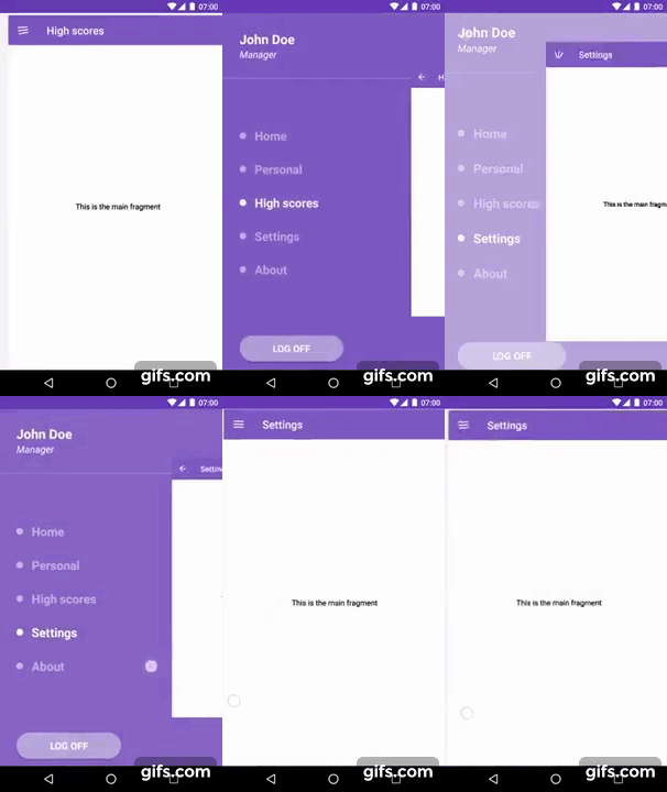
This Android library provides an easy way to create an alternative navigation drawer for android. Instead of a drawer that slides over the main content of the Activity, this lets the content slide away and reveal a menu below it.
By default it applies a scaling effect on the content and menu.
If you're still using legacy Android Support libraries you can use v2.0.8. AndroidX is supported by default since v3.0.0.
The demo app is included in the app module in this project.
You can download a jar from GitHub's releases page.
Or use Gradle:
repositories {
    mavenCentral() // jcenter() works as well because it pulls from Maven Central
}

dependencies {
    compile 'nl.psdcompany:duo-navigation-drawer:3.0.0'
}
Or Maven:
<dependency>
  <groupId>nl.psdcompany</groupId>
  <artifactId>duo-navigation-drawer</artifactId>
  <version>3.0.0</version>
  <type>pom</type>
</dependency><nl.psdcompany.duonavigationdrawer.views.DuoDrawerLayout
xmlns:android="http://schemas.android.com/apk/res/android"
android:layout_width="match_parent"
android:layout_height="match_parent"
... />Add the a content view to your drawer by adding the attribute: app:content to your drawer.
<nl.psdcompany.duonavigationdrawer.views.DuoDrawerLayout
    xmlns:android="http://schemas.android.com/apk/res/android"
    app:content="@layout/content"
    ... />
or, you can also add a view within the drawer with the tag content.
<nl.psdcompany.duonavigationdrawer.views.DuoDrawerLayout
    xmlns:android="http://schemas.android.com/apk/res/android"
    ... >

    <FrameLayout
        android:id="@+id/container"
        android:layout_width="match_parent"
        android:layout_height="match_parent"
        android:tag="content"
        ... />

</nl.psdcompany.duonavigationdrawer.views.DuoDrawerLayout>Add the a menu view to your drawer by adding the attribute: app:menu to your drawer.
<nl.psdcompany.duonavigationdrawer.views.DuoDrawerLayout
    xmlns:android="http://schemas.android.com/apk/res/android"
    app:menu="@layout/menu"
    ... />
or, you can also add a view within the drawer with the tag menu.
<nl.psdcompany.duonavigationdrawer.views.DuoDrawerLayout
    xmlns:android="http://schemas.android.com/apk/res/android"
    ... >

    <FrameLayout
        android:layout_width="match_parent"
        android:layout_height="match_parent"
        android:tag="menu"
        ... />

</nl.psdcompany.duonavigationdrawer.views.DuoDrawerLayout>The API of the DuoNavigationDrawer is mostly the same as the original DrawerLayout from the Android design library. Same for DuoDrawerToggle which is a modified version of the ActionBarDrawerToggle to support the DuoDrawerLayout.
DuoDrawerLayout drawerLayout = (DuoDrawerLayout) findViewById(R.id.drawer);
DuoDrawerToggle drawerToggle = new DuoDrawerToggle(this, drawerLayout, toolbar,
        R.string.navigation_drawer_open,
        R.string.navigation_drawer_close);

drawerLayout.setDrawerListener(drawerToggle);
drawerToggle.syncState();If you want your menu to look like the demo. you should consider using the DuoMenuView For more info using the DuoMenuView click here.
All values are Float values. The default values are used in the example.
The scaling applied on the content when sliding it from left to right.
app:contentScaleClosed="1.0"
app:contentScaleOpen="0.7"The scaling applied on the menu when sliding the content from left to right.
app:menuScaleClosed="1.1"
app:menuScaleOpen="1.0"The scaling applied on the click to close surface when the drawer is open.
app:clickToCloseScale="0.7"The alpha on the menu when sliding the content from left to right.
app:menuAlphaClosed="0.0"
app:menuAlphaOpen="1.0"This value is used to calculate how much of the content should be visible when the content is slided to the right. This is calculated with the width of the DuoDrawerLayout when: getWidth * marginFactor. So setting this to 1.0f will slide the content out of the activity. The default is 0.7f.
app:marginFactor="0.7"Feel free to apply your app to the list by sending me an email with a link to your app in the play store.
- Alexander Pot - alexander.dpot@gmail.com
If you'd like to support DuoNavigationDrawer development, you could make some donations here:
Thank you very much in advance!
Copyright 2017 Alexander Pot

Licensed under the Apache License, Version 2.0 (the "License");
you may not use this file except in compliance with the License.
You may obtain a copy of the License at

   http://www.apache.org/licenses/LICENSE-2.0

Unless required by applicable law or agreed to in writing, software
distributed under the License is distributed on an "AS IS" BASIS,
WITHOUT WARRANTIES OR CONDITIONS OF ANY KIND, either express or implied.
See the License for the specific language governing permissions and
limitations under the License.


