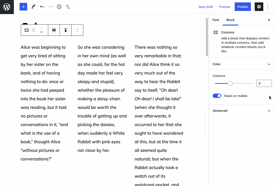
Columns block: Add stack on mobile setting to allow for columns without mobile breakpoints #31816
Conversation
|
I've fixed up the deprecations to add in the new attribute, and added another set of test fixtures to cover the class name in the markup ( |
|
Thanks for the PR @andrewserong! This works well in my testing:
These double negatives are my only real hesitation here — you're right that it's confusing to read. I do really appreciate that this works so nicely though. It doesn't break or modify any existing columns at all and that's the most important part. I'd like to cc @jasmussen for a second opinion, but if it seems ok on his end then I think we're good to go. |

|
One problem with media queries is that they work best in the site editor/iframe, even if there's some query handling in the post editor also. To that end, I've been exploring some container-query-esque alternatives, that I think we might be able to use here as well, in https://codepen.io/joen/pen/wvJMdGr. Question: if we land this with media queries as is, how are we on the deprecation front if we were to move to a media-query-less alternative as shown above instead? If that's a headache, we might want to postpone adding this feature. |
|
I see some strange behavior when the columns are unequal widths. In the screenshot the 50/50 columns are okay, but the 30/70 and 25/50/25 columns are not.
It seems that in viewport 782px and above, the columns |

|
Did you consider the grid based container query approach? Adding
The benefit is reduced CSS, working with container widths instead of viewport widths, and moving towards an intrinsically responsive future for the block which I'm starting to think has more potential than a media query based one. |

Thanks for spotting this one @Sandstromer! I've added in the
Really interesting ideas, thanks @jasmussen! And the Logrocket blog post linked through from your codepen is a great read. It does feel like CSS grid would be a neater approach for this block, and I'm aware my PR adds some additional complexity to the existing styling. A couple of concerns from the top of my mind in moving to CSS grid would be where are we at with dropping IE11 support on the front end of users' sites? And would that change negatively affect any themes, if they're expecting media queries to be used? I wonder if there's a decent-enough IE11 fallback we can include if need be?
That's a great point. Particularly for the kinds of patterns we might have in mind, a container based query (or something like it) more closely matches how we'd expect the block to behave. I'm happy to have a go at exploring the CSS grid approach...
In terms of potential blockers, since we're not significantly changing the markup for the block, but only adding a single class in this PR, I don't think we'll run into any deprecation issues so long as we maintain the same visual rendering of the block for end users. So if CSS grid support isn't quite there yet, we could always go with what's proposed so far, and iterate to move toward CSS grid in follow-ups, provided we're happy with the additional classname / toggle in this PR. |
|
The toggle to stop from collapsing to columns on mobile seems fine to add, so we might pragmatically want to land this after all. I just think we'll ultimately want to move to CSS grid for columns entirely, and avoid optimizing too much for the current flexbox system. Re-reviewing it seems there's as much red as there is green in this PR. The Media & Text block also adds the additional class, so it's probably fine.
One of the things that excites me the most about the recent decision to drop of support for IE11 is how much leaner and smarter we can build things in the future. Things like That said, I recognize that we'll probably be fine with this PR as an interim step on the path to bigger and better things. Thanks for the effort and for entertaining a refactor! (That said, if we can avoid a |
Yes, I'm particularly excited too about potentially using |
|
I've forked from this PR to hack away at the CSS grid approach. I think it seems promising... just saving my progress with this link to my hack WIP (no need for anyone else to look at that yet), but I'll continue on with exploring it on Monday. |
|
I've opened up a separate WIP PR to look at CSS Grid support as it's a bit different to the idea in this PR. I'll follow up with further discussion over on #32137 — to be able to support non uniform column widths (e.g. 25% 50% 25%) I'm not sure if we'll be able to avoid media queries to break down the layout on smaller widths, unfortunately (but very happy for feedback and ideas, of course!). But I'll continue exploring over in that draft PR. |
I just retested and this does appear to work ok to me. Should we consider merging this while we wait for a broader grid-based solution to land? Or do we feel that #32137 is close enough, and we can add this control to that PR? (I think either way, we're going to end up with some weird |
|
Thanks for giving this one another test! I definitely went down the rabbit hole investigating CSS Grid support for columns, so it might be more pragmatic to rebase and clean up this PR and get it in sooner if thats preferred. I agree, I think we’re still going to have some awkward rules to get this working, so I’m open to getting this in before some of the others. I’m at the end of my week, but can give this a rebase and take another look next week. |
 andrewserong
force-pushed
the
add/columns-stack-on-mobile-option
branch
from
andrewserong
force-pushed
the
add/columns-stack-on-mobile-option
branch
from
08d4199
to
2076c72
Compare
|
I've given this one a rebase and re-tested, I think it's still working as intended, if anyone would like to give it a review, and if we think this PR is an acceptable change (with all the |
There was a problem hiding this comment.
This works great in my testing, in both the front and back end:
| Desktop | Mobile |
|---|---|
 |
 |
I'm ok with the :not() rule, and it would be great to have this merged in while we continue to work on trying out grid. I'd love to see if @jasmussen or someone else can give this one last gut check before merge though.
Thanks for your work on this, @andrewserong!
|
Took it for another spin:
While I still think there's huge potential in grid and gap in the future, this does seem like a pragmatic and relatively safe step forward that as shown solves a bit of an issue present. I still think the Looking at this one: So in principle, 👍 👍 on this moving forward, but I'd love a good code review, CC: @WordPress/gutenberg-core Thanks for the work Andrew! |
There was a problem hiding this comment.
Thanks for working on this! The code looks good, and testing shows everything working as expected ✅
A couple of thoughts for future improvements:
- If we didn't enforce two equal width columns at medium-small breakpoints, but only moved to single column at small, we could do away with those
!importantflex basis altogether, as even fixed width columns would only needflex-grow: 1to go 100% in single column. It might be worth checking how useful the two-column behaviour actually is and if we really need it (is it annoying users? are theme authors working around it? are there open issues about it? etc.) - Love the idea of using grid! I did a POC for grid layout in Columns a couple years ago, when we were having issues with the adjustable widths. Main findings:
- in combination with custom properties it reduced the amount and specificity of the CSS dramatically;
- the UI for setting the width of each column separately becomes awkward, because the styles are now set at the Columns block level instead; it made me wish we could either drag the columns themselves to the required size, or have a sort of layout-builder interface where we set all the widths at the parent columns level. Now that we can set fixed widths in different units for each column, that might not be super straightforward though 🤔
I'd also be keen to see some experimentation similar to @jasmussen 's codepen, though fixed width support might also be an obstacle there. Specifically, if we have a combination of fixed column widths and the expectation of a responsive layout by default, we'll probably still need some media queries.
| @@ -28,66 +28,89 @@ | |||
| &.are-vertically-aligned-bottom { | |||
| align-items: flex-end; | |||
| } | |||
|
|
|||
| &:not(.is-not-stacked-on-mobile) > .wp-block-column { | |||
There was a problem hiding this comment.
What is the benefit of moving these rules inside &:not(.is-not-stacked-on-mobile) > .wp-block-column?
These previously were on .wp-block-column directly, and it was a lot cleaner. I haven't checked, but would it not be simpler to have these in .wp-block-column like before, and then simply override these rules where necessary in &.is-not-stacked-on-mobile?
Is there a reason I'm missing for the added complexity?
There was a problem hiding this comment.
The main benefit is that using the :not() rules avoids duplicate code. There are also some !important rules here, so we'd need to override those with more !important rules. 😅
There was a problem hiding this comment.
Yes, it's an awkward rule, but results in fewer lines of CSS, while preserving the existing styling / similar specificity. I couldn't quite come up with a neat way to handle it otherwise, so it was a bit of a trade-off! 😅
|
Thanks for all the work on this everyone. Very much looking forward to this! It is definitely needed. I have tested and it does the trick. |
|
Thanks for all the reviews and feedback, everyone! (And for merging this in while I was AFK, Kjell!) Great points re: styling specificity, mobile breakpoints, and things we can continue to improve in follow-ups. Hopefully we can address some of these in the context of the work on gap support, and explorations into CSS Grid. But for now, I'm pleased we're able to get this feature in. Thanks! |
…ut mobile breakpoints (#31816)

* Columns block: Add stack on mobile setting

* Update selector to specify the direct child

* Fix deprecations to include the new attribute, add another set of test fixtures

* Add nowrap to is-not-stacked-on-mobile

Co-authored-by: Andrew Serong <andrewserong@users.noreply.github.com>
Proposal to fix #31248
Description
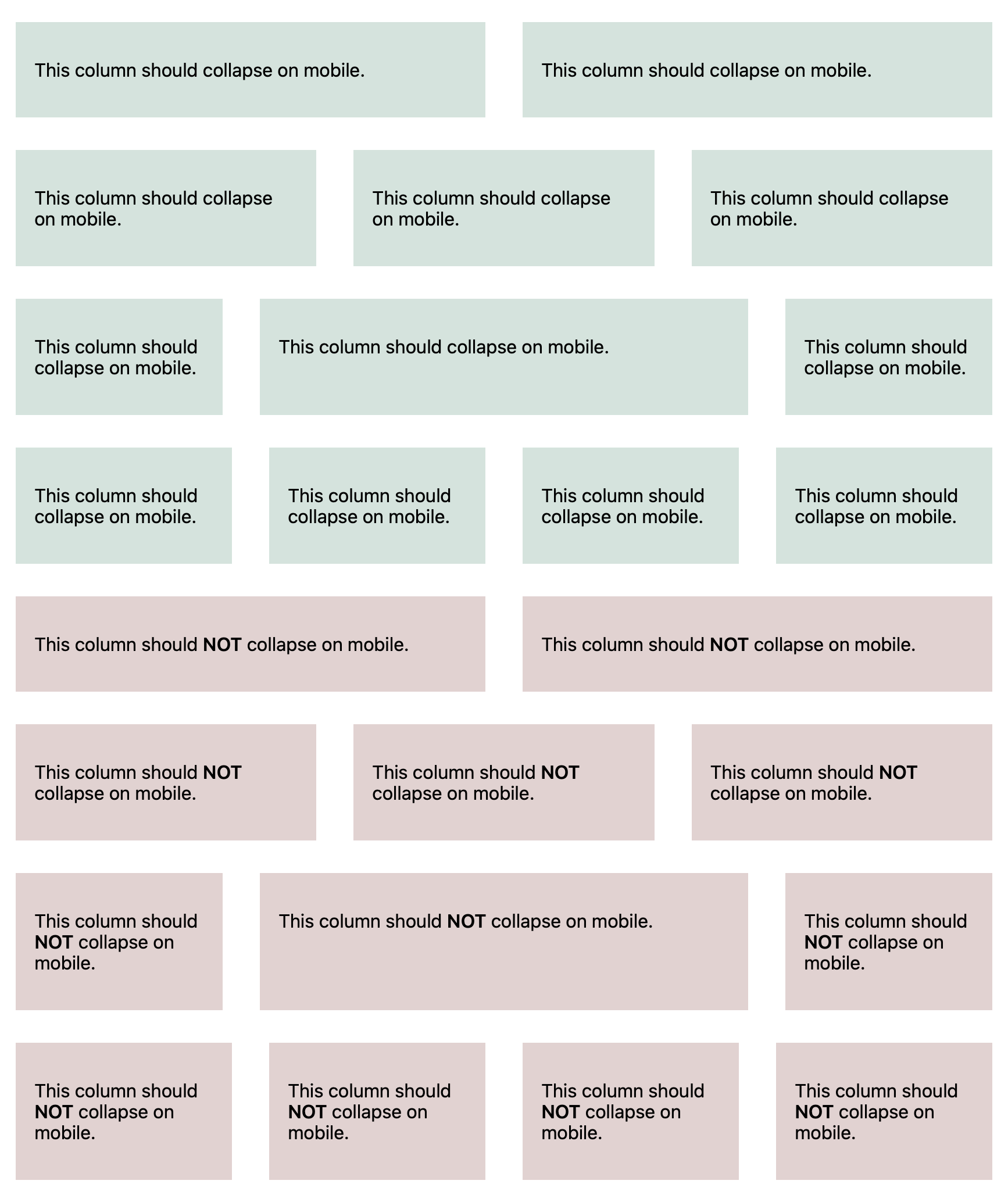
This PR adds a stack on mobile setting to the Columns block, set to true by default, so that it can be disabled for cases where we don't want the stacked behaviour. Good examples could include logo / social media links in a footer or header.
true.is-not-stacked-on-mobileclass isn't present.There are some double negatives here, which might be confusing to read, however it helps us to ensure that we treat all existing Column(s) blocks as stacked on mobile, by default.
How has this been tested?
Manually.
stack on mobileflag, and check that the.is-not-stacked-on-mobileclass is being added to the parent Columns block.Screenshots
Types of changes
Checklist:
*.native.jsfiles for terms that need renaming or removal).