NUX: Make tips appear inline #16582
NUX: Make tips appear inline #16582
Conversation
 noisysocks
added
[Type] Enhancement
noisysocks
requested review from
aduth,
ajitbohra,
ellatrix,
gziolo,
jorgefilipecosta,
nerrad,
ntwb,
talldan and
youknowriad
as code owners
noisysocks
force-pushed
the
add/inline-tips
branch
from
noisysocks
added
[Type] Enhancement
noisysocks
requested review from
aduth,
ajitbohra,
ellatrix,
gziolo,
jorgefilipecosta,
nerrad,
ntwb,
talldan and
youknowriad
as code owners
noisysocks
force-pushed
the
add/inline-tips
branch
from
076a1e1
to
2011a87
Compare
| // Options modal, which looks totally weird. | ||
| DeferredOption | ||
| ); | ||
| )( BaseOption ); |
|
This is looking great so far!
I hadn't realized that Notices have such super-tall top and bottom margins. 😄 I separately opened #16589 to clean that up. |


| @@ -370,7 +370,8 @@ The default editor settings | |||
| bodyPlaceholder string Empty post placeholder | |||
| titlePlaceholder string Empty title placeholder | |||
| codeEditingEnabled string Whether or not the user can switch to the code editor | |||
| \_\_experimentalCanUserUseUnfilteredHTML string Whether the user should be able to use unfiltered HTML or the HTML should be filtered e.g., to remove elements considered insecure like iframes. | |||
| **experimentalCanUserUseUnfilteredHTML string Whether the user should be able to use unfiltered HTML or the HTML should be filtered e.g., to remove elements considered insecure like iframes. | |||
| **experimentalEnableTips boolean Whether or not tips aimed at new users should appear in the UI. | |||
There was a problem hiding this comment.
I don't know why npm run docs:build has replaced the __ with ** 😕
|
This is looking really good. I just tested this today and noticed a few things.
|

|
@mapk: I'm working off this comp which has the confirmation as a modal. Currently using an |
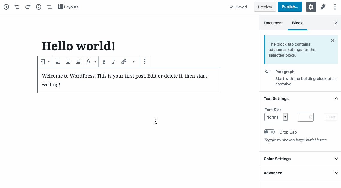
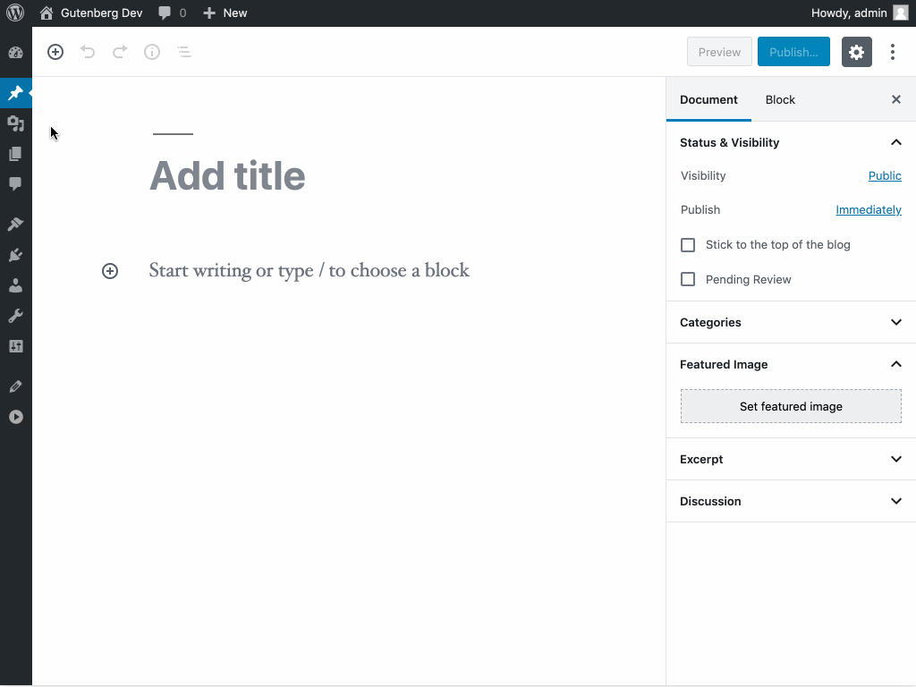
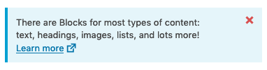
Improve the usability of NUX tips by making them appear as inline
notices rather than floating popovers.

Adds a new InlineTip component to accomplish this.
noisysocks
force-pushed
the
add/inline-tips
branch
from
48652f9
to
74e3205
Compare
noisysocks
force-pushed
the
add/inline-tips
branch
from
74e3205
to
7333838
Compare
|
This should be ready for a final review! 🙏
|
There was a problem hiding this comment.
I was really close to approving, but then I spotted some issues in testing, probably all related. 😭
-
When opening the confirmation modal from the insertion menu, focus isn't moved to the modal, you can see it's still in the inserter.

-
The modal can be closed by clicking outside. I feel like this is too easy to do given how small the modal is. It's also unusual for these kind of confirmation modals to be closable in this kind of way. One other thing is that the inserter menu closes as well when this happens:

-
That leads onto the next issue, which is that focus isn't transferred back to the right place when the modal is closed using the escape key (I imagine because it's not there any more):

I wonder if it's because the insertion menu has some logic for trapping keyboard input (I might've written it 😬): https://github.com/WordPress/gutenberg/blob/master/packages/block-editor/src/components/inserter/menu.js#L242-L247
Might also be a good use case for IgnoreNestedEvents, not sure as I haven't used that component much.
| const classes = classnames( | ||
| className, | ||
| 'components-notice', | ||
| status ? 'is-' + status : undefined, |
There was a problem hiding this comment.
It's really minor, and I don't care so much if it gets merged without it, but I notice this has changed and I think it could go in the object below.
Also wondering if status should be kebabbed for ultra safety:
[ `is-${ kebabCase( status ) }` ]: status,
| > | ||
| <div | ||
| className="components-notice__content" | ||
| <Fragment> |
There was a problem hiding this comment.
This snapshot now seems a bit pointless!
| * WordPress dependencies | ||
| */ | ||
| import { Notice } from '@wordpress/components'; | ||
| import { shallow, mount } from 'enzyme'; |
There was a problem hiding this comment.
I'm wondering if it is actually worth nuking these tests. E2E tests seem to cover the same ground.
| @@ -51,6 +53,11 @@ const BlockInspector = ( { | |||
|
|
|||
| return ( | |||
| <> | |||
| { enableTips && ( | |||
| <InlineTip tipId="core/editor.blockInspector" className="block-editor-block-inspector__tip"> | |||
There was a problem hiding this comment.
Should it be "core/block-editor.blockInspector" now? Would there be issues with localstorage keys if that changed?
| const { disableTips, dismissTip } = dispatch( 'core/nux' ); | ||
| return { | ||
| onDismissTip: () => dismissTip( tipId ), | ||
| onDisableTips: disableTips, |
There was a problem hiding this comment.
Nitpick - The prefix 'on' seems like it could be changed. Usually I'd expect something prefixed with 'on' to be an event handler prop on a component, but this is an action dispatch and most of those just start with a verb. I found the usage in some of the functions above looked a bit unusual.
|
One more little tidbit to note... I just noticed the hover color for the close
|
Yeah, that's part of the Notice component. I've started #16926 to fix that. |
noisysocks
added
the
[Status] Blocked
|
Hitting the ⏸ pause button on this until #16592 is resolved. |
|
Quick note on this one: we'll keep this PR closed, and will pick up the new changes proposed in #16315 (comment):
|
Implements part of #16315.
Improve the usability of NUX tips by making them appear as inline notices (via a new
InlineTipcomponent) rather than floating popovers.To test: