Consolidating WordPress Icons #20284
Comments
 mtias
added
[Feature] UI Components
mtias
added
[Feature] UI Components
|
I am very excited to see this type of work going on. Yes, it's going to mean changes, but having a robust and clear icon set we use going forward is really going to be a great foundation. I think right now, it's important to see this also as iterative. I would like many love to wave a wand and have this through everything today, but we have to start somewhere and in the editor, by the block, makes a lot of sense. We have the freedom of the plugin to refine, explore and then iterate across the entire experience of WordPress. Thanks for all the hard work @pablohoneyhoney and @mtias in pushing the little details and refining them. |
|
Really good work here! Remembering back to this post, it's been a long time coming. Starting somewhere is necessary, and I believe building upon the block icons was the right move. Having a Figma file for collaboration is wonderful. Should people follow standard Figma proposal procedures for requesting new icons? |
|
I was never the biggest fan of the Material icons, but one of the touted advantages that won me over was how easy it would be for third parties to find visually compatible icons without repeatedly reusing the limited set of dashicons. Now, looking at going back to a custom or semi-custom set, doesn’t this put us in the same position as before with a limited set of icons reused in many disparate places, and likely a growing backlog of icon requests? |
|
Important question to bring up, Chris, that was one of the main reasons for leveraging the vast Material set. But we can still do that, continue to use Material icons for blocks. One of the earliest conversations we had, this one, we discussed exactly how we could remove the bottleneck that was icon requests through adopting something like Material. But part of that conversation was to also keep some of the flavor, the identity of WordPress, through modernizing the icon set that defines WordPress. Keeping with that spirit, this set of icons is a WordPress icon set, designed with the same 24px grid that Material icons are. I recognize they optically diverge in the stroke width, but in a way that is embracing the diversity that is WordPress and the ecosystem:
More importantly, this icon set is designed to fit right into the G2 UI, stepping into the background and blending into the UI itself, letting you focus on the content: the blocks. And blocks can continue to use the material set. |


|
Thanks for the clarification @jasmussen. Knowing the new icons are designed within the same grid parameters as the Material set is very helpful; I think I had misread and thought the grid was changing as well. Since it remains consistent I think this is totally reasonable! |
|
As you can see above, we just merged the first pass 🎉 It's a great way to test G2 as a whole, and the icon component. But let's keep this ticket open to continue inviting feedback on the individual icons. I expect to submit many followup PRs. |
|
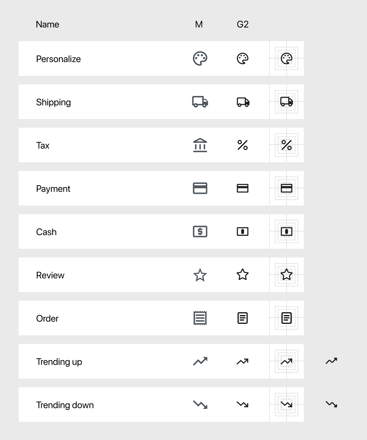
With the valuable feedback here and in the Figma itself by @ZebulanStanphill, along with seeing the icons in context, I did another pass at some of them. Below a few more iterations. With a dot instead of a square: A more natural bulb (still working on other options) Bullet list revisions An also added a few new ones:
|


|
I know the current tip icon is a bit abstract, but I think I like it quite a bit more for this purpose (tips) because of it. The more realistic lightbulb (with the rays coming out) feels a bit too gimmicky. This is more of an emphasis that can grow to be associated with helpful tips. We could consider something closer to a question mark, but that could also be too heavy handed (they imply a response has to be made). |
|
I've created some icons that would be handy for us over at WooCommerce (though I believe these would serve a universal purpose): I tried to base them on existing WordPress Icons wherever I could find similarities, but they should be considered a first-pass, so I'd love to hear any feedback. They can be found in Figma here. |
|
Relevant to the above: #21209 (comment) |
* Update Page icon to match G2 design language

* Add "Institution" icon

* Add "widgets" icon

* Add "product" icon

* Add "receipt" icon

* Add "trending up" icon

* Add "trending down" icon

* Add "money" icon

* Add "review" icon

* Add "percent" icon

* Add "payment" icon

* Add "shipping" icon

* Add "personalize" icon

* Revert "Add "widgets" icon"

This reverts commit 1f6211a.

* Add "inbox" icon

* Update "page" icon

* Update "receipt" icon

* Update "shipping" icon

* Tidy up and rename "institute" icon

* Revert "Add "personalize" icon"

This reverts commit 41c7486.

* Update "review" icon

* Revert "Add "money" icon"

This reverts commit 1f15282.

* Add "dollar" icon

* Add "pound" icon

* Add "euro" icon

* Capital P, dangit!

Also addresses some indentation issues in the code.

* Prettier linting

* Tabs not spaces

* Add icons

* Update tests

* Update "review" and "receipt" icons

* Update "shipping" icon

* Update "trending up" icon

* Update "trending down" icon

* rename "product" to "box"

* rename "review" to "star"

* update test snapsnots

* Rename "institute" to "institution"

* Prefix currency icons with "currency-"

* Update test snapshots

* svg case in xmlns attribute

* Update test snapshots

* Update test snapshots again
|
would it be possible to add the color-picker dashicon to gutenberg? I started porting the SVG from https://github.com/WordPress/dashicons/blob/master/svg-min/color-picker.svg but I'm not sure if that's enough, see master...JohnRDOrazio:add-color-picker-icon |
|
Hello @JohnRDOrazio, thanks for the PR! I do think there's a place for a color picker icon, generally. But we're still trying to figure out when to add icons to the core icon component, currently the emerging answer is to only add icons when the icon is used in the project, which the color picker isn't yet. When an icon is part of the component library, plugins and developers can do this However even if an icon is not part of the component library, you can do this, and essentially have the same end result: Depending on your use case, and until such a time as a color picker icon is added to the project, maybe the above code sample can help? |
|
hi @jasmussen, that is pretty much what I'm doing for now in my code, I'm creating it manually: const colorizeIco = createElement('svg', {
'aria-hidden': 'true',
focusable: 'false',
width: '20',
height: '20',
role: 'img',
'viewBox': '0 0 22 22',
xmlns: "http://www.w3.org/2000/svg"
}, createElement('path', {
d: "M0 0h24v24H0V0z",
fill: "none"
} ), createElement('path', {
d: "M17.66 5.41l.92.92-2.69 2.69-.92-.92 2.69-2.69M17.67 3c-.26 0-.51.1-.71.29l-3.12 3.12-1.93-1.91-1.41 1.41 1.42 1.42L3 16.25V21h4.75l8.92-8.92 1.42 1.42 1.41-1.41-1.92-1.92 3.12-3.12c.4-.4.4-1.03.01-1.42l-2.34-2.34c-.2-.19-.45-.29-.7-.29zM6.92 19L5 17.08l8.06-8.06 1.92 1.92L6.92 19z"
}) );And I just tested importing const colorizeIco = createElement(Dashicon, { icon: 'color-picker' } );So yes I can make do. My confusion was coming from the fact that in the documentation / tutorials it is stated that
And Dashicons icon set links to https://developer.wordpress.org/resource/dashicons/ . I was surprised however when most icons did work but a few didn't. Perhaps the tutorial should state something along the lines of "You can choose an icon from most of the icons included in the built-in Dashicons icon set. If you would like to use an icon that is not directly available by it's Dashicon tag, you can import the full Dashicon set from |
Ah, this is an excellent point. I believe that the dashicons resource you're linking to has recently been updated with a new version of the icon font, that has some 30+ new icons, perhaps including that very same color-picker. However it's very possible that the NPM component for Dashicons was not yet updated (with the code that's built here) — @youknowriad should we update this? It will be the last Dashicons component update as the project is now winding down. I'm happy to make the PR. |
|
Closing this out as much of this work has been done. Let's open individual issues for any more recent icon updates that are needed. |
Related Issues: #9647, #17055 and #18667.
With the fresh introduction of
@wordpress/iconswe have a much better baseline from which to operate and distribute iconography. It's extensively covered in the different issues above that there's currently a mix of icons between the historical dashicons, specific custom icons created during the editor project cycle, and the use of some Material design icons either directly or inspired by. These have been done as necessity dictated. @jasmussen summarizes some of the design issues at play in this comment. Outside of those, there have also been concerns with licenses and visual incompatibilities to consider when considering Material icons.So the
@wordpress/iconspackage is a stepping stone towards achieving an ever-growing set of open source & well-designed icons for WordPress that takes advantage of larger icons, better legibility, and a scaling grid for mobile contexts.In the process of exploring the design update of #18667 @pablohoneyhoney began to update some of the iconography in use (starting with block icons) with these principles in mind, and the results (from my perspective) have been wonderful. There has also been a proliferation of icons in dropdown menus that is unnecessary in places, prompting an opportunity to reevaluate these more coherently. The overall visual update also favors higher contrast colors in borders and text instead of subdued grays, so tweaking the icons to favor this presentation helps a lot.
That work has been happening on the figma files if you want to check it out and comment. (Also hopefully much easier to contribute there for designers.)
It's important to consolidate on a highly reusable icon component for block and plugin developers in the
wordpress/iconspackage as that would allow us to control the entry point and swap out specific implementations of individual icons gradually as time and effort permits. There are also some early questions about how it could or whether it should propagate with some of the component set to other places of the admin interface, for which this coalescing would be helpful.The text was updated successfully, but these errors were encountered: