Add light borders + padding to show the relationship between parent and child blocks. #14935
Comments
 kjellr
added
[Type] Enhancement
kjellr
added
[Type] Enhancement
|
I like this proposal, it would partially address the issue I raised when testing Group block (#14920 (comment)). There is no way to visually confirm that you inserted Group block as what user sees is Paragraph block. |

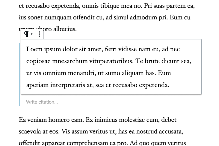
I've started #14961 to kick this off, but will still need help adding that extra class to the parent block. Here's what it looks like in the meantime:
|

|
Just posting my +1. Very much in favor of making borders visible when blocks are not selected, but would also like to see them even before you hover on them. This would make it a lot easier to drag and drop, because then, you can see where you actually want to drop it. I made a simplified demo myself (before checking this issue, so there may be some overlap or conflict with this issue): |
|
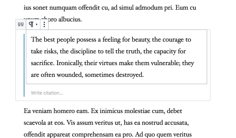
Kjell, inspired by your work here I meant to explore additional ideas. I didn't quite get as far as I wanted, but wanted to post some work in progress just to share the direction. The following assumes the quote block has nesting. Just click any text inside it and you select a paragraph:
But note how the parent — the quote block container — is still sort of selected. It shows the "write citation", and the block border is expanded outwards, and you see a dimmed version of the block type indicator. Click that to select the parent:
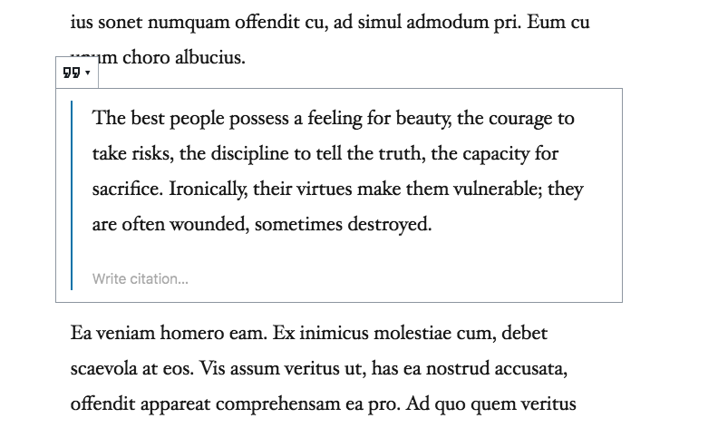
In an alternate direction, I explored a more card-based metaphor:
Now as soon as you hover a child there, the parent block outlines appear. I.e. they aren't visible until you hover — the idea being that this interface we're looking for is only for mouse users, there are already keyboard affordances for selecting the parent — just press the up arrow. So you only see the parent outlines on hover, and they are artificially wider to make them clickable:
Still a work in progress, but wanted to share. |

|
Thanks for sharing the explorations, @jasmussen! Some quick thoughts:
That is really interesting! The parent block icon does a great job of communicating the block hierarchy at a glance, and is functionally useful too. 🙌 Are you envisioning that the parent block icon would always be located to the left of the current block's icon? That works great in the screenshot example, but I imagine it may not work as well for child blocks that aren't near the top (like the citation field for instance). Also — in your example, you're not showing borders on any of the child blocks. I'm a little torn about this. One one hand, we're generally not showing borders on blocks, and it mostly works fine. But on the other hand, I do see how those borders are really useful in the context of #14961. I'd love your thoughts on that.
Showing the outlines only on hover might work. I feel like it's something that needs to be tried to be fully evaluated. In my PR, I worried that having both additional padding and borders on hover may be too much going on. But there may be some way we can design around that. 🤔 Your card-based exploration is interesting too — I wonder how it'd look in the context of the rest of the interface, since we don't actually have too many super-clear "levels" like that. In general, great explorations. 🙂 Thanks for taking the time to look into this! |
Thanks for asking about that, I meant to clarify and this is a good option to do so. What I'm picturing is this: When you select a child block, the parent block expands the width of the icon, 24px, to make room for its block icon. When you click that parent block icon to select it, the padding collapses back in. Or maybe only the icon is present for the parent — it's definitely something whose next step is a codepen which I'll take a look at. What about mobile, you ask? Well, aside from a buggy implementation, the mobile implementation is actually currently pretty decent — to the point that I think it's worth making opt-in for some complex blocks on desktop as well. It uses the click-through. Click the quote to select it and "unlock" the contents. Now you can select the contents. Like selecting inside groups in Figma or other traditional apps.
Yes, I don't have super strong feelings on this, and I think we could go both ways. Mostly I think it's one of those things that are worth trying out to get a feel for it. It's always different in a mockup than it is in implementation, and I recall it working well in your branch. Don't take the absence as critique, rather: divergent explorations — same with the card based experiment :) |
|
Okay, took a stab: https://codepen.io/joen/pen/VNOZoe?editors=1100 — it's not as compelling or scalable as I'd hoped — it definitely takes into account that the block toolbar of a child might overlap the icon, but that doesn't look good in cases where the block toolbar does not overlap. |
|
Thanks for bringing that into a codepen! It's interesting to see. In general, it ends up looking a lot like the original mockups above, but with the icon of the block parent's toolbar visible. This is somewhat helpful in that it gives you something nice and obvious to click to switch to that block, but in practice it also strikes me as potentially unnecessary? I'm not sure it's necessary to know what type of block the parent is, and the added padding and block borders already indicate the area you can click on.
This is an interesting approach too — I really like how it doesn't force things to scale down and move around a lot. Full-width parent blocks may be a problem, since we can't expand outward there. 😕 I'm sure there's a decent solution though... |
Definitely agree. Finding the edges of blocks is a trial and error process, which deters users from experimentation. Not ideal for learning a new editor. If user's can't distinctly see the cause/effect of what they're doing, they just won't do it (I've managed to coax a single user into dragging a block into another block. The rest are understandably confused.) Like #12515 (comment) and #13482 Permanent borders would be a drastic improvement, accessibility wise. |
 tellthemachines
added
the
[Status] In Progress
tellthemachines
added
the
[Status] In Progress
|
Should this issue be closed? #14961 added borders, and then they were removed again by #18105. Additionally, the G2 design direction in #18667 and #19344 is even removing the border around the selected block. The select tool and breadcrumb bar have also been added to the editor to make selecting nested blocks easier. |
|
Good call Zeb. Let's close this one for now as we explore some of the ideas outlined in #18667 and then revisit/reopen in case it becomes necessary. |
Spinning this out of #9628 as a concise idea to explore.
In order to help users visualize the structure and relationship of nested blocks, we should consider adding a second set of borders around parent and child blocks when they're selected. Combined with some additional padding, this will help users navigate between these blocks as well.
Rough mockups:
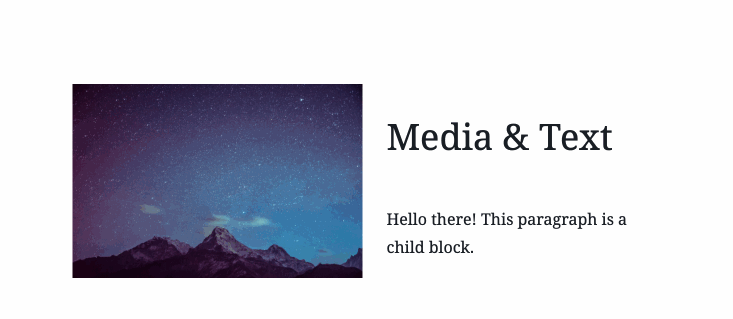
Exact color/treatment of the borders will be explored in PR. But in general, when a parent block is selected, we'd add padding and a light border to its children blocks:
When a child block is selected, we'd add padding and a light border border to the parent block:
There's a simplified demo here: https://codepen.io/kjellr/pen/jdEJQb?editors=0110
(via #9628 (comment))
Development considerations:
Exploration around the padding aspect of this was explored by @mapk in #14148. This was closed because there's currently no way for CSS to conditionally target the parent of a selected child block. Therefore, the padding would currently need to be added at all times, which means that those blocks would no longer appear like they do on the front end.
In order to build this in correctly, we need to add a
has-child-selectedclass (or something similar) to the parent block when a child is selected. I'm happy to run with this one if someone can help by kicking things off with a PR to add that classname to parent blocks.The text was updated successfully, but these errors were encountered: