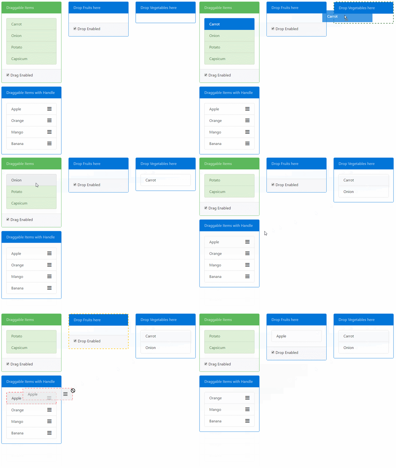
Angular 2 Drag & Drop based on HTML5 with no external dependencies. Provides draggable & droppable directives. Features:
- Transfer data from
draggabletodroppable. - Restrict drop to drop zones based on drag-drop scopes.
- Restrict drag to happen from either drag handles or the entire element.
- Ability to add custom visual cue styles.
Check out the Plunker demo.
The demo folder of the repository contains the same demo as Plunkr that uses SystemJS. To run that demo do an npm install in that folder followed by npm start to serve the demo app.
npm install ng2-drag-drop --save devIf you use SystemJS as your module loader then you will need to update the config to load the ng2-drag-drop module.
System.config({
    map: {
        'ng2-drag-drop': 'node_modules/ng2-drag-drop'
    },
    packages: {
        'ng2-drag-drop':  { main: 'index.js',  defaultExtension: 'js' },
    }
});You need to import the Ng2DragDropModule in the module of your app where you want to use it.
import {NgModule} from '@angular/core';
import {BrowserModule} from '@angular/platform-browser';
import {DemoComponent} from "./components/demo-component";
import {Ng2DragDropModule} from "ng2-drag-drop";


@NgModule({
  imports: [BrowserModule, Ng2DragDropModule],
  declarations: [DemoComponent],
  bootstrap: [DemoComponent]
})
export class AppModule {}Place the draggable directive on an element that you want to be draggable. The following example makes the
List item draggable:
<ul>
  <li draggable>Coffee</li>
  <li draggable>Tea</li>
  <li draggable>Milk</li>
</ul>
Similarly use the droppable directive on an element where you want to drop draggable:
<div droppable>
  <p>Drop items here</p>
</div> Both the draggable & droppable directives take a [dragOverClass] input. You can pass a class name to it that will be applied when the draggable item is being dragged and when the droppable is under the mouse:
<div droppable [dragOverClass]="'drag-target-border'">
  <p>Drop items here</p>
</div> You can use the dragScope & dropScope property on draggable and droppable respectively to restrict user from dropping a draggable element into a droppable.
Both are string properties and must match in both to indicate compatible drag-drop zones.
In the following example, only the draggable with the drink dropScope can be dropped on the droppable.
<ul>
  <li draggable [dragScope]="'drink'">Coffee</li>
  <li draggable [dragScope]="'drink'">Tea</li>
  <li draggable [dragScope]="'meal'">Biryani</li>
  <li draggable [dragScope]="'meal'">Kebab</li>
  ...
</ul> <div droppable [dropScope]="'drink'" [dragOverClass]="'drag-target-border'">
<p>Only Drinks can be dropped in the above container</p>
</div> You can transfer data from the draggable to the droppable via the dragData property on the draggable directive.
The data will be received in the (onDrop) event of the droppable:
import {Component} from '@angular/core';

@Component({
    selector: 'app',
    template: `
<h3>Transfer Data via Drag Drop</h3>
<div class="row">
    <div class="col-sm-3">
        <ul class="list-group">
            <li draggable *ngFor="let item of items" [dragData]="item" class="list-group-item">{{item.name}}</li>
        </ul>
    </div>

    <div class="col-sm-3">
    <div class="panel panel-default" droppable (onDrop)="onItemDrop($event)">
        <div class="panel-heading">Drop Items here</div>
            <div class="panel-body">
                <li *ngFor="let item of droppedItems" class="list-group-item">{{item.name}}</li>
            </div>
        </div>
    </div>
</div>
`
})
export class AppComponent {
    items = [
            {name: "Apple", type: "fruit"},
            {name: "Carrot", type: "vegetable"},
            {name: "Orange", type: "fruit"}];

    onItemDrop(e: any) {
        // Get the dropped data here
        this.droppedItems.push(e.dragData);
    }
    constructor() { }
}
Drag Handle can be defined for a draggable item that will restrict drag of the element unless the item is dragged from the specified element.
The handle should be a valid selector string. Example:
<li draggable [dragHandle]="'.drag-handle'">
   Not Draggable by list item but by the handle only.
   <div class="pull-right"><i class="drag-handle fa fa-bars fa-lg" aria-hidden="true"></i></div>
</li> ####Attributes
| Name | Type | Default Value | Description |
|---|---|---|---|
dragData |
any |
null |
The data that will be avaliable to the droppable directive on its onDrop() event. |
dragScope |
string |
'default' |
Defines compatible drag drop pairs. Values must match with droppable.dropScope. |
dragOverClass |
string |
null |
CSS class applied on the draggable that is applied when the item is being dragged. |
draghandle |
string |
null |
The selector that defines the drag Handle. If defined drag will only be allowed if dragged from the selector element. |
####Events
| Name | Parameters | Description |
|---|---|---|
onDragStart |
e: DOM event | Event fired when Drag is started |
onDrag |
e: DOM event | Event fired while the element is being dragged |
onDragEnd |
e: DOM event | Event fired when dragged ends |
For more information on Drag DOM Events: Drag Event
####Attributes
| Name | Type | Default Value | Description |
|---|---|---|---|
dropScope |
string |
'default' |
Defines compatible drag drop pairs. Values must match with draggable.dragScope |
dragOverClass |
string |
null |
CSS class applied on the droppable element when the item is being dragged over valid drop target. |
####Events
| Name | Parameters | Description |
|---|---|---|
onDragEnter |
e: DOM event | Event fired when Drag dragged element enters a valid drop target. |
onDragOver |
e: DOM event | Event fired when an element is being dragged over a valid drop target. |
onDragLeave |
e: DOM event | Event fired when a dragged element leaves a valid drop target. |
onDrop |
e: DropEventModel |
Event fired when an element is dropped on a valid drop target. |


