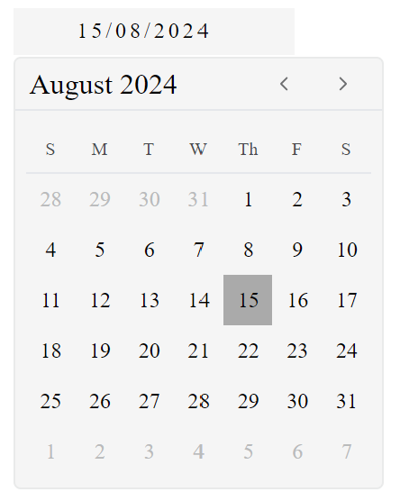
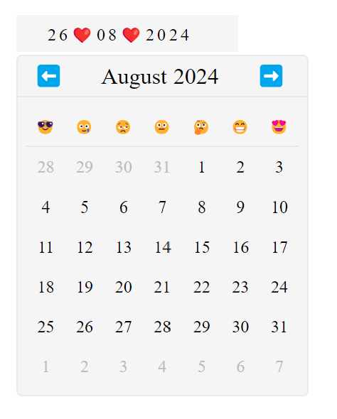
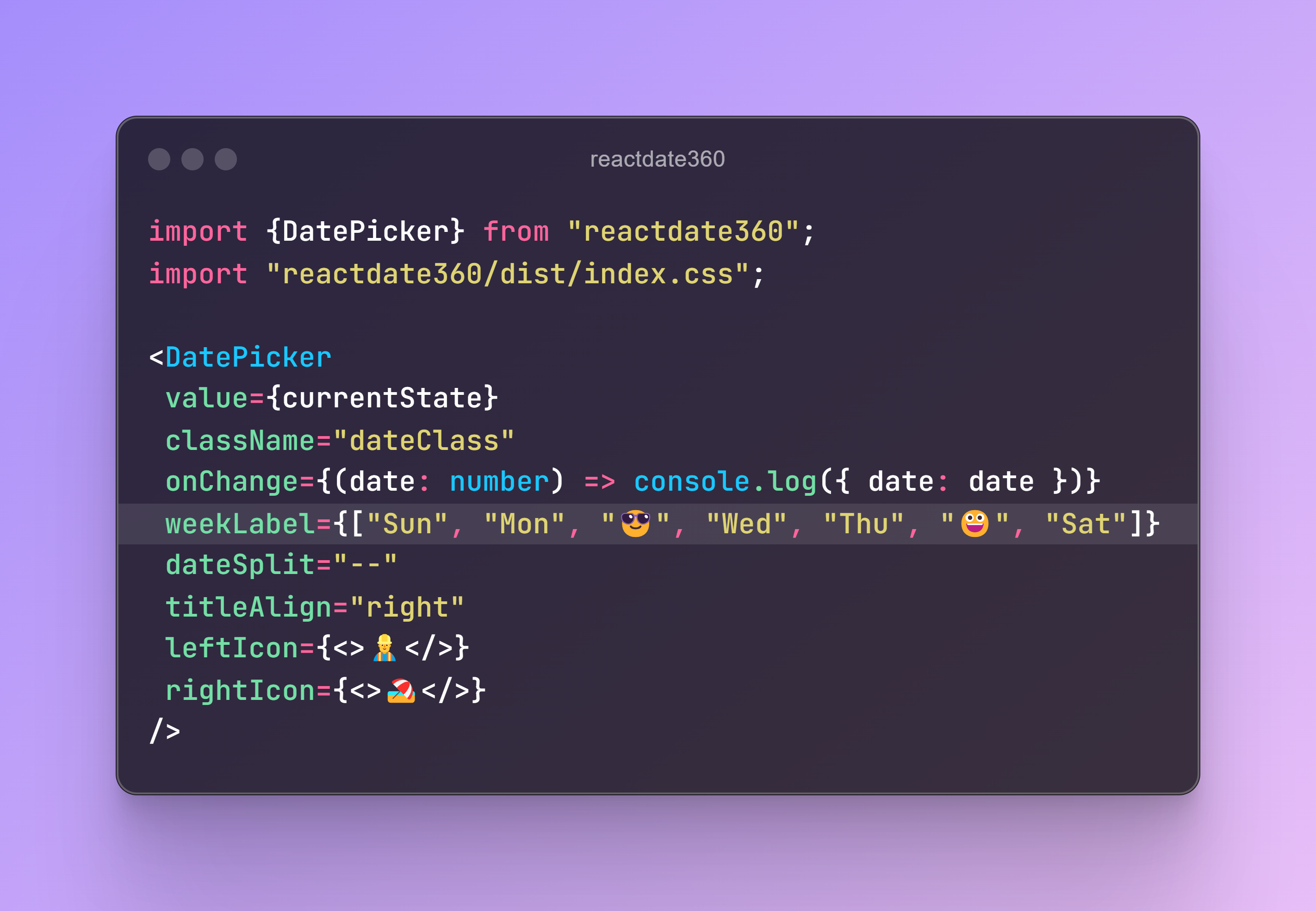
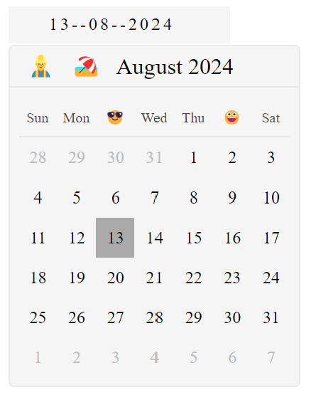
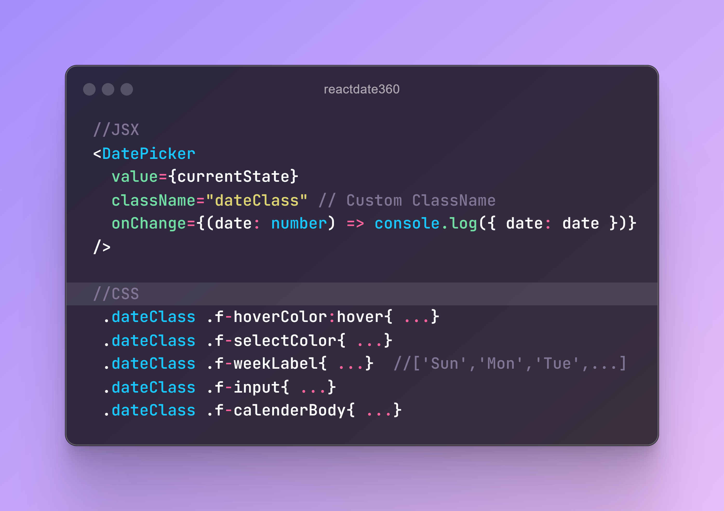
reactdate360 is a flexible and customizable date picker component for React. Unlike other date picker components, reactdate360 allows you to fully modify icons, styles, and alignment to fit your needs.
Install the package via npm:
npm install reactdate360
Here's a basic example of how to use reactdate360:
import React, { useState } from "react";
import DatePicker from "reactdate360";
import "reactdate360/dist/index.css"

const App = () => {
  const [formValues, setFormValues] = useState({ date: null });

  return (
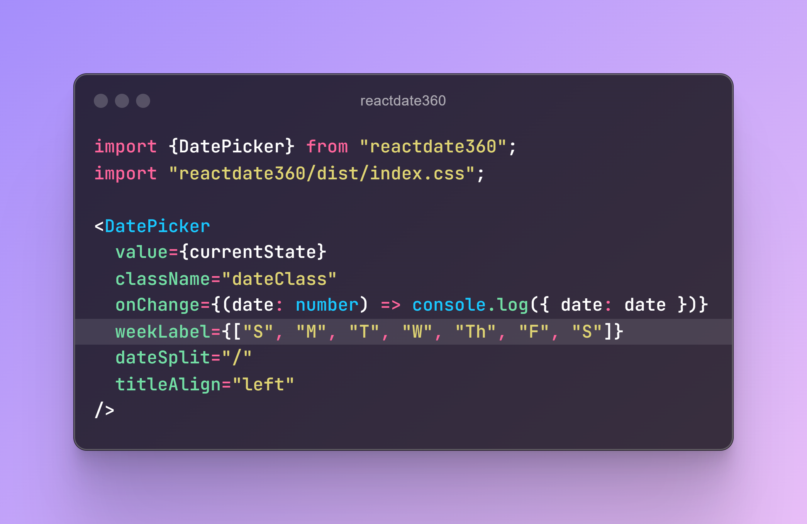
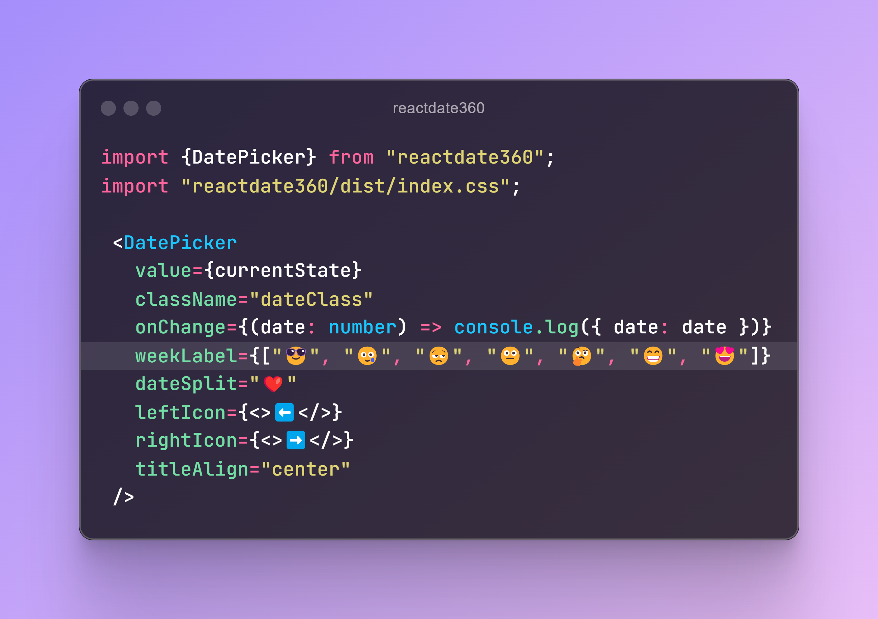
    <DatePicker
      value={formValues?.date}
      className="dateClass"
      onChange={(date: number) => setFormValues({ date: date })}
      weekLabel={["Sun", "Mon", "Tue", "Wed", "Thu", "Fri", "Sat"]}
      dateSplit="/"
      titleAlign="center"
      leftIcon={<>⬅️</>}
      rightIcon={<>➡️</>}
    />
  );
};
- Customizable Icons: Easily change the left and right icons for the date input.
- Flexible Styling: Apply your own styles and classes to the date picker.
- Alignment Options: Customize the alignment of the date picker title.
- Weekday Labels: Modify weekday labels to fit your preferences.
- Date Format: Choose your own date separator.
MIT.
Contributions are welcome! Please feel free to submit a pull request or open an issue.
