⚡ A custom component that can load heart-shaped Toggle Switch inside your Streamlit apps. Also, you can sync this toggle with different Streamlit widgets!
First pip install streamlit. Don't know how? 👉 Check here!
After that, install this component:
pip install streamlit-custom-toggle
Here's an example code 👇
import streamlit as st
from streamlit_custom_toggle import st_custom_toggle

st.subheader('Music Choices 🎵')
col1, col2, col3 = st.columns(3, gap="small")

with col1:
    # Disabled toggle switch
    calm = st_custom_toggle('Calm', active_track_fill="#EAE4E4", active_thumb_color="#EAE4E4", value="true", key="toggle1")

with col2:
    fun = st_custom_toggle('Fun', active_track_fill="#57FD6E", active_thumb_color="#EAE4E4", key="toggle2")

with col3:
    music_toggle = st_custom_toggle('Rock', active_track_fill="#FF5733", active_thumb_color="#900C3F", key="toggle3")

    music = st.radio(
    "Select your favorite artist",
    ('The Beatles', 'AC/DC', 'Pink Floyd', 'Elvis Presley', 'MÃ¥neskin'), disabled=music_toggle)
    st.markdown(f"You choose {music}")

# Checking the toggle state
st.code(f"Calm = {calm}, Fun = {fun}, Rock = {music_toggle}")It supports the following arguments customization:
| Args | Type | Required | Description |
|---|---|---|---|
| label | string | YES | Define the toggle with a short label value |
| active_track_fill | string | YES | Changes the color of the track when the toggle is in the active/on state. Default value is: #ff708f |
| active_thumb_color | string | YES | Changes the color of the thumb when the toggle is in the active/on state. Default value is: #ffffff |
| value | bool | OPTIONAL | If it's value is set to true, then the toggle switch is deactivated. The toggle is activated by default |
| key | string | YES | An optional key value that uniquely identifies this component. |
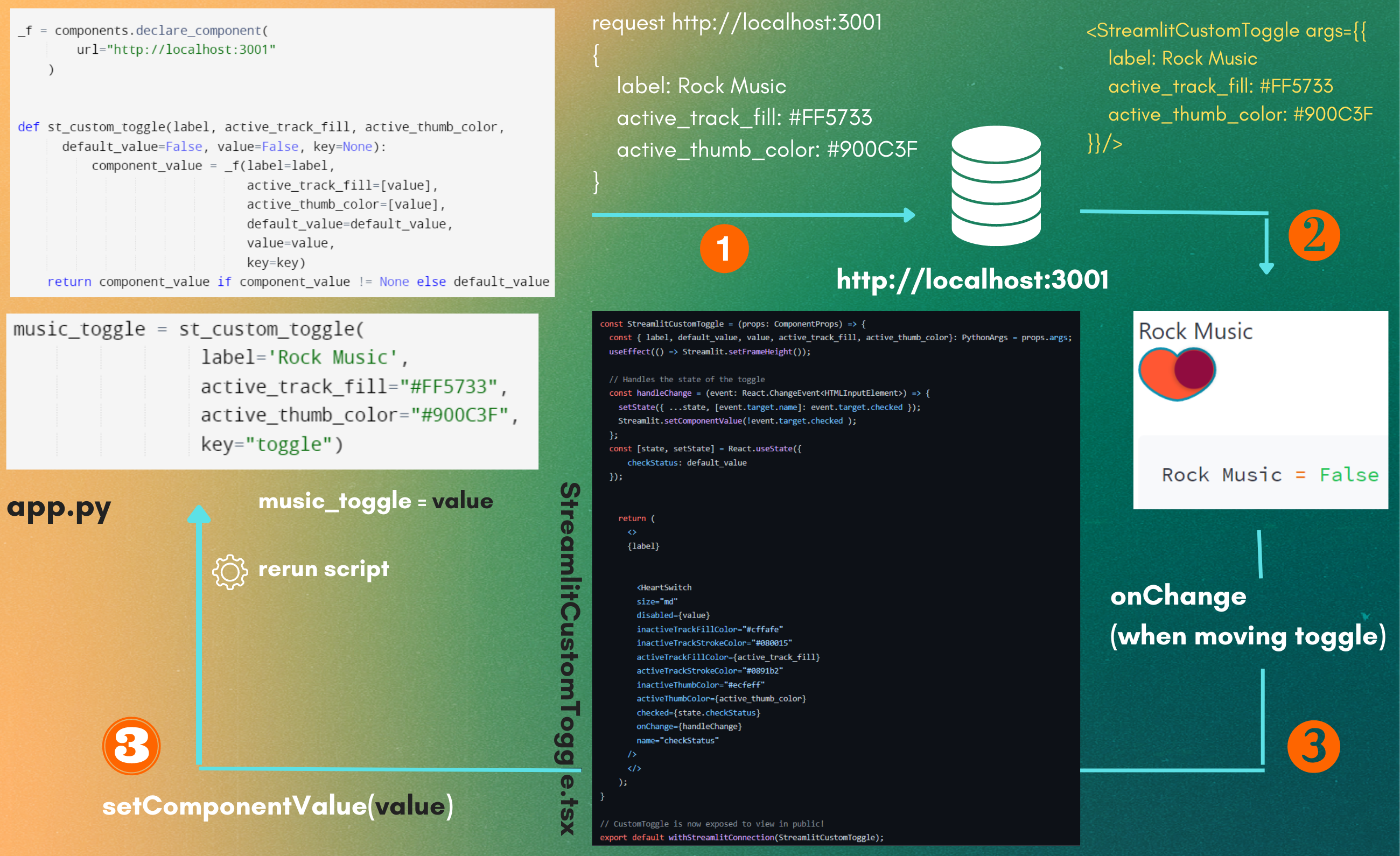
Here's the blueprint on how my component works. For understanding it in details, 👉 Read here please!
This software is open source, licensed under the MIT License.


