-
Notifications
You must be signed in to change notification settings - Fork 3.4k
New issue
Have a question about this project? Sign up for a free GitHub account to open an issue and contact its maintainers and the community.
By clicking “Sign up for GitHub”, you agree to our terms of service and privacy statement. We’ll occasionally send you account related emails.
Already on GitHub? Sign in to your account
Improve image sizes in the multicolumn section #2349
Merged
Merged
Changes from 3 commits
Commits
Show all changes
6 commits
Select commit
Hold shift + click to select a range
0fa7282
Update image settings for multicolumn.
eugenekasimov 0a11554
Add more breakpoints.
eugenekasimov 5a82973
Change naming. Add arbitrary number for widths. Improve sizes.:
eugenekasimov 708cfbb
Add more numbers to widths.
eugenekasimov 6278df7
Add paddings for calculation
eugenekasimov 2b44b74
Add variables
eugenekasimov File filter
Filter by extension
Conversations
Failed to load comments.
Loading
Jump to
Jump to file
Failed to load files.
Loading
Diff view
Diff view
There are no files selected for viewing
This file contains bidirectional Unicode text that may be interpreted or compiled differently than what appears below. To review, open the file in an editor that reveals hidden Unicode characters.
Learn more about bidirectional Unicode characters
Add this suggestion to a batch that can be applied as a single commit.
This suggestion is invalid because no changes were made to the code.
Suggestions cannot be applied while the pull request is closed.
Suggestions cannot be applied while viewing a subset of changes.
Only one suggestion per line can be applied in a batch.
Add this suggestion to a batch that can be applied as a single commit.
Applying suggestions on deleted lines is not supported.
You must change the existing code in this line in order to create a valid suggestion.
Outdated suggestions cannot be applied.
This suggestion has been applied or marked resolved.
Suggestions cannot be applied from pending reviews.
Suggestions cannot be applied on multi-line comments.
Suggestions cannot be applied while the pull request is queued to merge.
Suggestion cannot be applied right now. Please check back later.
There was a problem hiding this comment.
Choose a reason for hiding this comment
The reason will be displayed to describe this comment to others. Learn more.
The mobile logic is improved, which is important because there's a pretty big range images can render at between 0 and 750px. But the 990px breakpoint is still a static number and will usually render too large of an image, with the worst case scenario being a viewport width closer to 990 with a page_width set closer to 1600.
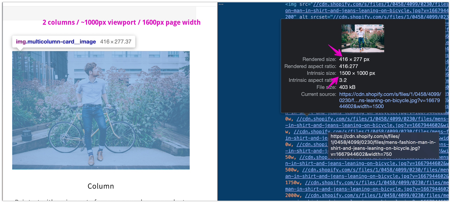
I mentioned the strategy we use in other sections here but something like this is more or less what I would expect.
If we're not going to factor any padding values into these calculations, we can probably skip the 750px breakpoint, but I think we should definitely improve the larger breakpoints somehow at least.
There was a problem hiding this comment.
Choose a reason for hiding this comment
The reason will be displayed to describe this comment to others. Learn more.
Oh, what you are trying to say is that when the page-width is set to 1600px and a view port of the screen is smaller we are not really efficient. Is that right?
That's a good catch @kmeleta . I'm going to fix it but still skip the 750px. Does it sound good to you?
There was a problem hiding this comment.
Choose a reason for hiding this comment
The reason will be displayed to describe this comment to others. Learn more.
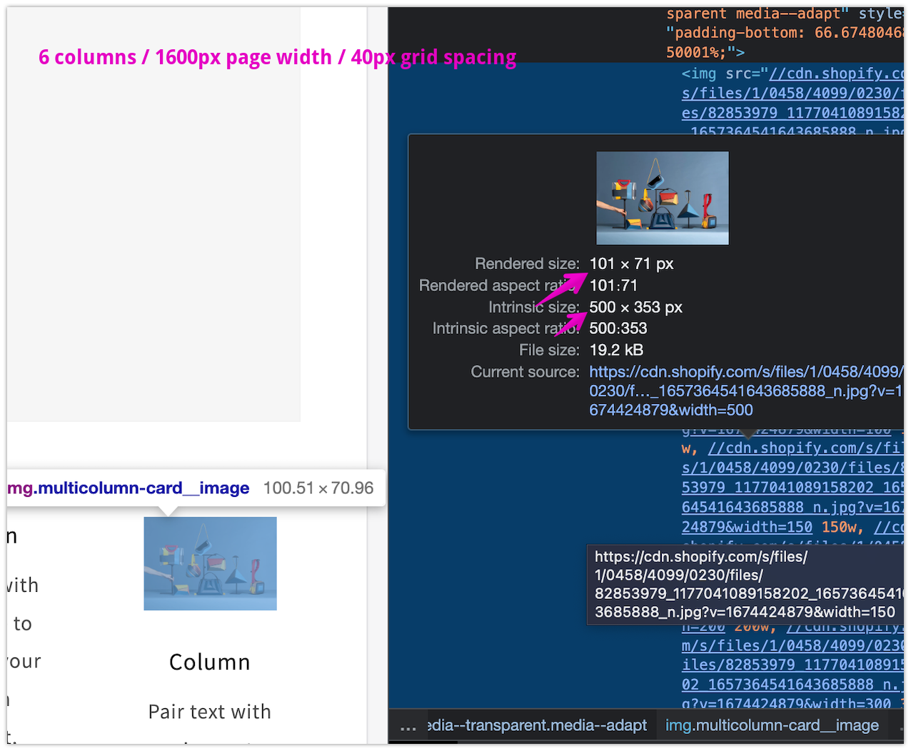
Bottomline is if we can get good results without accounting for paddings, then we don't need to consider them and enjoy the simpler logic. The desktop and tablet page paddings are 50px (100px total), the gaps between columns can be between 4px and 40px (40px * (num_columns - 1) or 200px worst case total). So in theory, under some conditions there could be a calculated discrepancy of up to ~300px.
Here's an example factoring in more grid spacing. Pretty inaccurate result, but of ourse with 6 columns the general image sizes are at least smaller. What's your feeling?
There was a problem hiding this comment.
Choose a reason for hiding this comment
The reason will be displayed to describe this comment to others. Learn more.
I reviewed everything again and decided to add paddings. I think it's worth it. Now I feel we are quite precise in the calculations even though I had to hardcode some of the padding values.