A set of UWP controls and utilities (I will add more over time) Note: To see my Telerik UWP examples, go here: https://github.com/LanceMcCarthy/TelerikUwpProjects
##Contents
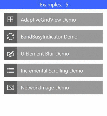
- BusyIndicators in UwpHelpers.Controls.BusyIndicators (cool custom busy indicator)
- AdaptiveGridView in UwpHelpers.Controls.ListControls (maintains aspect ratio of items as it scales for column width)
- BlurElementAsync in UwpHelpers.Examples.Helpers (converts any UIElement into a blurred BitmapImage)
- IncrementalLoadingCollection in UwpHelpers.Controls.Common (demo in Examples)
- NetworkImage in UwpHelpers.Controls.ImageControls (an Image control that shows download progress)
- DownloadStreamWithProgressAsync in UwpHelpers.Controls.Extensions (HttpClient Extension method that reports download progress)
###AdaptiveGridView

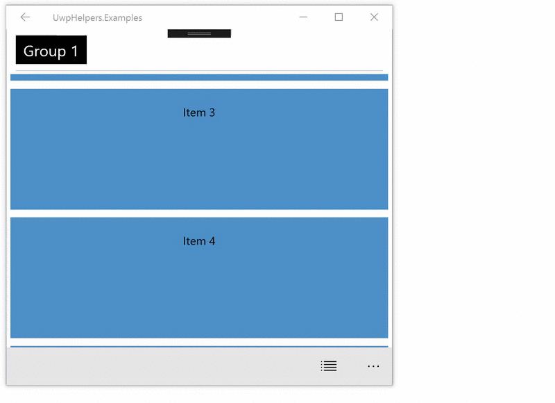
###AdaptiveGridView with grouping
Properties
- MinItemWidth (double)
- MinItemHeight (double)
Example
<listControls:AdaptiveGridView ItemsSource="{Binding ListItems}"
                               MinItemHeight="105"
                               MinItemWidth="315">
###BusyIndicators
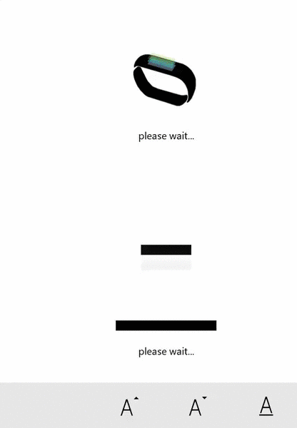
- BandBusyIndicator
- DownloadUploadIndicator
Properties
- IsActive (boolean): shows or hides the indicator
- Direction (AnimationDirection.Uploading or Downloading): The direction of the animation
- DisplayMessage (string): message shown when active
- DisplayMessageSize (double): message font size
<busyIndicators:BandBusyIndicator IsActive="{Binding IsBusy}"
                                  DisplayMessage="busy..."
                                  Direction="Uploading"  />
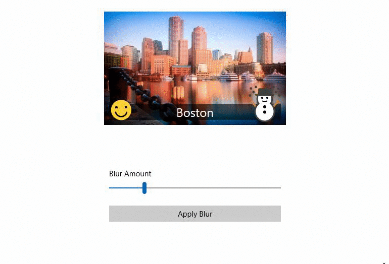
###BlurElementAsync
Example
//You can pass any UIElement to the method and it will render all of the children into a bitmap with a Blur applied
var blurredElement = await ContentToBlur.BlurElementAsync();

//example: you can then set Background brush of a Grid
ContentRootGrid.Background = new ImageBrush
{
      ImageSource = blurredBitmapImage,
      Stretch = Stretch.UniformToFill
};
###IncrementalLoadingCollection
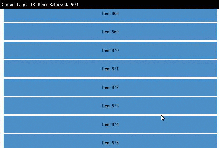
Example
XAML
<ListView ItemsSource="{Binding InfiniteItems}" />
ViewModel or Code-Behind
InfiniteItems = new IncrementalLoadingCollection<T>((cancellationToken, count) => Task.Run(GetMoreData, cancellationToken));

//and GetMoreData is
private async Task<ObservableCollection<T>> GetMoreData()
{
      return more items of type ObservableCollection<T>
}
###NetworkImage
Properties
- ImageUrl (string): string url of the photo
- IsActive (bool) - the control manages this automatically, but you can manually enable/disable if needed
- DownloadPercentageVisibility (Visibility) - If you want to hide the progress percentage
- ProgressRingVisibility (Visibility) - If you want to hide the ProgressRing animation
- ImageStretch (Stretch) - Stretch property passed ot the underlying Image control
Example
XAML
<imageControls:NetworkImage ImageUrl="http://bigimages.com/MyHugeImage.jpg" />
###DownloadStreamWithProgressAsync (HttpClient Extension)

Properties
- Url (string): url of the thing you want to download
- Reporter (Progress ) - reports the progress via event, see example below
Note: There are a couple more methods in the helper class (i.e. DownloadStringwithProgressAsync)
Example
C# - usage
var reporter = new Progress<DownloadProgressArgs>();
reporter.ProgressChanged += Reporter_ProgressChanged;

var imageStream = await new HttpClient(myFavoriteHandler).DownloadStreamWithProgressAsync(bigImageUrl, reporter)
C# - event handler
private void Reporter_ProgressChanged(object sender, DownloadProgressArgs e)
{
     SomeProgressBar.Value = e.PercentComplete;
}