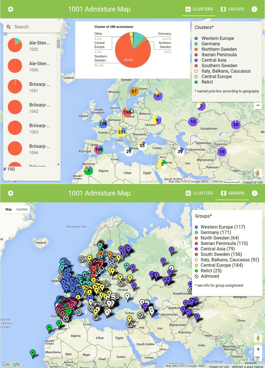
The 1001 Genomes Admixture Map is an interactive web-based tool, that allows to interactively explore the fine-scale picture of population structure for the 1135 A. thaliana accession that are part of the 1001 genomes project.
The data was generated using the software package ADMIXTURE and stored in a Google spreadsheet.
For each accession a piechart is displayed. The slices correspond to the various fractions of the ADMIXTURE cluster. Users can change the number of clusters K by clicking on the gear icon in the top left corner (by default data for K=9 is shown).
For K=9, clusters were named post-hoc according to geography. These clusters were also used to attribute individuals to groups. An individual for which more than 60% of its genome derives from a given cluster is attributed to the group of the same name as the cluster. Individuals which do not draw more than 60% from a single cluster were labelled "admixed".
Because of the number of accessions (1135) nearby accessions are clustered together and an averaged piechart is displayed. The number inside the piechart shows the number of accessions that are clustered together. Clicking on a cluster will zoom into the region and display piecharts for individual accessions or smaller clusters.
The list on the left side shows all accessions that are visible in the current view. Zooming into specific regions either by clicking on a cluster or using the Google Maps zoom control will update the list. Hovering the mouse over a cluster will filter the list to display only the accessions that are part of the corresponding cluster and in addition to show a popup with a more detailed version of the piechart.
Hovering the mouse over an accession in the list will display a pin on the map at its location and clicking on the list item will zoom into that position. A searchbox above the list allows the user to search for a specific accession using either the ID or the name.
