Respect html_logo, and throw it in the sidebar, fixes #24 #69
Conversation
|
This looks awesome. Gonna let Dave take a look before merging it.
|
|
Thoughts on this @snide -- looks great, and I see a lot of people who have logos in their main text to work around this. |
|
I'll check it out today. i did something similar earlier but removed it because I didn't like the way it worked in mobile and because ultimately, using a logo meant using other colors (not blue) and that should be configurable as well. |
|
re: mobile, we could always have it hide the logo in mobile view, and just default back to the text link only, to compensate (looks a bit nicer, might stop a few issues – particularly with large logos. If all else fails, I could always look into ways to try and let other colours be configurable? |
|
I'll take care of it. It was something I was meaning to do anyway. Just gimme a day to mess around first. I'll try to get a merge in tomorrow. Thanks for the submission. |
|
All good – thanks for the quick response! |
|
Ran through this a bit this morning. Gonna rewrite bits of it mostly so it's a little more friendly on the html side. I'll also try and do some styling if a logo exists to tone down the blue in that area. Sorry for the long wait on this, had a busy week with the holidays. |
|
Fair enough, it's a little silly with how it currently generates the HTML anyways! All good, holidays are always busy, family and all. Thanks for taking the time to look over it! |
|
Any update on this? I don't like to prod like this but it seemed like this was pretty much done and may have just been forgotten. |
|
I'd be interested in having a logo in the side bar as well… |
|
+1 |
|
If stuff needs to be updated, lemme know and I'll merge master back in and On Friday, June 6, 2014, pdion891 notifications@github.com wrote:
|
|
Unfortunately I'm launching my startup over the next month and I don't have the bandwidth for this right now. There are a couple problems that have kept me from merging it in that I think need to be addressed.
Putting this in as is would just jam at the problem. It needs more work. Specifically I'd love to see a way to manually build menus so that we can get rid of the whole dark background color on that menu in general. The only reason it exists is because without a hierarchy, that list is just a bunch of flat links. toc-depth won't work, because everyone lays out their folder structure completely different. It's a big enough problem that even RtD itself adds category headers to it's index.rst file to give large lists some order. I'd be happy to work on a refresh of this theme in a month, but I'd like to see some way to manage the menu before I jump back in to do any serious work. If someone at least wants to address the top concerns beforehand, I'll take a look at it. |
|
2: That's fine, it'll almost definitely look better hidden on mobile! I'll also show the project title name by default on there, regardless of whether it's usually hidden. 3: I'd just wrap it in another div with I think I looked into issue 1 earlier, but that's a bit of a weird, integrated problem that takes some doing to resolve. Once I'm fairly free, I'll tackle those two issues though, try and get it a little closer and think about menu/colour stuff. Thanks for the direction @snide, and good luck with the startup! |
|
I would like to see this working too. Hopefully you didn't give up. |
This basically fixes issue #24, and lets users' html_logo choice get put in the sidebar, below the little house logo and title. There's also an html_theme_options option, logo_only, which makes it so the house logo and title are completely removed, only showing the logo.
Examples, logo-only:
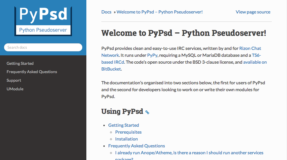
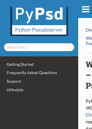
Examples, logo and text:

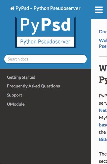
It also shrinks to fit how small the sidebar is. For example, if the sidebar is only 50px wide, the logo image will shrink to fit. It won't expand, though, which I think is acceptable (don't want pixellated images!)