Skip to content

This issue was moved to a discussion.

You can continue the conversation there. Go to discussion →

New issue

Have a question about this project? Sign up for a free GitHub account to open an issue and contact its maintainers and the community.

By clicking “Sign up for GitHub”, you agree to our terms of service and privacy statement. We’ll occasionally send you account related emails.

Already on GitHub? Sign in to your account

More Built-in Controls or Toolkit-Nugget-Package Controls so that Developers have more focus on App Features. #295

Closed
nextcodelab opened this issue Jan 5, 2021 · 6 comments

Comments

@nextcodelab
Copy link

nextcodelab commented Jan 5, 2021

ADD MORE CUSTOMIZABLE PROPERTIES/FEATURES ON BUILT-IN CONTROLS.

These are some of my controls that I really like.

In flutter no need renderer to make this beautiful checkbox menu dialog with custom add text. hope we can do it in MAUI.
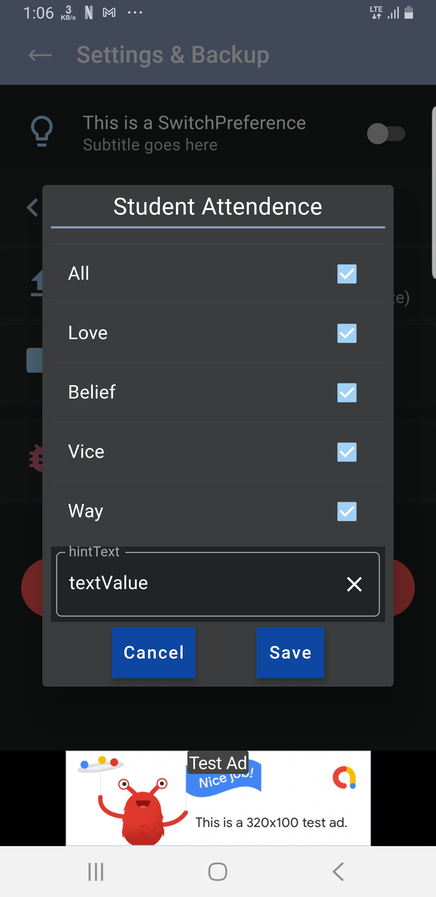
I write these code for reusable checkbox menus for the future flutter app.
Screenshot_20210105-130650

      BuildContext context, List<String> menus,
      {String title = "Category", String hintText = "Add tags"}) {
    Map<String, bool> items = Map<String, bool>();
    menus.forEach((element) {
      items[element] = true;
    });
    double h = 0;
    if (menus.length >= 5) {
      h = 270;
    }
    List<String> selecteds = menus.toList();
    String newTag = "";
    final Future<List<String>> action = showDialog(
      context: context,
      builder: (context) {
        return StatefulBuilder(
          // StatefulBuilder
          builder: (context, setState) {
            return AlertDialog(
              actions: <Widget>[
                Container(
                  width: 400,
                  height: null,
                  child: Column(
                    crossAxisAlignment: CrossAxisAlignment.center,
                    children: <Widget>[
                      Text(
                        title,
                        style: TextStyle(fontSize: 20),
                      ),
                      SizedBox(
                        height: 5,
                      ),
                      Container(
                        height: 2,
                        color: themeData.colorScheme.secondary,
                      ),
                      SizedBox(
                        height: 15,
                      ),
                      Container(
                        height: h == 0 ? null : h,
                        child: SingleChildScrollView(
                          child: Column(children: [
                            Column(
                              children: List<Widget>.generate(menus.length,
                                  (int index) {
                                return Column(
                                  children: [
                                    Divider(
                                      height: 0,
                                    ),
                                    CheckboxListTile(
                                      value: items[menus[index]],
                                      title: Text(menus[index]),
                                      onChanged: (valueP) {
                                        setState(() {
                                          items.update(menus[index],
                                              (value) => value = valueP);
                                          selecteds.clear();
                                          items.forEach((key, value) {
                                            if (value) {
                                              selecteds.add(key);
                                            }
                                          });
                                          print(selecteds);
                                        });
                                      },
                                    ),
                                  ],
                                );
                              }),
                            ),
                            SizedBox(
                              height: 5,
                            ),
                            TextEditorCard(
                              hintText,
                              "",
                              false,
                              onTextChanged: (value) {
                                newTag = value;
                              },
                            ),
                          ]),
                        ),
                      ),
                      SizedBox(
                        height: 5,
                      ),
                      Row(
                        mainAxisAlignment: MainAxisAlignment.center,
                        children: <Widget>[
                          FlatButton(
                            shape: RoundedRectangleBorder(
                                borderRadius: BorderRadius.circular(5.0),
                                side: BorderSide(
                                    color: themeData.colorScheme.secondary)),
                            color: themeData.secondaryHeaderColor,
                            textColor: getBrightnessColor(
                                themeData.secondaryHeaderColor),
                            padding: EdgeInsets.all(8.0),
                            onPressed: () {
                              Navigator.of(context).pop(null);
                            },
                            child: Text(
                              "Cancel".toUpperCase(),
                              style: TextStyle(
                                fontSize: 14.0,
                              ),
                            ),
                          ),
                          SizedBox(width: 20),
                          FlatButton(
                            shape: RoundedRectangleBorder(
                                borderRadius: BorderRadius.circular(5.0),
                                side: BorderSide(
                                    color: themeData.colorScheme.secondary)),
                            color: themeData.colorScheme.secondary,
                            textColor: getBrightnessColor(
                                themeData.colorScheme.secondary),
                            padding: EdgeInsets.all(8.0),
                            onPressed: () {
                              if (newTag.isNotEmpty &&
                                  selecteds.contains(newTag) == false) {
                                selecteds.add(newTag);
                                print(selecteds);
                              }
                              Navigator.of(context).pop(selecteds);
                            },
                            child: Text(
                              "Save".toUpperCase(),
                              style: TextStyle(
                                fontSize: 14.0,
                              ),
                            ),
                          ),
                        ],
                      )
                    ],
                  ),
                )
              ],
            );
          },
        );
      },
    );
    return (action != null) ? action : selecteds;
  }```
@nextcodelab
Copy link
Author

Setting tile can also be achieved easily these code no need renderer this is my the code I have written in flutter...
Screenshot_20210105-131921

import 'package:flutter/material.dart';
import 'package:flutter_project/basics/styles/theme_settings_widget.dart';

class TileHeader extends StatelessWidget {
  final String subtitle;
  final String title;
  final Function onTap;
  final double size;
  final Color iconColor;
  final IconData iconData;
  const TileHeader(
      {Key key,
      @required this.onTap,
      this.size = 35,
      this.iconColor,
      this.iconData,
      this.subtitle,
      this.title})
      : super(key: key);

  @override
  Widget build(BuildContext context) {
    Color iconC = iconColor;
    if (iconColor == null) {
      themeData = Theme.of(context);
      iconC = themeData.colorScheme.secondary;
    }
    var boxShadow = BoxDecoration(
      color: backgroundColorCard,
      borderRadius: BorderRadius.only(
          topLeft: Radius.circular(5),
          topRight: Radius.circular(5),
          bottomLeft: Radius.circular(5),
          bottomRight: Radius.circular(5)),
      boxShadow: [
        BoxShadow(
          color: Colors.grey.withOpacity(0.1),
          spreadRadius: 3,
          blurRadius: 3,
          offset: Offset(0, 1), // changes position of shadow
        ),
      ],
    );
    return Container(
        decoration: boxShadow,
        child: MaterialButton(
          onPressed: () {},
          padding: EdgeInsets.only(
            left: 6,
          ),
          child: ListTile(
            title: Text(title),
            subtitle: Text(subtitle),
            onTap: onTap,
            leading: Icon(
              iconData == null ? Icons.lightbulb_outline : iconData,
              size: size,
              color: iconC,
            ),
          ),
        ));
  }
}

@nextcodelab
Copy link
Author

nextcodelab commented Jan 5, 2021

On AppBar builder you can attach any kind of widget example you want dropdown menu... I hope we can do it in MAUI this code no need renderer...
Screenshot_20210105-132513

AppBar buildAppBar(BuildContext context) {
    var colorBar = getBrightnessColor(themeData.primaryColor);
    colorizeSystemsBars(SystemUiOverlayStyle(
        statusBarBrightness:
            ThemeData.estimateBrightnessForColor(themeData.primaryColor)));
    return AppBar(
      backgroundColor: themeData.primaryColor,
      elevation: 0,
      centerTitle: false,
      title: Text(
        'Dashboard',
        style: TextStyle(color: colorBar),
      ),
      actions: <Widget>[
        Padding(
          padding: EdgeInsets.only(right: 10),
          child: ClipOval(
            child: Material(
              color: Colors.transparent, // button color
              child: InkWell(
                splashColor: themeData.primaryColorLight, // inkwell color
                child: SizedBox(
                    width: 40,
                    height: 40,
                    child: Icon(
                      Icons.add,
                      size: 40,
                      color: colorBar,
                    )),
                onTap: () {
                  var newItem = ProductHelper.createNewProduct();
                  product = newItem;
                  Navigator.push(
                    context,
                    MaterialPageRoute(
                      builder: (context) => DetailsScreen(),
                    ),
                  );
                },
              ),
            ),
          ),
        ),
        PopupMenuButton<OptionMenu>(
          onSelected: _seletedMenu,
          color: backgroundColorCard,
          icon: new Icon(
            Icons.more_vert,
            color: colorBar,
            size: 35,
          ),
          itemBuilder: (BuildContext context) {
            return mainOptions.map((OptionMenu choice) {
              return PopupMenuItem<OptionMenu>(
                  value: choice,
                  child: Row(
                    mainAxisAlignment: MainAxisAlignment.start,
                    children: [
                      new Tab(icon: new Icon(choice.icon, color: textColor)),
                      Padding(
                        padding: EdgeInsets.only(left: 10),
                        child: Text(
                          choice.title,
                          style: TextStyle(color: textColor),
                        ),
                      ),
                    ],
                  ));
            }).toList();
          },
        ),
      ],
    );

@nextcodelab
Copy link
Author

nextcodelab commented Jan 5, 2021

In xamarin.forms we need to use plugin to have a round buttons and image... create renderer at all times is real PAIN..
These code is just few lines in flutter to achieved round image or buttons..
Screenshot_20210105-134321

import 'package:flutter/material.dart';
import 'package:flutter_project/basics/styles/theme_settings_widget.dart';

class RoundButton extends StatelessWidget {
  final Function onTapped;
  final Icon icon;
  final double size;
  final Color color;
  const RoundButton({
    Key key,
    this.icon,
    this.size = 40,
    this.color,
    this.onTapped,
  }) : super(key: key);

  @override
  Widget build(BuildContext context) {
    return Padding(
      padding: EdgeInsets.only(right: 10),
      child: ClipOval(
        child: Material(
          color: this.color == null
              ? Colors.transparent
              : themeData.colorScheme.secondary, // button color
          child: InkWell(
            splashColor: themeData.primaryColorLight, // inkwell color
            child: SizedBox(
                width: size,
                height: size,
                child: icon != null
                    ? icon
                    : Icon(
                        Icons.color_lens,
                        size: size,
                        color: color != null
                            ? color
                            : getBrightnessColor(themeData.primaryColor),
                      )),
            onTap: onTapped,
          ),
        ),
      ),
    );
  }
}

import 'package:flutter/material.dart';
import 'package:flutter_project/basics/styles/default_styles.dart';
import 'package:flutter_project/basics/styles/theme_settings_widget.dart';

class ProductPoster extends StatelessWidget {
  const ProductPoster({
    Key key,
    @required this.size,
    this.image,
  }) : super(key: key);

  final Size size;
  final String image;

  @override
  Widget build(BuildContext context) {
    return Container(
      margin: EdgeInsets.symmetric(vertical: defaultPadding),
      // the height of this container is 80% of our width
      height: size.width * 0.8,

      child: Stack(
        alignment: Alignment.bottomCenter,
        children: <Widget>[
          Container(
            height: size.width * 0.7,
            width: size.width * 0.7,
            decoration: BoxDecoration(
              color: themeData.colorScheme.secondary,
              shape: BoxShape.circle,
            ),
          ),
          Image.asset(
            image,
            height: size.width * 0.75,
            width: size.width * 0.75,
            fit: BoxFit.cover,
          ),
        ],
      ),
    );
  }
}

@nextcodelab
Copy link
Author

Creating a back button is very simple with svg or
I hope in MAUI support xaml path... in flutter no need renderer..
Screenshot_20210105-134321

AppBar buildAppBar(BuildContext context) {
    return AppBar(
      backgroundColor: backgroundColor,
      elevation: 0,
      leading: IconButton(
        padding: EdgeInsets.only(left: defaultPadding),
        icon: SvgPicture.asset(
          "assets/icons/back.svg",
          color: getBrightnessColor(backgroundColor),
        ),
        onPressed: () {
          Navigator.pop(context);
        },
      ),
      centerTitle: false,
      title: Text(
        'Back'.toUpperCase(),
        style: Theme.of(context).textTheme.bodyText2,
      ),
      
    );
  }

@nextcodelab
Copy link
Author

nextcodelab commented Jan 5, 2021

In xamarin.forms, this is really hard to make a beautiful search ,box with icon, all we need in xamarin is renderer.
That takes weeks to have features on that simple searchbox icon. But... in flutter this is just 1 minute to write that searchbox with icon..

Screenshot_20210105-140120

import 'package:flutter/material.dart';
import 'package:flutter_project/basics/styles/default_styles.dart';
import 'package:flutter_project/basics/styles/theme_settings_widget.dart';
import 'package:flutter_svg/flutter_svg.dart';

class SearchBox extends StatelessWidget {
  const SearchBox({
    Key key,
    this.onChanged,
  }) : super(key: key);

  final ValueChanged onChanged;

  @override
  Widget build(BuildContext context) {
    var txtColor = getBrightnessColor(themeData.primaryColor);
    return Container(
      margin: EdgeInsets.all(defaultPadding),
      padding: EdgeInsets.symmetric(
        horizontal: defaultPadding,
        vertical: defaultPadding / 4, // 5 top and bottom
      ),
      decoration: BoxDecoration(
        color: Colors.white.withOpacity(0.4),
        borderRadius: BorderRadius.circular(12),
      ),
      child: TextField(
        onChanged: onChanged,
        style: TextStyle(color: backgroundColorCard),
        decoration: InputDecoration(
          enabledBorder: InputBorder.none,
          focusedBorder: InputBorder.none,
          icon: SvgPicture.asset(
            "assets/icons/search.svg",
            color: txtColor.withOpacity(0.6),
          ),
          hintText: 'Search',
          hintStyle: TextStyle(color: txtColor.withOpacity(0.6)),
        ),
      ),
    );
  }
}

@nextcodelab nextcodelab changed the title More Built-in Controls so that Developers have more focus on App Features. More Built-in Controls or Toolkit-Nugget-Package Controls so that Developers have more focus on App Features. Jan 5, 2021
@nextcodelab
Copy link
Author

nextcodelab commented Jan 6, 2021

Fully customizable text or label like this.. this is flutter.
Screenshot_20210106-120748

Now flutter works on web I tried it and plan to create website using flutter ... I am still waiting for MAUI.NET... 👍

@PureWeen PureWeen closed this as completed Feb 1, 2021
@dotnet dotnet locked and limited conversation to collaborators Feb 1, 2021

This issue was moved to a discussion.

You can continue the conversation there. Go to discussion →

Projects
None yet
Development

No branches or pull requests

2 participants