This week, we're going further into mapmaking.
1. Download this data.
There should be two files.
2. Double click on the shapefile to open it up.
Notice EPSG:4269 at the bottom right. This defines the map projection and datum for the layer.
Right-click on CA_counties_medicare in the Layers panel at left and select Properties>General. You should see the following under Coordinate reference system:
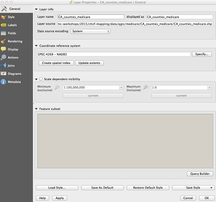
EPSG:4269 and NAD83 mean that this shapefile is in an Equirectangular projection, and the NAD83 datum.
(The Equirectangular projection, which draws a map with degrees of latitude and longitude the same size across the entire globe, is also the default for QGIS if no projection is specificied.)
We'll select another projection for our map later. Let's close for now.
3. Explore our data
Now we need to color the areas for the CA_counties_medicare layer by values in the data. Right-click on it in the Layers panel and select Open Attribute Table.
Scroll to the right of the table to see the fields detailing various categories of Medicare reimbursement.
Very interesting.
We are going to make a choropleth map of reimbursements per enrollee for hospitals and skilled nursing facilities, in the hospital field.
Why choose this kind of map? What'll we learn?
4. Change the colors
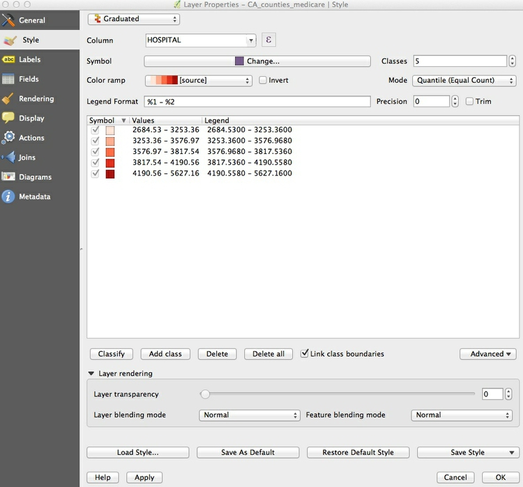
To do this, close the attribute table and call up Properties>Style [also called Symbology] for the CA_counties_medicare layer. Select Graduated from the dropdown menu at top, which is the option to color data according to values of a continuous variable. Select 5 under Classes, and then New color ramp... under Color ramp. While QGIS has many available color ramps, we will use this opportunity to call in a ColorBrewer sequential color scheme.
At the dialog box select ColorBrewer and then Reds, and then click OK:
You will need to give the color ramp a name — the default Reds5 is fine. Select HOSPITAL under Column, and select Quantile (Equal Count) for Mode. This menu gives various options for automatically setting the boundaries between the five classes or bins. Then click the Classify button to produce the following display:
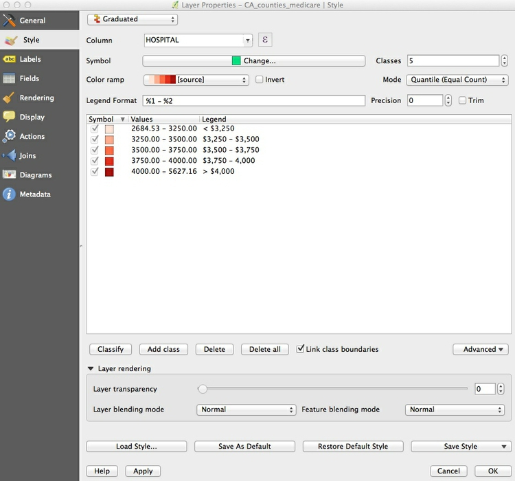
Now let’s edit the breaks manually to use values guided by the quantiles, but which will be easier for users to process when reading the map legend.
Double-click on the first symbol and select 3250 for the Upper value and click OK. Then double-click on the Label for this symbol and edit the text to < $3,250. Carry on editing the values and labels until the display looks like this:
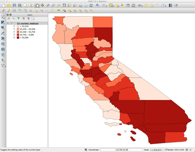
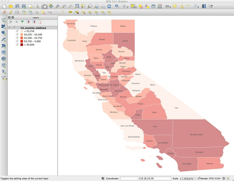
Click OK and the map should look like this:
We've done a lot of work already. Time to save the project, by selecting Project>Save.
5. Time to design
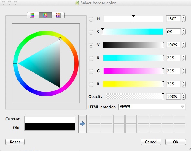
Let's make the boundaries white and see if that looks better. So open up the Style tab under Properties once more and click on Symbol>Change [or just the long, thin bar].... Then select Simple fill, click on the color for Border [or stroke color] and in the color wheel tab of the color picker, change the color to white, by moving each of the RGB sliders to 255:
Click on Symbol>Change [or just the long bar] again, and and set the Transparency to 50%. This will keep the relative distinctions between the colors, but tone them down a little so they don’t dominate the layer we will later plot on top.
OK. The map should now look like this:

6. Label o'clock
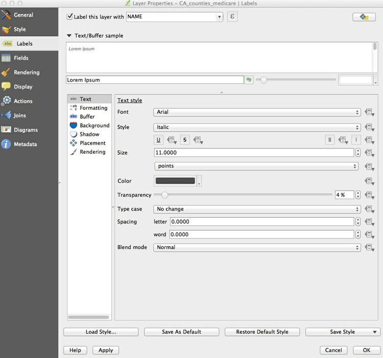
To add labels to the map, select Properties>Labels [you may need to specify Single Labels] and fill in the dialog box. Here I am adding a NAME label to each county, using Arial font, Italic style at a size of 11 points and with the color set to a HEX value of #4c4c4c for a dark gray:
Click OK and the map should now look like this:
Save again.
7. About that projection...
Now is a good time to give the project a projection: We will use variant of the Albers Equal Area Conic projection, optimized for maps of California (!).
Select Project>Project Properties>CRS (for Coordinate Reference System) from the top menu, and check Enable 'on the fly' CRS transformation [new versions will not need to do this]. This will convert any subsequent layers we import into the Albers projection, also.
Type Albers into the Filter box and select NAD83(HARN)/ California Albers, which has the code EPSG:3311.
Click OK and the map should reproject. Notice how EPSG:3311 now appears at bottom right.
8. Go deeper with more data.
Let's add a layer showing locations and capacities hospitals/skilled nursing facilities.
We're starting from a csv. Anyone remember how we did this last time?
When you click OK you will be asked to select a projection, or CRS, for the data. [Gets wonky, but important.] You may be tempted to select the same Albers projection we have set for the project, but this will cause an error. QGIS will handle the conversion to that projection: Because this data is not yet projected, we should instead select a datum with a default Equirectangular projection, either WGS 84 EPSG:4326 or NAD83 EPSG:4297.
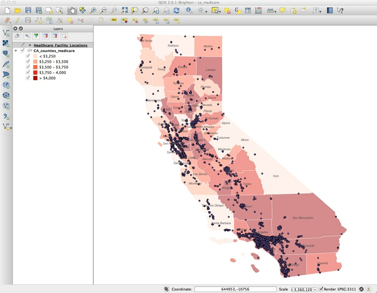
Click OK and a large number of points will be added to the map:
Great. Let's take a quick look at the attribute table to see what kind of data we're working with.
9. Style these points...
...using color to distinguish hospitals from skilled nursing facilities, removing other facilities from the map, and scaling the circles according to the capacity of each facility.
Sounds complicated, but it's not too tricky.
Select Properties>Style [or Symbology] for the Healthcare_Facility_Locations layer, and accept Categorized from the top dropdown menu. Select TYPE under Column and then hit the Classify button. (Keeping Random colors for the Color ramp is fine, as we will later edit the colors manually). Select and then Delete facilities other than General Acute Care Hospital and Skilled Nursing Facility, like this:
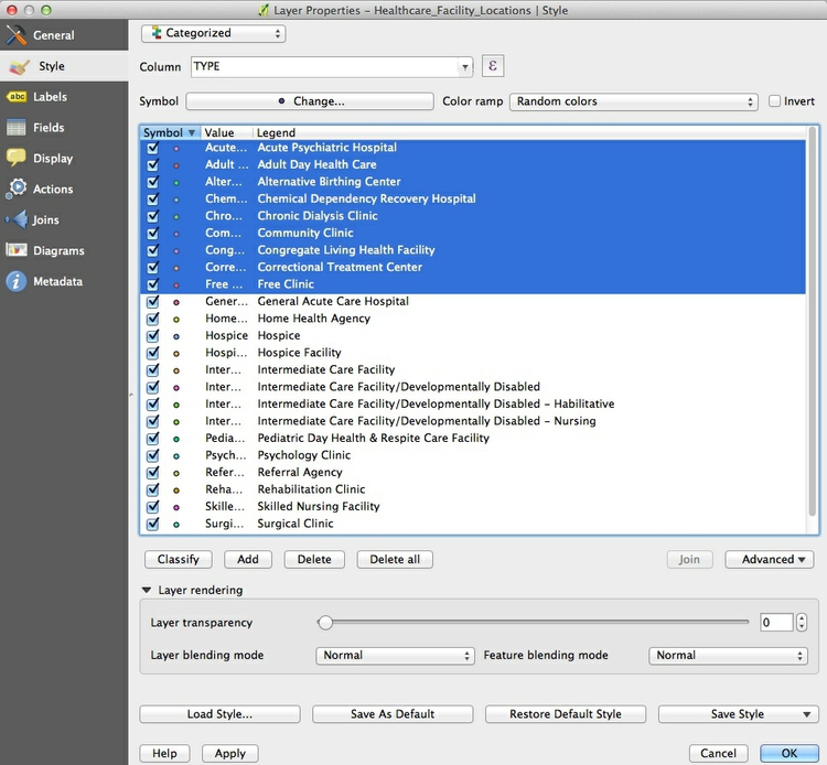
To then have just the two left.
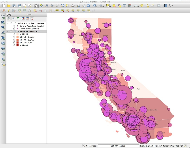
Now click the Change button next to where it says Symbol [or the long color bar next to Symbol], and then click on the menu next to "Size" and go to "Size Assistant". Choose Capacity for the field [Source] and Radius for the Scale Method.
[You may have to set from / to in newer versions of QGIS, from 0 to 1500]
(We're scaling smaller than what the picture shows.)
10.Control the size
Let's say we want to change the size.
To fix this, return to Properties>Symbol>Size, then select
- edit - and fill in the dialog box as follows:
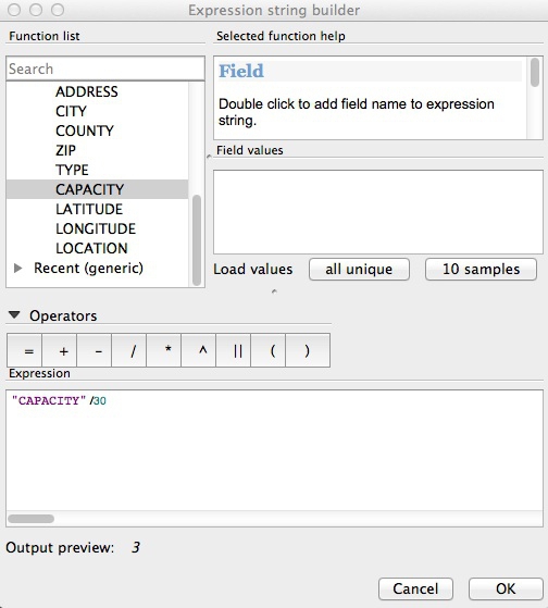
We're just dividing the numbers in the CAPACITY field by 30.
Good or no? Let's try another number until we get it right.
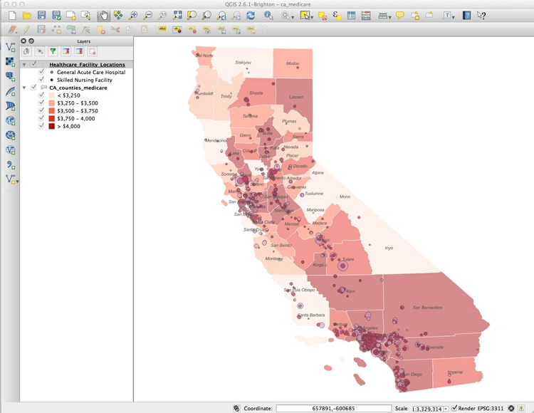
In the main Style tab, click on each point symbol and select Simple marker to edit its color. Also set transparency for the symbols to 50%, as we did for the choropleth map.
The final map should look something like this:
Good work!
11. If we have time: export and make a legend
We can export our finished map with a legend explaining the colors, so let’s change the name of the fields so they display nicely. Right-click on each layer and rename them Facility type and Medicare reimbursement per enrollee.
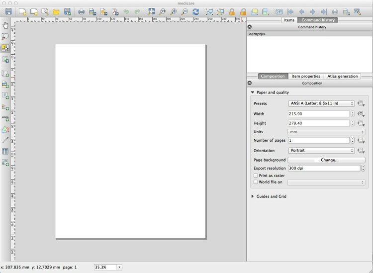
To export the map, select Project>New Print Composer, give the composer an appropriate name and click OK. In the print composer window, select the following options in the Composition tab:
Now click the Add new map icon, which looks like a little scroll of paper. Draw a rectangle over the page area, and the map should appear, You can edit its size, and adjust its position, as desired.
Once you are statisfied with the appearance of your map in the print composer, click the Add legend icon. It looks like a legend if you look very closely.
Draw a rectangle on the page where you want the legend to appear.
12. Export
You can save your maps in raster image formats (JPG, PNG etc) from the Print Composer by clicking the Save Image icon. Boom!
This tutorial is based on a session from NICAR 2015 by Peter Aldhous
- Map projection video
- Google Maps now depicts the Earth as a globe
- Boston public schools map switch aims to amend 500 years of distortion
- TURN IN YOUR DRAFT! It's due Monday at 5 PM.
- Mapping Assignment 1. Due by Monday at 5 PM.
- Part 1: Download this data about the Seismic Ratings and Collapse Probabilities of California Hospitals. Plot them all on a map of California. (You have a shapefile with the counties from today's lesson.) Filter for only the buildings with an SPC rating of 1 or 2 (1 and 2 mean "assigned to buildings posing significant risk of collapse following a strong earthquake".) Export it, they way we did in class, with a legend.
- Here's the data dictionary (i.e. descriptions of the fields in the data).
- Part 2: Using the data from the homework: write a memo for a story you could report. At least 100 words. Include your lede, sources you could interview, and a data visualization.
- Part 1: Download this data about the Seismic Ratings and Collapse Probabilities of California Hospitals. Plot them all on a map of California. (You have a shapefile with the counties from today's lesson.) Filter for only the buildings with an SPC rating of 1 or 2 (1 and 2 mean "assigned to buildings posing significant risk of collapse following a strong earthquake".) Export it, they way we did in class, with a legend.