Tabs #100
Comments
|
@adamsilver and @trevorsaint have very kindly agreed to develop this component, using their work on tabs in the Reform pattern library. The Sass and JavaScript for their tab component is available on GitHub. |
|
@adamsilver and @trevorsaint have reported that the original version of the component is being used successfully in the following services (amongst others): Criminal Justice Services (CPP)
Judiciary UI internal systems (HMCTS)
Rural Payments (Defra) |
Tabs component criteriaFollowing 2 discussions with @adamsilver and @trevorsaint we've agreed that, in addition to meeting the Design System criteria, this component will meet the following additional criteria: Coding criteriaThe tabs component must:
Design criteriaThe tabs component must:
Guidance criteriaThe tabs component guidance must:
Research criteriaThe component must have been tested with a representative range of users in a prototype or live service. Accessibility criteriaThe tabs component guidance must:
|
|
I'm wondering if it's helpful to split this work into smaller chunks, something like:
I think 1. might be significantly easier to do, and easier to get through the process and deliver value quickly. We could then enhance it to 2. |
|
@trevorsaint and @adamsilver - what do you think? Would that help, or do you think that both chunks will be ready in good time? |
|
We've already tackled all of those things now and we're close to finishing V1 (subject to crit etc). |
|
We just had a quick discussion about this on the team - to try and summarise (these are all just thoughts and not a steer in any particular direction): It might be tricky to convey when teams should use version 1 (full page navigation, tabs link to content on separate pages) and version 2 (all content on one page, enhanced with javascript to switch between them). Version 1 seems to be in wide use around government. Version 1 is useful when the pages are quite large, and combining them in version 2 would mean users download a lot of data they don't necessarily need. We need to be careful to only use ARIA on version 2, it would be incorrect on version 1. |
|
Following a productive discussion with @adamsilver and @trevorsaint we've agreed the following:
|
|
Also of interest https://inclusive-components.design/tabbed-interfaces/ |
|
DWP using JS tabbed interfaces with research showing the need and proof of accessibility testing |
|
These DWP internal services use tabbed panels with JS:
|
|
Probably worth mentioning on here that our stance on tabs at DWP was not to have both tabbed navigation and javascript tabs with the same styling. The reason being that if they look the same, the expected behaviour is the same, but it's not. We opted to keep our tabs styling for the progressive enhanced version, and for our tabbed navigation, we are going to switch to a component with different styling. This way you don't see two things that look identical and have an inconsistent experience with how they work. Also, the user need for having the JS tabs over the tabbed nav fell out of research we did on Bereavement, where our agents were getting disorientated. The tabs were a little way down the page, and when we used the non-js version it would pop them back to the top and they would lose their place. We also tried doing it with anchor links to the ID's, but it never quite puts them back to the same place. It's still jarring, and it was creating unnecessary cognitive load to try and orientate themselves again. |
|
Some of the Accordion guidance, I think, is relevant to Tabs. https://paper.dropbox.com/doc/Accordions-4lnTjyNru2mN1XXjA1Xf3 |
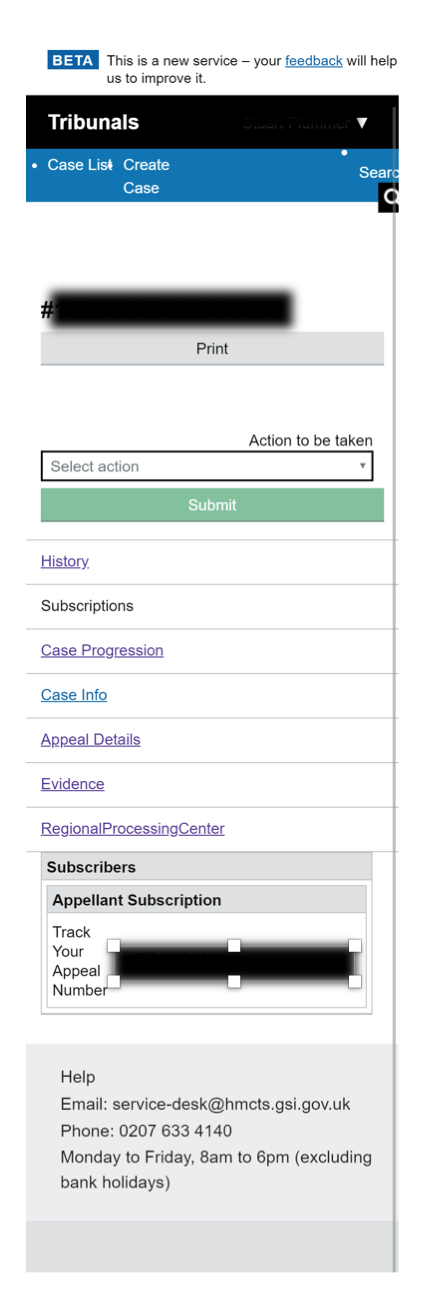
Judicial case manager screenshotsWith a cheeky example of sub nav too. Big screens
Small screens
|


Court Case Data ScreenshotsBig screen
Small screen
|

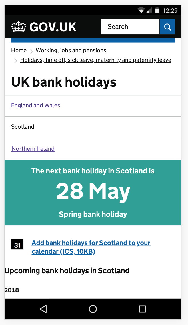
Bank holiday screenshotsBig screen
Small screen
|

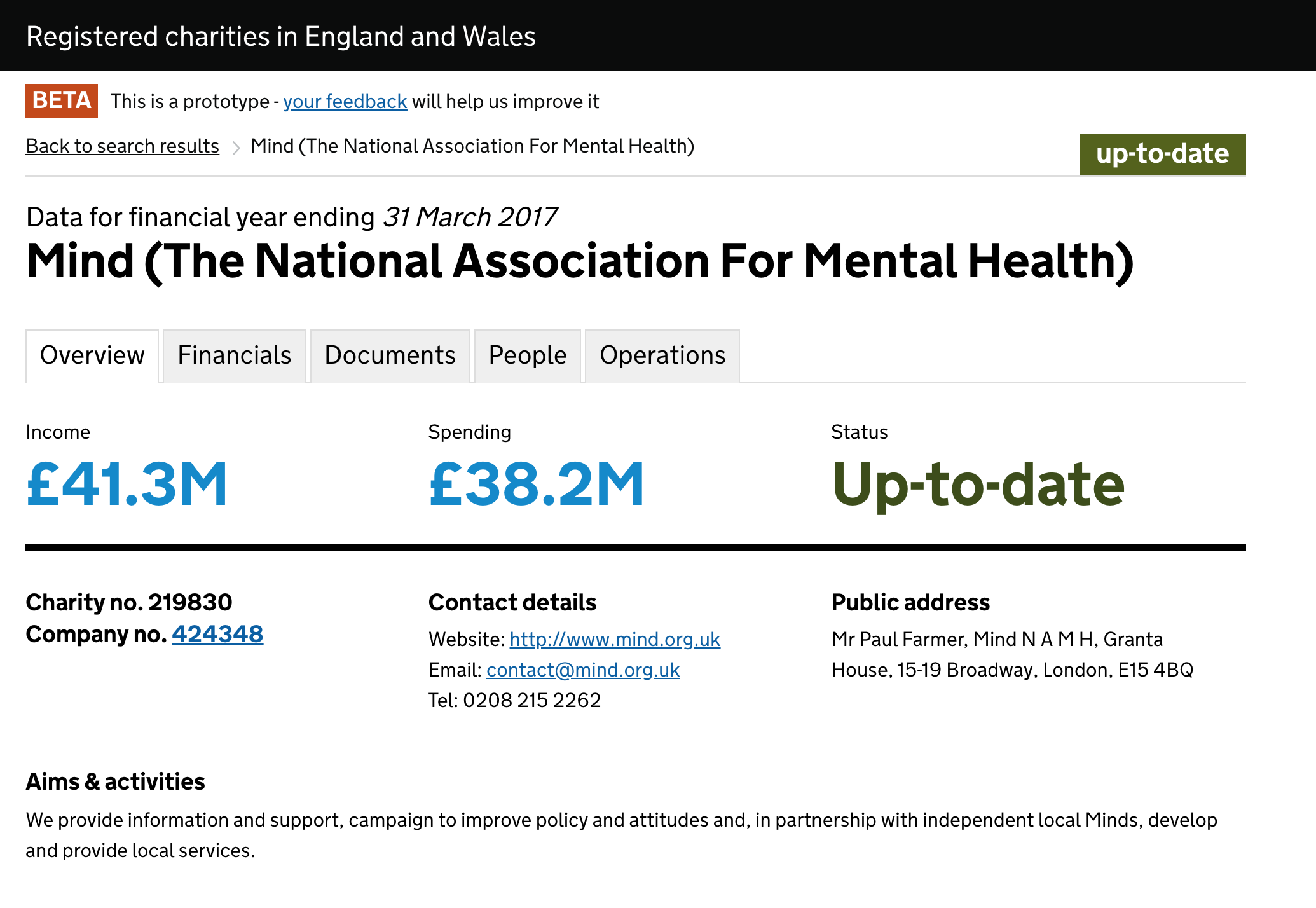
Find a charity uses tabbed panelshttp://beta.charitycommission.gov.uk/charity-details/?regid=219830&subid=0 Big screens
Small screens (broken)
|

Find and compare schools screenshotsBig screens
Small screens (broken)
|


Correct me if I'm wrong, but is this JavaScript only listening for click events, and not keyup or keydown ones? I couldn't see anything there to handle moving keyboard focus from one tab to another using arrows, as in the WAI-ARIA examples (JavaScript source code here), which has keyboard event handlers, and uses roving tabindex to manage focus. |
|
@Astra-Gal GOV tabs have come a long way since we worked on them at HMCTS. From what I can see they work absolutely fine in the GOV design system :). |
|
@trevorsaint Thanks so much for the swift reply! I'm new to the GOV design system, and was trying to understand how the tabs worked 'under the hood' |
|
Hi @Astra-Gal, the current recommended implementation of the tabs component in the GOV.UK Design System is in GOV.UK Frontend here: https://github.com/alphagov/govuk-frontend/tree/main/src/govuk/components/tabs. I hope this helps! |
|
@lfdebrux that's very helpful - thanks very much! |
|
Hi! How can I possibly default select the second or the third tab? It seems when I set "govuk-tabs__list-item--selected" and "govuk-tabs__panel--hidden" classes accordingly to activate the second tab by default in HTML, it does not work as expected and resets it to the first tab during the page load. Here is the live URL to the scenario I am working on (I am upgrading the tabs here to GOVUK Frontend version). There is a validation error and user needs to see the tab where the error is. |
|
Hello, Firstly I am very admiring of your work which has a real international scope I must admit that tabs through the design pattern tablist/tabpanel/tabs are a choice that I recommend very rarely. As the design pattern role="menu", I find that this component has a desktop application ergonomy not adapted to a website. Indeed users are not always used to use arrows to select tabs. For that I prefer a component like this : For the list of tabs
For each panel
the component has the advantage of working only with the TAB key Among your user feedbacks, have you ever had any problems using the tab component? cordially, |
|
We have removed the 'Experimental' tag from components, patterns, and guidance in the Design System 😌. The tag was being used on the tabs component to raise awareness that more research is needed to validate it. However, we recently published new guidance on how to share findings from users which we hope will make it easier to collect more information about how our Design System is being used across services. If your team has used this component please let us know 💪🏻. |
|
Hello, Not an issue with the tab component itself but with the example containing tables. The tables are missing the 
We advise adding the An alternative may be to nest the heading in the
|
|
Following a recent accessibility audit I'm looking for some advice on the ideal behaviour of the tab component. Our page interaction is similar to the GOV.UK Design System. A user navigates through the page using the tab index, when they press enter to view the tab, the content is displayed but as the page reloads the focus is reset back to the first element on the page. This has been flagged as an issue by the audit team;
We're not sure what we can do to ‘fix’ this. The issue here is that our service does a full page refresh when a user clicks any of the tabs. This resets the focus back to the start of the page. This requirement might make more sense if we were a single-page Web application. Is the intention here to have the active tab always take the initial focus or only immediately after the user has switched tab? The former seems achievable but the latter would require some JavaScript to implement it. Any guidance would be appreciated. |
|
@andrewscrivener the component in the design system does use JavaScript, and is not intended to load a new page: |
|
Ok thanks @joelanman I know the tabs use JavaScript. We'll alter the interaction to refrain from reloading the page and keep the focus on the tabs as opposed to resetting it to the top of the page like GOV.UK Design System. |
|
I don't know whether anyone has come across this issue before but I think there may be a problem with this component. When trying to use it via keyboard only with JAWS or NVDA screenreader running, it does not appear possible to use the down arrow to navigate into any non-interactive content on the tabs because the down arrow is moving focus to the next tab. The guidance here - https://www.w3.org/WAI/ARIA/apg/patterns/tabs/#keyboardinteraction would seem to indicate that in a horizontal implementation of tabs, the up and down arrows should not be listened for thus enabling them to be used for browser scrolling or presumably when using a screenreader, they would allow the user to navigate the non-interactive content of the tab. Please tell me if I am missing something here but it would seem to constitute a block to screenreader users. |
|
Hi @hezjbunch, thanks for bringing this to our attention. We aren't sure whether this specifically constitutes a 'block', insomuch as overriding any keyboard function is potentially blocking some function of a screen reader. The left and right arrow keys can sometimes be used to announce text letter-by-letter, for example, which also wouldn't be possible in this situation. However it is notable that the WAI pattern specifically seems to advise against what we're currently doing, and that does lead me to think that we should change how it works. I'm consulting with the other devs and our accessibility specialist on whether and how we want to handle this. |
|
Hi, thanks for getting back to me so quickly. I think it would pose a problem mostly for blind users because they may not be aware that there is any content there without using the read all function of the screenreader to read the entire page. Anyway, I'm sure there are some changes that could be made in order to make it more accessible for keyboard only screenreader users. |
@hezjbunch, I can verify there is an issue with NVDA. But I cannot reproduce this with our version of JAWS. Can you please share with us the JAWS version and browser you used when you encountered that? |
I've found that this is a known issue. See alphagov/govuk-frontend#860. I've added a comment with more information to that issue as it seems to be a bit misunderstood by people. |
|
why are we listening for up and down button presses at all, especially if it causes an issue? The tabs are always displayed horizontally |
It doesn't cause an issue. The issue is independent of us listening to up and down key presses. I know, it appears as if that's the issue but it isn't. (Check the link from my previous comment.) For example, the same problem (presenting slightly differently) happens with the tabs pattern in WAI's Authoring Practice Guide even though they are not listening for up and down arrow presses. |
|
thats good to know but it doesn't really answer the question, especially when it appears to be recommended against in that link:
|
Apologies for late response. We have JAWS 2022 on POISE machines |
Thanks. I can confirm the issue is also in JAWS 2022 and all older JAWS versions that I could find (down to JAWS 16), but not in JAWS 2023 (with which I had initially tested). I will update the related issue accordingly. |
|
I am a full-time screen reader user. With NVDA version 2021.1 (The version we have on POIS). The interaction of the tabs is as expected. I enter focus mode for the interaction. Select the tab I want using right and left arrow (up and down do switch tabs as well). I will test on the latest version of NVDA and JAWS when I can get to a personal device. |
That just made me realise that I didn't notice when I tested that the screen reader would go into focus/forms mode automatically. I guess I heard the beep but didn't pay attention to it. This makes much more sense now. Thanks for checking this and describing your interaction. I guess it is working as intended after all. (With the exception of NVDA and Firefox due to an additional other bug.) |
 and others
Tabs
Use this issue to discuss this pattern in the GOV.UK Design System.
Contributors
Related components
Related links
The text was updated successfully, but these errors were encountered: