Allow toolbar segments to collapse (responsive toolbar) #9075
Comments
 jasmussen
added
[Type] Enhancement
jasmussen
added
[Type] Enhancement
|
I love this idea! From a code perspective, this could be an additional option on |
|
This is a great idea! It seems like the best way to handle toolbars in nested contexts like columns and in cases where a custom block has a lot of inline actions. It would also be helpful in situations where plugins extend the core blocks to have more options in the toolbar like text color and super/subscript formatting tools. |
|
Technically speaking, I'm not certain if this is possible at the moment. How would you decide to trigger the collapsed variation for a The only "possible" alternative I can think of is to avoid "smart toolbars" and just trigger the collapsed version of all toolbars on a given breakpoint. It's less ideal, I know but technically speaking the smart behavior is not possible at the moment. |
Let's work out the ground rules and tweak them until we find an approach we can get to work. Here's one suggestion for ground rules:
For starters, we could start with just the alignments and allowing those to collapse. Do these ground rules inspire any technical solutions that are feasible? |
|
@jasmussen Actually no. The problem is: When the toolbar detects that there's not enough space, it has to "inform" its latest segment that it needs to collapse. But it can only say, collapse everything or don't collapse everything, because the detection of the available space is done on the Toolbar level using DOM and since we're using |
|
Thanks for the clarification. I'll think a bit about this and see what configurations we might look at. But for now, what if we said that all segments, except inline formatting, could collapse? Would that simplify things? Yes be fine if all those collapsed at once. |
Yes, that's definitely possible.
Not saying I have all the answers, just that It's very hard, I have some weird ideas I'll try to experiment with but definitely too complex. Others might have some ideas on the subject. |
|
This is a great idea to increase understanding. I do wonder how discoverable without a drop down indication is, but that is something to consider as we rely more heavily on this. |
I'm #teamriad. But it's always good to get a baseline and then improve from there. If there's an easy path forward that gets us most of the way, seems like a good place to start. |
|
I also agree that just having all the tool groups (or all but the inline tool groups) collapse is a good first step and an improvement over |
|
Apart from the technical challenges mentioned above, I'm not fully sure this could work well from an accessibility perspective. Keyboards and screen readers are used also on mobile devices. Yes, keyboards 🙂and it's a growing trend. https://webaim.org/projects/screenreadersurvey7/#mobilekeyboard
That said, all the drop-downs should communicate semantically they're menus, and be implemented as ARIA menus, which adds an extra layer of complexity to the implementation. Worth noting that even if implemented in a compliant way, I'm not really sure the final result would be so easy to use for keyboard and screen reader users. I'm sorry I don't have good alternative ideas to propose at the moment, but I'd propose to explore simpler solutions. |
|
I like the collapsing approach, but given the above, it seems to have a lot of challenges. What if we take an intermediate approach — even if less ideal than the collapsing — two ideas:
Also to consider: a. might be interesting to see if ••• could trigger a horizontal (potentially multi-line) bar instead of a vertical line. That would allow more scalability, and wouldn't have to change vertical/horizontal order (and preserve ease of memorization). |
|
Something like this?
Interesting idea but it might be awkward on desktop… |
|
Thank you Davide, your insights are always appreciated. Horizontal scrolling is implemented on mobile, and works reasonably. We had to do some hacks in order to make dropdowns work inside the scrollable div, but I believe it should already be in place. So the challenge here is definitely desktop centric. The idea of "popping off items" one by one into the overflow menu is definitely a solid one, this is what Google Docs does, and I tried to mock this up before what you see on this ticket. But our challenge is that we already have an ellipsis menu, which contains things that aren't really related to formatting, which is mostly the domain of the block toolbar. In practice this ended up feeling very weird and not that helpful:
I acknowledge the challenges with dropdowns, but I feel like this might be a good first step on the path. Then we can have a baseline responsive toolbar, and improve from there. What do you think? |

I agree. Good exploration, but shows that combining isn't right. I was more thinking of a new icon, which could not be an ellipsis but a chevron, that triggers just the overflow. |
|
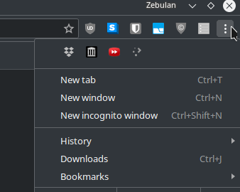
@folletto You mean kind of like what Firefox has for add-on/toolbar icons? (With a horizontal layout and without the text, of course.)
I think that could work. But the combined ellipsis really does not bother me, personally. Chrome/Chromium actually does something pretty similar to this, actually:
|

I knew I saw it before, thanks I couldn't recall where :D |
This is my preference I think. |
Horizontal scrolling can be problematic for accessibility and ideally it should be avoided. It's not just about screen readers, there's a multitude of alternative devices to take into consideration. Also, worth reminding on Windows there will be a visible, big, horizontal scrollbar 😞 I'd rather consider to explore what can be done with the ellipsis menu, as @folletto mentioned above. |
|
Element queries would provide the missing information necessary to determine when there is too little space and controls need to start collapsing. Of course element queries are not a real thing yet, so a JS polyfill is necessary. I have worked with two different solutions for element queries in the past that would be worth looking into regarding the toolbar challenges: CSS Element Queries - This seems to be the more lightweight solution that leverages existing CSS selectors to define element queries. I was also impressed by the focus on performance as shown in the demos page. EQCSS - This is a more powerful library that opens up a lot of possibilities regarding element queries. The downside is that it uses its own syntax and does a lot more than we need it to. But maybe there are pieces that could be leveraged. For the purposes of detecting the width of a container and showing/hiding elements, the CSS Element Queries polyfill should do what we need. |
|
I like the design of the toolbars with collapsing sections, and it does seem like a perfect use-case for element queries! Since any element query solution will be powered by JavaScript (for the foreseeable future) I think you'll have to approach the design like this:
That way all of the JS-powered styles aren't replacing anything CSS can do, but only doing the things you otherwise wouldn't be able to do at all. And if the JS-powered styles fail for any reason you still have a usable, well-designed toolbar. What it looks like this design needs to take it to the next level is a way to set responsive breakpoints based on the width of the element holding the toolbar in situations where there's no known relationship between the width of the element and the width of the browser's viewport. That's definitely something we can do! I'm sure you're better at writing accessible HTML than I am, so rather than having me mock up HTML for a demo, is there an example of the actual markup you're working with for this menu? I've got a stripped-down element query plugin (~500 bytes of JS) that I think would work well for this toolbar, and can be controlled from (valid) CSS stylesheets, as well as from JS, and I'd love to see if I could make this design work! |
|
@tomhodgins I think that's a fair point regarding keeping element queries to a minimum. It could easily get out of hand :)
Gutenberg doesn't work at all if JS isn't loaded, so if they get to that point we'll have bigger fish to fry 😅 I think it's safe to assume that if they've made it into the Gutenberg UI, they have JS available to them. |
|
Unfortunately, CSS Element Queries or CSS can't solve the issue mentioned in this PR because the ideal behavior is not to collapse when the container reaches a certain size but the behavior is to
For me, there's no alternative other than JS computation and even with JS is not obvious how to collapse the segments one after another. |
Accessibility 🙂Just to remind that multiple sections with multiple drop-downs would be a nightmare for accessibility (and I doubt it's even feasible). I'd totally second the proposal of one, single, additional drop-down where all the things can be moved into. |
|
@mapk and I worked on responsive tabs for the Plugins Directory last year. He wrote some JS to collapse tabs one by one as the container shrinks. I think it could be relevant to the solution we're looking for. Here's the CodePen with his proof of concept: https://codepen.io/mapk/full/BRWGWQ |
I like the idea. Pretending to not see the list items are not usable with a keyboard, not semantic, and the click event is attached to the list items 😄 |
When blocks grow thin, whether shown on mobile or in tight nested contexts, the block toolbar currently overflows the boundaries of the block itself. It is not as responsive as it should be.
Let's try and mitigate that, by allowing sections of the toolbar to collapse.
When there's space, show everything:
When space becomes a premium, collapse sections into single icons with dropdowns:
Let's start by doing this for alignments (both decorative and text alignment).
The rules of the block toolbar is that they contain, in order:
However you'd never see both the Decorative alignments and text-alignments/inline formatting together. So if we implemented collapsing for all sections, this would be the minimum size of the toolbar:
Note that this uses a new icon for formatting — we'd want to discuss that icon first. But this would be an extreme version of toolbar-section-collapsing.
We could look at employing https://github.com/marcj/css-element-queries to help with this.
The text was updated successfully, but these errors were encountered: