Keyboard in select mode: Show available moves #25126
Comments
|
A few hours later I'm asking myself if this feature might be too focused on keyboard users. Furthermore I realized that one target group of keyboard mode are the visually impaired, and that they of all people cannot really profit from it. Therefore, maybe it should be an (a) optional setting or (b) the snackbar should only appear after pressing the first arrow key (→ means: "keyboard mode finally activated"). |
AlternativeWhile creating an issue to show outlines of blocks in select mode (#25133), I had another idea: Instead of using the snackbar, the available momements/keys could be shown directly at the blocks.
Designs I tried1The first one uses the "block name rectangle" – but it causes a lot of overlapping and maybe it's not easy enough to identify them.
2The second one is the one I used for the GIF. Better, but maybe too large AND too low contrast.
3The third one might be the most appealing. It's a bit smaller and therefore causes less overlapping and has a higher contrast, going well with the "add"-button. BUT it could be identified as clickable button e. g. to move a block.
|


 mariohamann
changed the title
mariohamann
changed the title
 annezazu
added
[a11y] Keyboard & Focus
[Focus] Accessibility (a11y)
annezazu
added
[a11y] Keyboard & Focus
[Focus] Accessibility (a11y)
|
Thanks so much for this thorough and in depth report, @mariohamann! I've added appropriate labels so more people can chime in. |
|
Interesting idea thanks @mariohamann. I'd totally agree there's the need to better communicate how to navigate with keyboard especially with some layouts e.g.: Columns block, groups, nested blocks. In these cases users really have to guess when they're supposed to use the Tab key (to move through blocks at the same level) or the arrow keys (to move deeper into nested levels). There's room for improvements here as the UI doesn't communicate the available actions at all. As you also pointed out, not sure the "snackbars" would be an appropriate place to show this info, as snackbars aren't accessible to start with. Showing the available actions within the block itself sounds better, as that's the place where users focus is. However, the squares with arrows I see in the mockups above would be only a visual information. How to communicate these infos to screen reader users? |
Maybe pressing |
|
One thing is a general information on keyboard keys / shortcuts to use. |
|
That's what I tried to describe. Example: A block is focused, screen reader user presses |
|
And why users should have a clue they have to press |
|
This is a really nice idea, and I agree that placing the indicators in the content is the best way to contextualize the movement direction. I have to admit that I'm not yet very familiar with keyboard navigation in Select mode. Is this intended to show where the selection focus will move when pressing certain buttons, or to indicate where a selected block will move to when you press an arrow key? Could you describe the scenario briefly for us? |
Problem
I was interested in using the keyboard in select mode and felt a bit lost sometimes.
Solution
I would be happy to see the currently usable moves in the snackbar. Especially for nested blocks this might be very helpful.
Alternatives
Not really alternatives but here are some thoughts on the design:
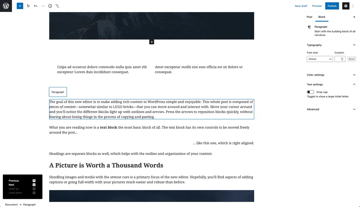
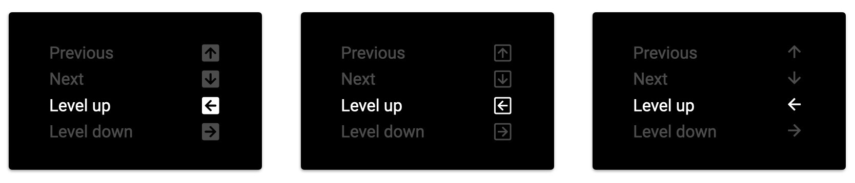
Arrow design
I think the first version is the best compromise between readability and providing idea to press a key. In terms of readability and a11y, the last version might be better. The outlined version does not match to the inverted coloring.
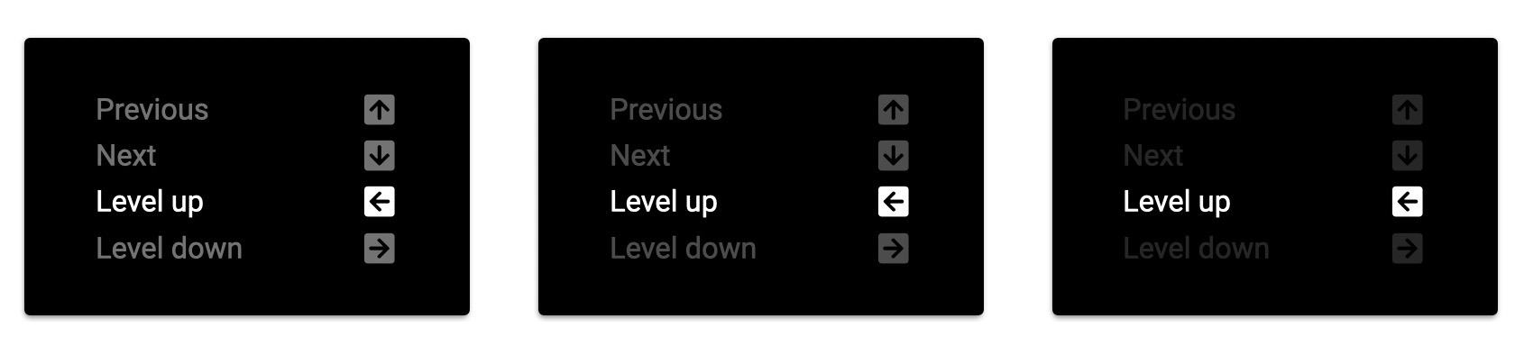
Opacity of disabled moves
I tried 45%, 30% and 15%. For me 30% seems to be the best compromise.
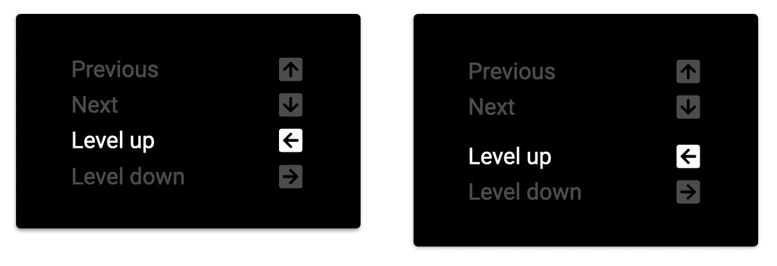
Additional spacing
It would be a nice improvement to bundle related functions with a small spacer.
The text was updated successfully, but these errors were encountered: