Evolving Movers #21935
Comments
 ZebulanStanphill
added
[Focus] Accessibility (a11y)
ZebulanStanphill
added
[Focus] Accessibility (a11y)
|
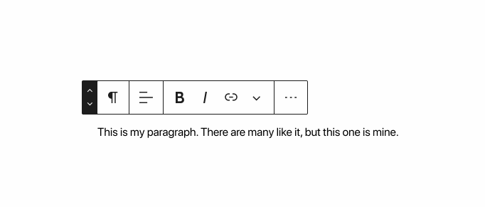
I'm concerned about the button size of the movers in the above mockups; I think the current movers are already as small as they can get. Any smaller and it becomes difficult to press them with a touchscreen and annoying to pinpoint your cursor over them with a mouse. I do think it would be nice if we could make the movers less hidden and in a more obvious tab location. Personally, I think having the movers after the block icon makes more sense than their current tab position in However, it's important to remember why the movers became hidden in the first place: to try and keep the block UI from feeling overwhelming. Do the positives of having them always visible outweigh the negatives? |
|
There's a lot of conversations around the Movers, so I'm glad to see others are thinking them through. Thank you!
Was there feedback that expressed an ambiguous relationship? I ask because I always thought that was clear. Even when we moved them to a more hidden state, their relationship to the block toolbar was strong IMO. When glancing at this iteration, I noticed an element on the left and two small arrows on the right of it. At first, I thought this was a variation on the Number input field.
And combined with my former knowledge of how the block transform tool works, I imagined the arrows would cycle through the various block types that are available for transformation. Or maybe they were there to indicate that this button opened a selectbox of options. For these reasons, I feel they might become more lost or misrepresent their intended actions. Pulling them away from the block type into their own icon square could help. I'm sure it's been explored, but throwing it out there as an option...
|


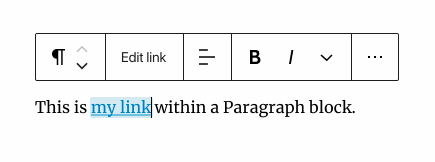
I agree; I think it's pretty clear what block the movers are attached to, assuming you know what block their associated toolbar is attached to. I think the mockup @mapk posted is probably the way to go if we're going to move the movers into the visible part of the toolbar. Of course, it takes up more space, but that also means the buttons aren't cramped. When a block can't be moved, should the block mover disappear or just appear disabled? |
|
Thanks for adding this exploration. To expand on the context a bit: the current setup in
A good example here with the List block.
Arrows could be more like this when interacting with them (spacing needs some small adjustments still):
@ZebulanStanphill good point on how to handle blocks that cannot be moved. There are a few cases here to distinguish:
|


|
Thinking in terms of toolbar groups, perhaps it makes sense to view the block icon and movers as part of the same toolbar group, and thus having the same amount of space between each other as any other toolbar group. So somewhere between the mockups posted by @mapk and @mtias. Increased space between the block icon and mover arrows would also help avoid misinterpreting them as some sort of number input/dropdown.
I'm not really a fan of the expanding button idea (I think it could feel annoying/obtrusive; I'm not opposed to trying it in a PR, though), but I really like the idea of making the block icon a drag handle.
Agreed.
Yeah, I'm not entirely sure what to do to convey that moving blocks is disabled by the template. To start out simple, I think just omitting the movers entirely might work. |
|
I messed around a bit more because these arrows still remind me of a selectbox.
One of the larger concerns of people is that these arrows keep getting smaller and visually look more difficult to click on. Maybe some animation can help here?
|


|
@mapk In that mockup, it looks like the buttons are moving away from the cursor, rather than just expanding. It feels off. But maybe it would feel better with the hover color included. Also, that mockup doesn't work with horizontal movers. |
|
I played with a few quick transition ideas. The first mimicking the behavior we have now, hiding/showing as you hover:
This has the same problem we have now, with the movers not being obvious and many never noticing them. It also moves the block icon around, and generally feels overly complex. The second transition makes the movers visible, but small until hovered:
This still suffers the problem of moving stuff around needlessly. -- In general, I think there needs to be some separation between the movers and the block icon — we're starting to collect a lot of functionality (block menu, movers, drag handle) all with little differentiations between the UI elements. --
Part of me wants to revisit this. I think the movers could help anchor the block, and with a different styling, the block icon would still feel like the first element in the toolbar. Here's a quick idea:
Here's how it could work when dragging:
|


|
@shaunandrews In those last two mockups, the movers are definitely too small for my taste. I also don't think the inverted colors are a good idea since it's so similar to the style used for toggled buttons. Additionally, it doesn't work well with horizontal movers. I still think this is the best mockup so far:
In my opinion, the requirements for a mover design are:
|
|
Similar to Mark's comments, at first glance I thought the up/down arrows were to cycle between different block types. I don't think that such placement and treatment communicates well the action. I also don't see the issue of relationship with the current approach, but if discoverability is an issue, then I think that Shaun's concept does a good job to fix that. |
|
What I really like about Shauns animated gif is that it shows a change in the toolbar icon during the drag & drop. But instead of having the background black I would likely keep it white and have the arrows black. On drag & drop change the icon to reflect the drag icon and keep a white background and the icon black. We also need a bigger up and down hit arrow area. Perhaps we should have a think grey line between the up and down hit area. As it creates an idea for the user that the hit area is larger than just the arrow icons.
EDIT: EDIT 27th May: Arrows having their own space. Keeping them separate from the Paragraph icon. + Making the arrows a little bigger so they become easier to click. From Zeb. A variation. The arrows are bigger. |


 github-actions
bot
added
the
[Status] In Progress
github-actions
bot
added
the
[Status] In Progress
|
Lets keep in mind that a lot of these examples rely on hovering, or arrows that get bigger, which is a non-starter on touch based devices such as laptop touch screens, smart projectors, or tablets. I'm also in favour of visually separating the arrows as in some of the above mockups the arrows imply that they're part of a dropdown menu, or that they control the block type by being in the same square, which is not the case. |
|
Right now @jasmussen Joen is working on the mockup Matias added above to this PR: #22673 |
|
I like the new movers without any hover effect. @jasmussen @pablohoneyhoney Is there any more polish to the new design you wish to do for WP 5.5? |
|
Hey there @jasmussen! The accessibility team discussed movement on this concept during our meeting on 07/03/2020, and voted that the new combi-controls might confuse the user and therefore constitute a regression from an accessibility perspective. Our discussion was mostly based on this issue, but we also recognized the following related issues and PRs:
Our main concerns from the discussion include: Noticing that the “grab area” is now gone and has been unified with the buttons area:
Noticing that the mouse cursor on interactive buttons is now the “hand”:
Other general a11y concerns:
Pre-existing issues:
As this is my first task joining core, please let me know if I can provide any more info and feel free to reach out to @afercia and @Ryokuhi as they were a key part of the discussion. Thanks! |
|
Thanks for the feedback, let's consider it. This issue is from April - what can be done to have this brought up sooner? It’s difficult to make big changes before 5.5. Here some observations on the notes that will hopefully keep us moving forward.
Unfortunately, the placement of UI on the side of blocks caused a cascading number of issues around toolbars being cropped, overlap, or being inaccessible in constrained viewports:
In fact, the mover control on the sides assumes a minimum height of blocks, which in many cases are not tall enough to support such a control. Additionally its positioning on the side prevents the block toolbar from being horizontally shifted to avoid getting cropped:
This is something the new toolbar solves:
The placement on the side also does not account for situations needing lateral movement, which the placement above the block solves:
When considering the array of blocks that exist, and looking beyond top level blocks shown on a desktop screen, the unification of controls into a single toolbar above the block hopefully starts to make sense as ultimately being the more intuitive path forward.
Thanks for calling this out. Here’s a new PR to remove the hand cursor from those controls: #23759.
The chevron buttons are in fact substantially bigger than what ships with WordPress 5.4, they are 36x24px compared to 24x28px before. Here’s a PR, #23760, which makes it visible that buttons are 36x24px. Here’s a PR to make the touch targets bigger (48x48px) on mobile devices: #23761.
Mind including a ticket or additional context? Happy to take a look. This is all iterative work. We are tight with major changes before 5.5 but we’ll certainly keep working on this. Please do keep bringing this to our attention as early as you can so we can work better together. |


|
Yeah, overall I'd say the current situation is a net improvement over WP 5.4, though there's certainly room for improvement.
This issue isn't really new. The movers in WP 5.4 already use the same icon as accordions. I definitely agree we should use separate icons for these two different use-cases, though. Perhaps the movers should switch to more traditional arrows, or perhaps the accordions should use different icons to better convey the notion of expand/collapse.
As stated before, the buttons are already larger now than in WP 5.4. And of course, touch screens are well-suited to drag-and-drop anyway, so I don't think this is a terrible issue. However, I would not be opposed to splitting the movers into larger, non-stacked buttons... but only if you could solve this problem: How do you deal with the increasing number of vital toolbar controls? This problem is perhaps the biggest obstacle to any further improvements. If you unstack the movers and add a visible drag area between them, the toolbar becomes significantly longer... especially now that the toolbar button size has been increased significantly compared to WP 5.4. If you split the switcher into a separate thing from the block icon, it gets even longer! Ultimately, I think it's clear that we need to find a way to manage the growing number of toolbar controls. I'm starting to think the toolbar needs to have at least two different "modes" showing different controls:
Perhaps switching between the two could be done using a button near the far left of the toolbar. The interaction could work something like this, where clicking a button replaces some or all of the toolbar with different controls.
(Note that I am not suggesting we implement this specific link control interaction. I'm just using it as a demonstration.) Assuming something similar to this can be done in an accessible way, perhaps we could go even further and split the toolbar controls even further, having a primary toolbar consisting of:
And when you enter one of the toolbars, there would always be a button on the far left to go back to the main toolbar. The only thing I haven't quite figured out is how inline formatting controls fit into this. I guess that could be another sub-toolbar, or perhaps those could always be shown at the end of the toolbar before the ellipsis regardless of which sub-toolbar you're currently in. How does that idea sound? It seems to me that something along these lines is the best way to handle the growing number of toolbar controls (especially as the Global Styles effort moves forward) while also keeping all buttons at a standard size and avoiding weird stuff like the parent-selector button floating above the rest of the toolbar. |
|
Thanks for all the responses! This is definitely a tough one and y'all have done a great job! As we're tight on time, I'll try to keep my response limited in scope. Speaking for myself instead of the a11y team now: Overall, I like the idea of keeping the movers in the block toolbar instead of on the side, as it keeps them more visible and accessible (vs the more hidden state on the side before). I also like how they switch to represent horizontal movement - not sure if the team had all seen that example yet. That said, feels like we are on the right path, just need to solve:
At this point, I'd say these concerns are suggestions, not blockers. Happy to iterate, so long as the teams feel confident in the path and it creates the least amount of disruption for the end users. Re: Space:
Re: Block Switcher:
If any of the feedback is doable before the launch, I think that would be best, but totally understand if it is too big of a lift. Tool tips can probably be punted, since there appears to be many existing issues noted for that already. |
Uh... that wasn't an idea. I was just talking about the existing block toolbar ellipsis.
Yeah, now that I think about it, it is kind of similar to the classic editor's kitchen sink, except that instead of doubling the toolbar height, it would just replace what's currently shown in the toolbar.
Agreed. If we split the switcher from the movers with a line (thus putting them in separate toolbar groups) and kept with our existing style patterns, it would also make the mover buttons a bit larger as a result. |
|
Related to making the toolbar more touch-friendly, accessible, and generally more usable, I've opened #23766 to propose a change to how the parent-selector-button is presented. |
|
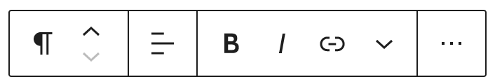
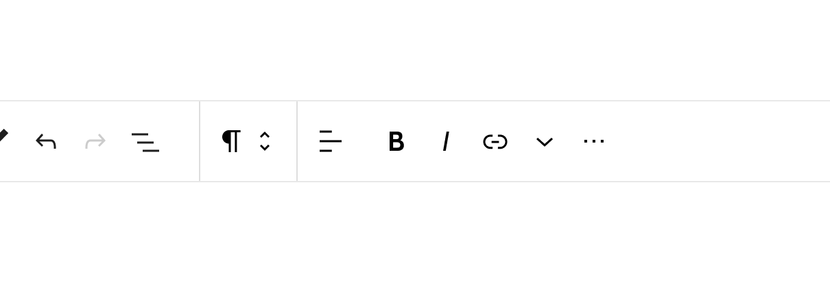
I agree that the movers next to the block switcher as they were a single control may be confusing. It reminds me of a select button as @mapk pointed, which would actually make sense if you consider that the block switcher is a kind of select control. I'd suggest making the movers a separate control in the toolbar, just like the "Change text alignment" button, as @ZebulanStanphill suggested on #23760 (comment). Or, at least, add an extra space between them and the block switcher to match the style of other toolbar groups like format controls. So instead of this:
This would be just like other toolbar groups:
Also, although the movers now have a bigger touch area, the perceived area is smaller, because people will usually click or touch on the icon, and not on the blank space. And they're so close to each other that it's super easy to do a misclick. So, in addition to #23760, I'd also consider increasing the vertical space between them (or the horizontal space in case of horizontal movers):
|


|
@diegohaz I tried doing the space-increase thing, but due to all the complicated CSS involved to adjust the positioning, sizing, and padding of the SVGs, focus rectangles, and various #23971 is the PR that makes this change. If the combined switcher/mover confusion is considered an accessibility regression, then I'm hoping it could be backported to core for WP 5.5. |
As the efforts of the new UI need to keep evolving, here a design exploration to bring movers to a permanent state within the toolbar, while keeping the hierarchy within to have a clear relationship to the block type they are affecting.
A few states below as a start.
Rest
Active
Dragged
Top toolbar

The text was updated successfully, but these errors were encountered: