-
-
Notifications
You must be signed in to change notification settings - Fork 2.4k
New issue
Have a question about this project? Sign up for a free GitHub account to open an issue and contact its maintainers and the community.
By clicking “Sign up for GitHub”, you agree to our terms of service and privacy statement. We’ll occasionally send you account related emails.
Already on GitHub? Sign in to your account
DialogCoordinator.ShowMessageAsync Button Accent #2468
Comments
|
@Hikerakashiya This is a little bit tricky and must be explained on main mahapps docu (tba) The dialogs use there own button styles https://github.com/MahApps/MahApps.Metro/blob/develop/MahApps.Metro/Themes/Dialogs/BaseMetroDialog.xaml#L6-L24 So if you want to override this styles you must create your own res dictionary with the style overrides and put this on the <Style BasedOn="{StaticResource SquareButtonStyle}" TargetType="{x:Type Button}">
<Setter Property="controls:ControlsHelper.ContentCharacterCasing" Value="Normal" />
<!-- Your custom style changes -->
</Style>
<Style x:Key="AccentedDialogSquareButton"
BasedOn="{StaticResource AccentedSquareButtonStyle}"
TargetType="{x:Type Button}">
<Setter Property="controls:ControlsHelper.ContentCharacterCasing" Value="Normal" />
<!-- Your custom style changes -->
</Style>
<Style x:Key="AccentedDialogHighlightedSquareButton"
BasedOn="{StaticResource HighlightedSquareButtonStyle}"
TargetType="{x:Type Button}">
<Setter Property="controls:ControlsHelper.ContentCharacterCasing" Value="Normal" />
<!-- Your custom style changes -->
</Style>yourDialogSettings.CustomResourceDictionary = new ResourceDictionary { Source = new Uri("pack://application:,,,/YourReallyCoolApp;component/CustomStyles/CustomDialogStyles.xaml") }Hope this helps! |
|
@punker76 Thanks for the response. Why can't the dialog inherit the styles from the main overall theme? It does not seem intuitive this way. Also how does the ColorScheme setting work for dialog settings? |
|
@Hikerakashiya You maybe totally right, so I'll look at this point. The ColorScheme setting handles e.g. background and foreground brushes... |
|
I had the same problem and discovered that I missed to include in the App.xaml Without this reference the dialog will always appear in the "default" light theme with blue as the color. |


What steps will reproduce this issue?
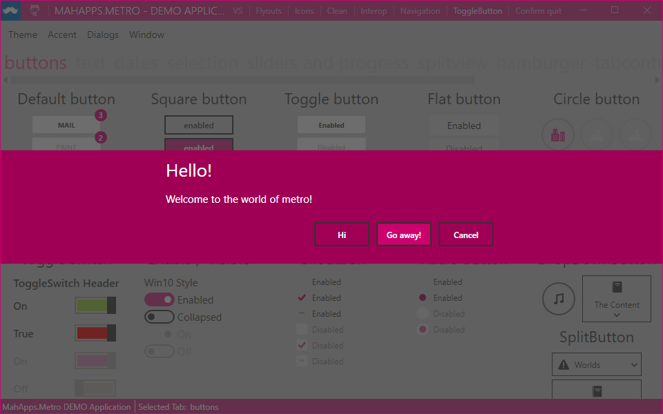
I am using the DialogCoordinator to display dialogs and I noticed when a dialog is displayed it does not use the colors of my custom theme. I tried setting the MetroDialogSettings and setting ColorScheme, but none of the choices for ColorScheme have an affect on the button colors of the dialog. No matter what I set for the ColorScheme, the OK button was always using the light blue theme color.
Expected outcome
Dialog buttons are themed with the current set theme.
Environment
The text was updated successfully, but these errors were encountered: