
This part of the tutorial is dedicated to plotting gridded data in GMT: contour plots, pseudo-color plots (images), etc.
The main file format GMT uses for grids is called netCDF:
"self-describing, machine-independent data formats that support the creation, access, and sharing of array-oriented scientific data"
The file contains information about:
- Data values on the grid
- Coordinates
- Metadata: units, projections, etc
All stored in a binary file that support data compression and is widely accessible from other software (GIS, Matlab, Python, etc).
Further reading: https://docs.generic-mapping-tools.org/latest/gmt.html#grd-inout-full
Open a terminal and follow along with the exercise.
All GMT commands that operate on grids start with grd: grdimage,
grdsample, grdcontour, etc.
Throughout this section, we'll use GMT's built-in Earth relief grids. The grids
are available is several resolutions. They are downloaded automatically by GMT
when you use the special @earth_relief_rru file name. See
https://docs.generic-mapping-tools.org/latest/datasets/remote-data.html#global-earth-relief-grids
Use grdinfo to
get information about a grid file:
gmt grdinfo @earth_relief_10m
The option -Cn will print only numerical information about the grid (
w e s n z0 z1 dx dy nx ny by default):
gmt grdinfo @earth_relief_10m -Cn
Further reading: https://docs.generic-mapping-tools.org/latest/grdinfo.html
BONUS
Option -o can be combined with -Cn to select only one of the number printed
out. This is useful if you need to use this information as input for other
commands or assign them into variables. For example, we can get the grid
spacing in the x dimension:
gmt grdinfo @earth_relief_10m -Cn -o6
# Or store it in a variable with
dx=`gmt grdinfo @earth_relief_10m -Cn -o6`
Finally let's get to the plotting already! We'll start with contour plots first.

The command for making contour plots from grids is
grdcontour.
By default, it will plot using black contours with a reasonable interval.
It has many options for configurations, which you are encouraged to explore.
You can make very nice looking plots with grdcontour.
Further reading: https://docs.generic-mapping-tools.org/latest/grdcontour.html
Open VSCode (or your text editor of choice) and follow along with the exercise.
We'll make contour plots of our Earth relief grid for Antarctica, starting with the default options and adding some tweaks to make it look a bit nicer.
First, we need to set the basemap to the right region and use an appropriate
projection. For Antarctica, we will go with a
South polar stereographic projection.
The region can be set using ISO 3166 country code. This is a 2-letter code
for every country/region in the world. GMT supports these codes as arguments to
-R. This means that we can specify the region for Antarctica as -RAQ:
Here is a list of ISO 3166 country codes: https://en.wikipedia.org/wiki/List_of_ISO_3166_country_codes
Further reading: https://docs.generic-mapping-tools.org/latest/cookbook/map-projections.html
See the script contours.sh. The output should look like:

Now we can tweak this a bit to specify intervals for regular and annotated
contours. We can also set the line thickness and color (i.e., the pen). See
the script contours-custom.sh. The output should look
like:

Take the customization further by layering two plots: one for the oceans (in
blue) and one for land (in gray). See the script
contours-fancy.sh. The output should look like:

Full list of GMT color names: https://docs.generic-mapping-tools.org/latest/gmtcolors.html
These are the maps you might be used to seeing. Each data value is mapped to a color through a colormap or color palette table (CPT) as they are called in GMT.

GMT has many CPTs: https://docs.generic-mapping-tools.org/latest/cookbook/cpts.html#of-colors-and-color-legends
The command for plotting pseudo-color images in GMT is
grdimage.
By default, it will choose a CPT for you depending on the input grid. The Earth
relief data are automatically assigned a topographic CPT.
Further reading: https://docs.generic-mapping-tools.org/latest/grdimage.html and https://docs.generic-mapping-tools.org/latest/tutorial/session-4.html#color-images
Open VSCode (or your text editor of choice) and follow along with the exercise.
We'll continue with our map of Antarctica relief but this time we'll use color to represent values.
First, plot the Earth relief data using the defaults, including a colorbar.
See the script images.sh. The output should look like:

GMT supports automatic hill shading (adding a shadow effect to the image based
on the gradient of the data values). You can also apply custom shading
(including shading one data type with another) using grdgradient.
See the script images-shading.sh. The output should look like:

Further reading: https://docs.generic-mapping-tools.org/latest/grdgradient.html
We can control the placement of the colorbar using the -D option. We can also
set the annotation intervals and add axis labels using -B (just like for a
basemap).
See the script images-colorbar.sh. The output should look like:

Further reading: https://docs.generic-mapping-tools.org/latest/colorbar.html
Custom CPTs can be generated and configured with the makecpt command.
See the script images-cpt.sh. The output should look like:

Further reading: https://docs.generic-mapping-tools.org/latest/cookbook/cpts.html#of-colors-and-color-legends and https://docs.generic-mapping-tools.org/latest/makecpt.html
You will be split into teams to work on an exercise:
- Discuss with your team which commands and options you would use
- Work together to make a script that generates the desired plot
- If you have any questions, ask on the Slack chatroom
Make a relief map of a country of your choice:
- Agree on which country you will map and find the ISO country code for that country (to use as the region)
- Choose a projection: https://docs.generic-mapping-tools.org/latest/cookbook/map-projections.html
- Make a hillshaded pseudo-color plot of Earth relief (with either default CPT or not)
- Overlay contours on your plot. Be careful not to make your plot too busy with the contours.
- Add a colorbar.
- BONUS: Add a label to the colorbar indicating that the units are meters.
- BONUS: Add a title to your plot.
You map should look something like this:

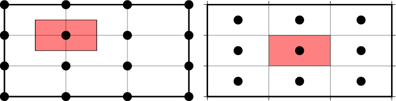
The coordinates of grids and what the data values represent can be specified in two ways (known as the grid registration):
- Grid lines: the coordinates correspond to the center of the area that is represented by the data value (where grid lines intersect)
- Pixels: the coordinates correspond to the borders of the area (pixel)
Gridline (left) and pixel (right) registration of data nodes. The red shade indicates the areas represented by the value at the node (solid circle).
Grids are generated using one of the two options and it's very important to
know which you have (hint: grdinfo can tell you). The plotting modules in
GMT can usually automatically detect this. When generating output grids, you
can specify which one you want using the -r option.
Further reading: https://docs.generic-mapping-tools.org/latest/cookbook/options.html#grid-registration-the-r-option
Use grdinfo to figure out if the Earth relief grids are gridline or pixel
registered:
gmt grdinfo @earth_relief_10m
GMT actually distributes both versions of the Earth relief data. You can
specify which version you want by appending _p (for pixel) or _g (for
gridline) to the file name (for example, @earth_relief_10m_p).
Further reading: https://docs.generic-mapping-tools.org/latest/datasets/remote-data.html#global-earth-relief-grids